Although color bars are useful, they can lead to poor visibility one a limited screen scale. Therefore, in this tutorial, we will learn how you can hide the color bar in Plotly figures.
Let’s dive in.
Plotly Figure with Color Bar
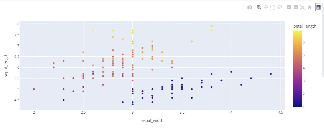
Before we can illustrate how to hide the color bar in a plot, let us first create a simple plot showing what a color bar is and how it can be used.
For this example, we will use a simple Scatter plot as shown in the code below:
df = px.data.iris()
fig = px.scatter(df, x="sepal_width", y="sepal_length", color='petal_length')
fig.show()
Running the code above should return a scatter plot with the color scale as shown:
Plotly Update_coloraxes
The best way to hide the color bar in a Plotly figure is by using the plotly update_coloraxes() function.
The function allows us to specify if the colorvscale should be visible or not. For example, we can run the code:
df = px.data.iris()
fig = px.scatter(df, x="sepal_width", y="sepal_length", color='petal_length')
fig.update_coloraxes(showscale=False)
fig.show()
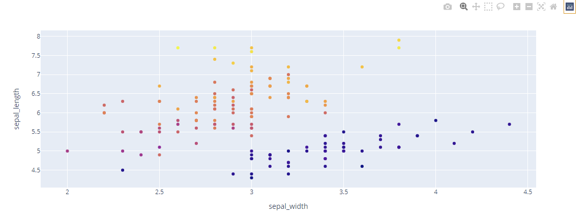
In the example above, we use the update_colorscale() function. We also pass the showscale parameter to False. Doing this will force Plotly to hide the color bar. as shown in the figure below:
Plotly Hide Colorbar using Update Function.
You can also use the fig.update() function to hide the color bar. In this case, we use the layout_coloraxis_showscale parameter.
An example code is as shown below:
df = px.data.iris()
fig = px.scatter(df, x="sepal_width", y="sepal_length", color='petal_length')
fig.update(layout_coloraxis_showscale=False)
fig.show()
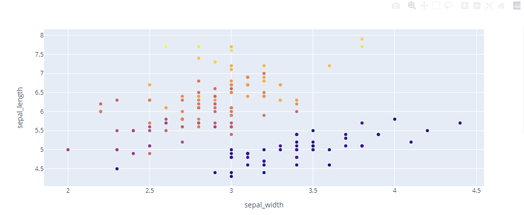
The code above should return the same figure without the color bar as shown:
Closing
In this article, you learned of two main methods of disabling the color bar in Plotly figures. We hope you enjoyed this tutorial.


