Let’s dive in.
Basic Bar Plot With graph_objects
We can create a simple bar plot by using the Bar class from the graph_objects module. Using graph_module provides us with low-level control of the features and customization of the figure.
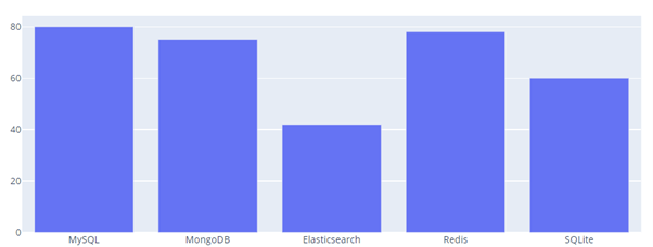
The code below shows how to use the Bar class to create a Bar chart.
databases = ['MySQL', 'MongoDB', 'Elasticsearch', 'Redis', 'SQLite']
usage = [80, 75, 42, 78, 60]
fig = go.Figure(data=go.Bar(
x=databases,
y=usage
))
fig.show()
The code above should return a simple bar plot as shown:
We can also create Grouped Bar Chart as shown in the sample code below:
databases = ['MySQL', 'MongoDB', 'Elasticsearch', 'Redis', 'SQLite']
fig = go.Figure(data=[
go.Bar(name='AWS', x=databases, y=[80,75,42,78,60]),
go.Bar(name='GCP', x=databases, y=[99, 70, 65,80,78])
])
fig.update_layout(barmode='group')
fig.show()
The code above will create a grouped bar chart based on the values provided in the go.Figure function. Ensure to update the layout and set the bar mode to the group to allow plotly to group the specified bar plots.
The resulting figure is as shown:

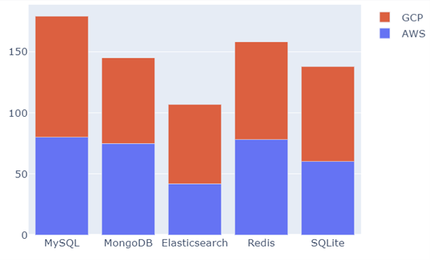
To create a stacked bar chart, you can set the barmode to stack as shown in the example below:
databases = ['MySQL', 'MongoDB', 'Elasticsearch', 'Redis', 'SQLite']
fig = go.Figure(data=[
go.Bar(name='AWS', x=databases, y=[80,75,42,78,60]),
go.Bar(name='GCP', x=databases, y=[99, 70, 65,80,78])
])
fig.update_layout(barmode='stack')
fig.show()
In this case, the code above will return a stacked bar chart as shown:
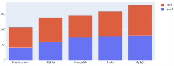
To sort the values within a bar chart, we can use the x-axis and y-axis parameters as shown in the sample code below:
databases = ['MySQL', 'MongoDB', 'Elasticsearch', 'Redis', 'SQLite']
fig = go.Figure(data=[
go.Bar(name='AWS', x=databases, y=[80,75,42,78,60]),
go.Bar(name='GCP', x=databases, y=[99, 70, 65,80,78])
])
fig.update_layout(barmode='stack', xaxis={'categoryorder': "total ascending"})
fig.show()
In this case, we sort the values in the x-axis by ascending order. The resulting figure is as shown:
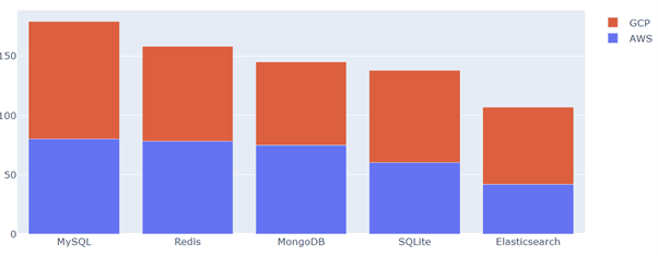
Similarly, you can sort in descending order by setting the categoryorder parameter to total descending:
databases = ['MySQL', 'MongoDB', 'Elasticsearch', 'Redis', 'SQLite']
fig = go.Figure(data=[
go.Bar(name='AWS', x=databases, y=[80,75,42,78,60]),
go.Bar(name='GCP', x=databases, y=[99, 70, 65,80,78])
])
fig.update_layout(barmode='stack', xaxis={'categoryorder': "total descending"})
fig.show()
Resulting figure:
Conclusion
Through this article, you learned how you could use the Plotly graph_objects module to create various types of Bar plots using Plotly. The Plotly graph_objects module is practical when you need low-level control over your figures. However, if you are looking for a quick and easy way to create plots, Plotly express is a better alternative.
Thanks for reading & catch you in the next one!!