You can learn more about ECDF in the resource below:
https://en.wikipedia.org/wiki/Empirical_distribution_function
For this article, we will focus on creating ECDF plots using the Plotly Express module.”
Simple ECDF Plot
The following code shows how to create a simple ECDF Plot using the Plotly express module.
df = px.data.tips()
fig = px.ecdf(df, x='total_bill')
fig.show()
The code above should return an ECDF distribution plot as shown:

To create combined ECDF plots, you can specify the columns you wish to plot as a list. An example code is shown below:
df = px.data.tips()
fig = px.ecdf(df, x=['total_bill', 'tip'])
fig.show()
The output figure:

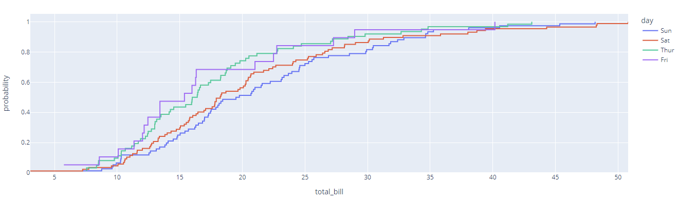
To plot the color dimension in the plot, we can run:
df = px.data.tips()
fig = px.ecdf(df, x='total_bill', color='day')
fig.show()
Output:
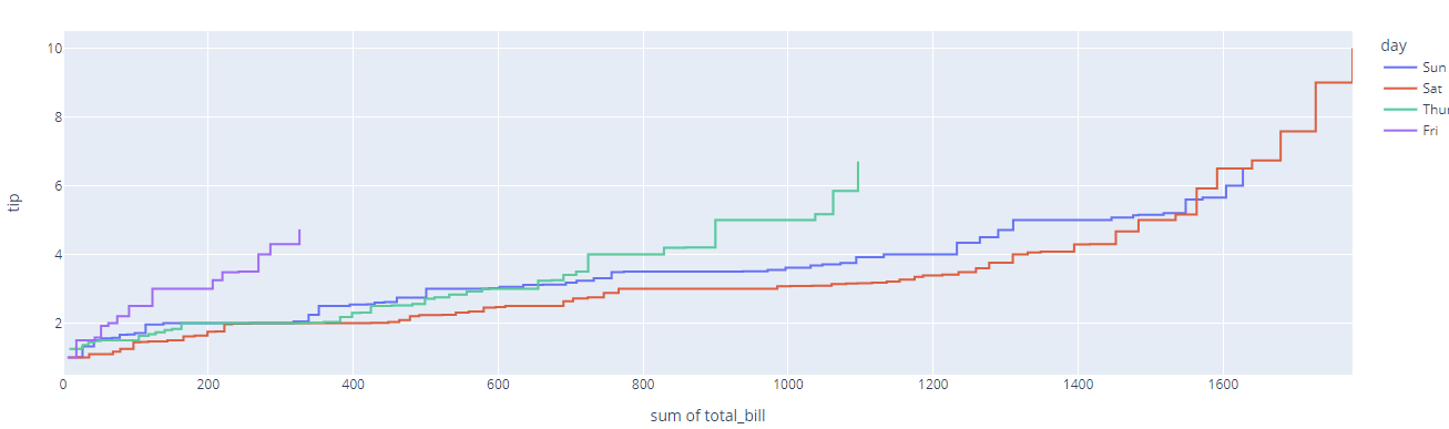
To show the raw counts of the data, set the ecdfnorm parameter to None as shown:
df = px.data.tips()
fig = px.ecdf(df, x='total_bill', color='day', ecdfnorm=None)
fig.show()
Resulting plot:

You can also customize the orientation of the ECDF plot by setting the orientation parameter.
For example, to set the orientation to horizontal, run:
df = px.data.tips()
fig = px.ecdf(df, x='total_bill', y='tip', color='day', orientation='h', ecdfnorm=None)
fig.show()
The code above should return the ECDF plot in horizontal orientation as:
Change the orientation value to “v” to create a vertically oriented ECDF plot.
To include markers in your ECDF plot, use the markers parameter as:
df = px.data.tips()
fig = px.ecdf(df, x='total_bill', y='tip', color='day', orientation='h', ecdfnorm=None, markers=True)
fig.show()
The resulting figure:

To show a marginal plot, we the marginal parameter to the type of plot you wish to include:
df = px.data.tips()
fig = px.ecdf(df, x='total_bill', y='tip', color='day', orientation='h', ecdfnorm=None, markers=True, marginal='box')
fig.show()
The code above will include a box plot as a marginal plot as:

To show a facetted ECDF plot, specify the facet_col parameter as:
df = px.data.tips()
fig = px.ecdf(df, x='total_bill', y='tip', color='day', orientation='h', ecdfnorm=None, markers=True, facet_col='day')
fig.show()
Output:

And that’s it.
Closing
In this article, we covered how to create various types of ECDF plots using the Plotly Express module.
Happy coding!!