- Data can be represented visually in a variety of ways including line charts, scatter plots, bar graphs, heat maps, and even histograms
- Interactive features such as panning, zooming, and selection tools
- The ability to create subplots and animations
- The ability to save and share plots online or offline
In this tutorial, we’ll go over how to use Python’s Plotly to create interactive graphs/plots. Here are the steps to use Plotly to create interactive plots:
Prerequisite: Install Plotly
Plotly can be installed using the “pip” command on the command prompt if we haven’t installed it yet:

Import Plotly
To create a plot or chart with the assistance of Plotly, the developers are required to import the essential library packages initially:
Create Your Data
Prepare the data that we’ll need for the presentation. Although NumPy arrays and lists can also be used with Plotly, Pandas DataFrames perform best.
Create a Simple Scattered Chart/Plot
Plotly’s functions can be used to build interactive plots. An illustration of an interactive scatter plot is shown here:
iris_data = px.data.iris()
fig_Obj = pexp.scatter(data_frame=iris_data,
x="sepal_width", y="sepal_length",
color="species", title="Iris Dataset")
fig_Obj.show()
The Iris dataset is plotted using the “plotly.express” module which is imported into the code. This module offers a high-level interface to build the common plot types. From the Plotly Express data package, this line loads the Iris dataset. The Iris dataset is a widely used dataset for machine learning and data visualization. Sepal, petal, and ovary measurements were taken on 150 Iris flowers from the Setosa, Versicolor, and Virginica species.
![]()
Using the px.scatter() function, this line plots the Iris dataset as a scatter plot. The data_frame input provides the Iris dataset, while the “x” and “y” arguments specify the sepal width and sepal lengths columns as the plot’s corresponding “x” and “y” axes. The color argument indicates the species column as the color of the data points in the plot. The title argument specifies the plot’s title. To show the plot on the browser screen, the following code is used:
![]()
When the code is executed, a scatter plot with three different colored data points, each representing one of the three species of Iris blooms, appears. The plot’s y-axis displays the sepal length, and the x-axis indicates the sepal width.

Here is the output:

Customize Your Plot
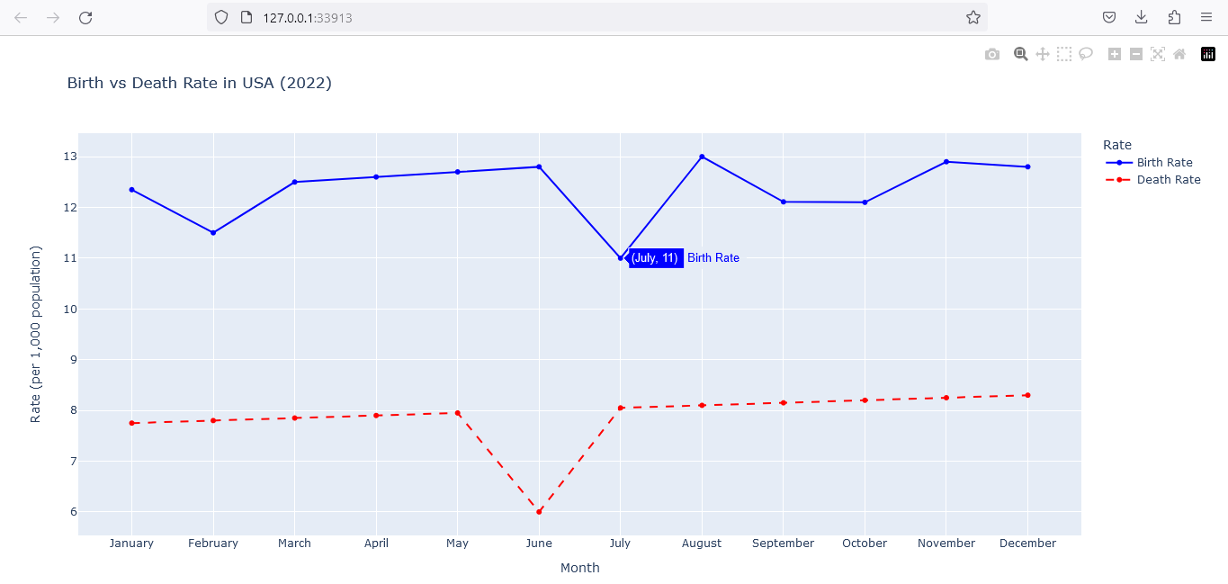
We can alter the plot by including the titles, legends, labels, and other elements. Plotly gives the users with various customizing choices to make their plots more aesthetically pleasing. With the help of this code, a line graph with two lines—one for the birth rate and one for the death rate—is generated. The month name is displayed on the x-axis, and the rate per 1,000 people is shown on the y-axis. The storyline can also be further customized by altering the line’s color, size, and style. We may also include a grid to make the plot easier to follow. An example on how to change the plot is provided here:
months_Array = ['January', 'February', 'March', 'April', 'May', 'June',
'July', 'August', 'September', 'October', 'November', 'December']
birth_rates_Array = [12.35, 11.5, 12.5, 12.6, 12.7, 12.8, 11, 13, 12.11, 12.10, 12.9, 12.8]
death_rates_Array = [7.75, 7.8, 7.85, 7.9, 7.95, 6, 8.05, 8.1, 8.15, 8.2, 8.25, 8.3]
fig_Obj = pgo.Figure()
fig_Obj.add_trace(go.Scatter(x=months_Array, y=birth_rates_Array, name='Birth Rate', line=dict(color='blue', width=2, dash='solid')))
fig_Obj.add_trace(go.Scatter(x=months_Array, y=death_rates_Array, name='Death Rate', line=dict(color='red', width=2, dash='dash')))
fig_Obj.update_layout(title='Birth vs Death Rate in USA (2022)', xaxis_title='Month',
yaxis_title='Rate (per 1,000 population)', legend_title='Rate', xaxis_showgrid=True, yaxis_showgrid=True)
fig_Obj.show()
Here is the output of the interactive and customized graph:
Export or Share the Plots or Charts
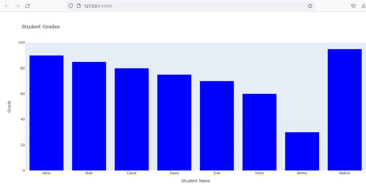
The Plotly plot can be shared online or exported as an image by the developer or end user. We may create a plot that shows the student data with grades and bar charts on grades using the Python Plotly library. The following code illustrates how to do this:
student_names_Name = ["Alice", "Bob", "Carol", "Dave", "Eve","Tomy","Jimmy","Babra"]
student_grades_Array = [90, 85, 80, 75, 70,60,30,95]
fib_Obj = go.Figure()
fib_Obj.add_trace(go.Bar(x=student_names_Name, y=student_grades_Array, name="Grades", marker_color='blue'))
fib_Obj.update_layout(title="Student Grades",
xaxis_title="Student Name", yaxis_title="Grade", legend_title="Grades")
fib_Obj.show()
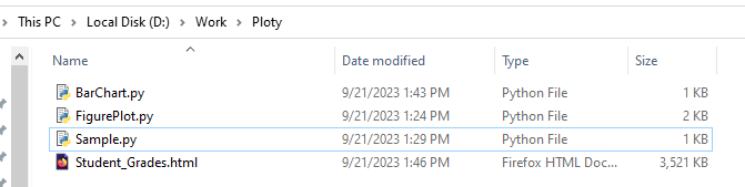
fib_Obj.write_html("Student_Grades.html")
fib_Obj.write_image("Student_Grades.png")
A bar chart with one bar for each student is generated with this code. Each bar’s height signifies the student’s grade. By altering the bar’s color (for example: red, blue, or green), size, and arrangement, we can change the plot. We might also include a legend to make it easier to differentiate between the several bars.
The developer may use the Plotly website or export the plot in an HTML format or file to share it online.
With the fib_Obj.write_html(“Student_Grades.html”) function, the Plotly fib_Obj figure is exported to an HTML file called “Student_Grades.html”. Then, the plot may be seen and interacted with by launching this HTML file in a web browser.
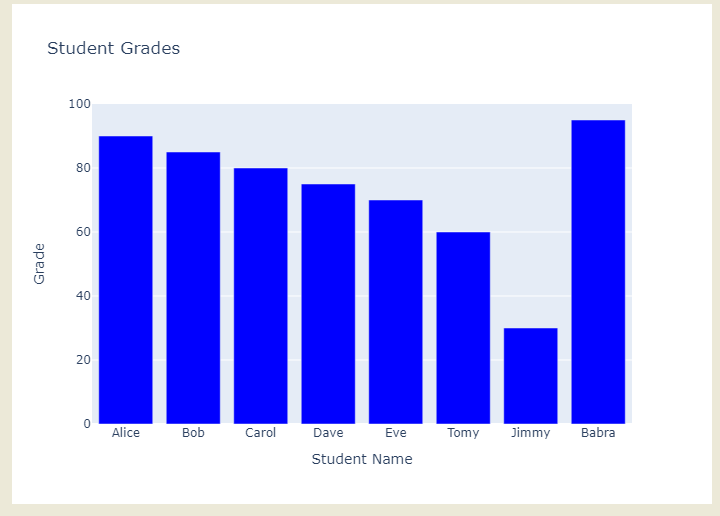
Use the write_image() method to export the plot as an image. How to achieve this is demonstrated in the following code:
![]()
The Kaleido package must be installed to export the plot in image format. Here is the command to use on the command shell:

Here is the picture that the code exported:
Interact with the Plot
We may pan, zoom, hover over the data points to get more details, and even export the particular plot views. This code generates three pie slices, one for each kind of fruit. The thickness of each slice is determined by how many of that fruit there are in total. The pie chart can be further customized by changing the values, labels, and coloring of the slices. We may also include a legend to make the identification between the various slices easier.
Here is a code for the pie chart:
pie_chart_slice_labels = ["Apples", "Oranges", "Bananas"]
pie_chart_slice_values = [10, 20, 30]
fig_Obj = go.Figure()
fig_Obj.add_trace(go.Pie(labels=pie_chart_slice_labels,
values=pie_chart_slice_values, name="Fruit %",
marker_colors=["red", "orange", "yellow"], hoverinfo="label+percent"))
fig_Obj.update_layout(title="Pie Chart for Fruits", legend_title="Fruit Type")
fig_Obj.show()
Here is the pie chart that displays the slices depending on the percentage of fruits:

A pie chart can be used in a variety of ways. Among the frequent interactions are:
- Hovering over slices: A slice’s label, value, and proportion of the total can all be seen via a tooltip that appears when the mouse is over it.
- Clicking on slices: Slices can be selected and highlighted in some other way by clicking on them. This can help narrow in on a certain slice or compare the slices.
- Dragging slices: Slices in some pie charts can be moved around to alter their size or placement. This can help to design the unique pie charts or investigate various data visualizations.
- Zooming in and out: Users can focus on certain pie slices or receive a general overview of the full pie chart by zooming in and out of the pie chart.
Several pie charts show the complex relationship among different parameters in addition to these fundamental interactions. For instance:
- Filtering slices: We can also use filters to show or hide the slices manually. This can be useful when we want to focus on a particular part of the data or when we are required to compare the different data subsets.
- Sorting slices: This is used to sort the slices by a label, a value, or a percentage based on the user. This can help organize the information so it’s understandable to the user.
- Drilling down into slices: In some pie charts, users can click on a particular slice to get more information about it. This can be helpful if the end-users want to look at the data closer.
Conclusion
For the data scientist, ML engineer, researcher, or business person who wants to make data visualizations that look great, Plotly is the perfect and handy tool. It’s a Python library that’s really versatile and can be used with some of the most popular libraries out there like NumPy, Pandas, Matplotlib, and more.