Bar plots are the most common, apart from line plots, types of plots anyone can create. They show the relationship between a numerical and a categorial value. Each relationship is then shown as a bar with the size height of the bar representing the actual value.
Due to this simplicity, bar plots are fairly easy to create and interpret. This makes them very useful for quick plots.
In this tutorial, we will explore how we can use the Plotly Express module to create bar plots.
Plotly.Expres.bar()
As you have probably guessed, to create bar plot in Plotly, we use the bar() function. The function syntax as shown below:
Don’t be intimidated by the massive parameter list. The function is very simple to use and you will only need to remember five of the above parameters.
The most useful function parameters that you will need to know include:
- Data_frame – specifies the columns used in the plot. You can pass a Pandas DataFrame, a dictionary, or an array_like object.
- x – specifies the values used position the marks along the x axis. You can specify this parameter as a column name with a DataFrame, a Pandas Series or a array_like object.
- y – similar to x but the values are used to position the marks along the y axis.
- color – specifies the values used to assign a unique color the marks.
The function will return the Bar Plot of the specified data as graph_objects.Figure type.
Let us explore how we can use the bar() function to create real bar plots.
Example 1 – Simple Bar Plot
Let us start with a simple bar plot as shown in the code below:
import pandas as pd
df = pd.DataFrame({
"OS": [ 'Android', 'Windows', 'iOS', 'OS X', 'Linux', 'Other'],
"Usage": [44.17,28.96,17.46,5.56,0.92,1.92]
})
fig = px.bar(df, x='OS', y='Usage')
fig.show()
In the example code above, we start by importing the plotly express pandas packages.
We then create a DataFrame and pass the values we wish to plot.
Finally, using the bar() function, we create a bar plot of the OS popularity. The resulting figure is shown:
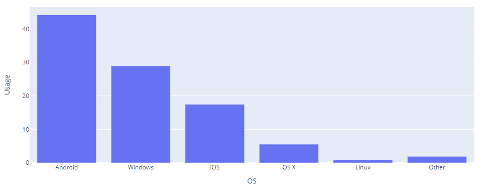
Notice that each row represents the data of OS. Therefore, each bar represents each browser.
Example 2
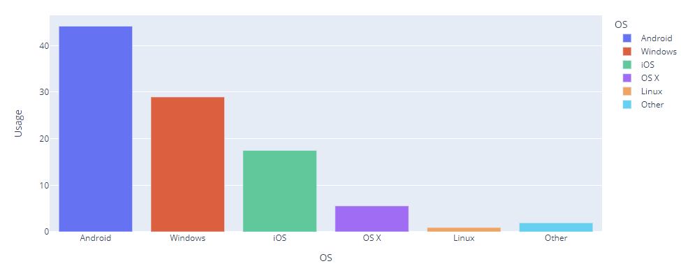
For better visibility, we can tell Plotly to assign a unique color for each OS as shown below:
import pandas as pd
df = pd.DataFrame({
"OS": [ 'Android', 'Windows', 'iOS', 'OS X', 'Linux', 'Other'],
"Usage": [44.17,28.96,17.46,5.56,0.92,1.92]
})
fig = px.bar(df, x='OS', y='Usage', color='OS')
fig.show()
The example above sets the color parameter as the OS column in the DataFrame. This should result in a figure as shown:
Example – Horizontal Bar Plot
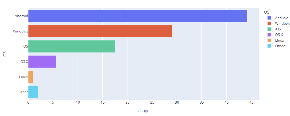
We can create a horizontal bar plot by switching the columns for x and y axis. An example is as shown:
import pandas as pd
df = pd.DataFrame({
"OS": [ 'Android', 'Windows', 'iOS', 'OS X', 'Linux', 'Other'],
"Usage": [44.17,28.96,17.46,5.56,0.92,1.92]
})
fig = px.bar(df, x='Usage', y='OS', color='OS')
fig.show()
The code above should result in a horizontal bar plot as shown:
Example 4 – Bar Plots with Text
If you wish to set the values inside the bars, you can use the text_auto parameter and set it to True as shown:
import pandas as pd
df = pd.DataFrame({
"OS": [ 'Android', 'Windows', 'iOS', 'OS X', 'Linux', 'Other'],
"Usage": [44.17,28.96,17.46,5.56,0.92,1.92]
})
fig = px.bar(df, x='Usage', y='OS', color='OS', text_auto=True)
fig.show()
The resulting figure is as shown:
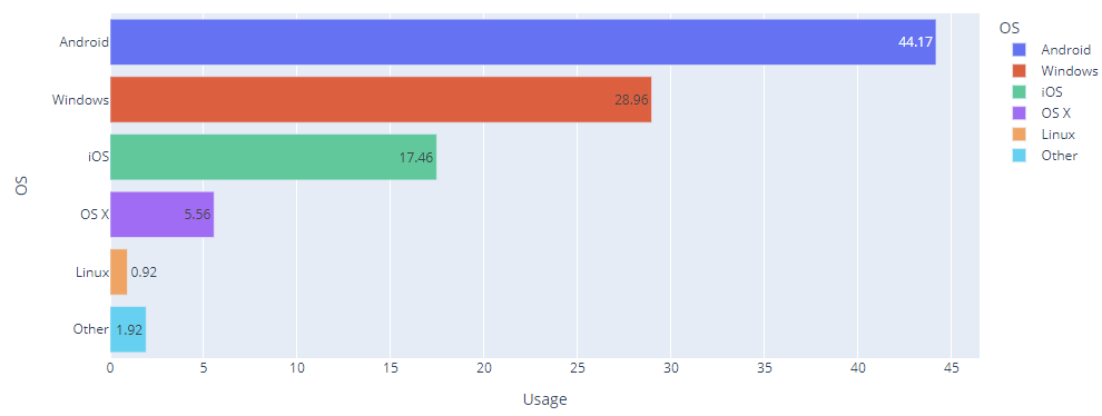
Here, we can see the actual values inside the bars.
Closing
In this article, we explored the fundamentals of working with Bar plots in Plotly.