Basic Scatter Plot With graph_objects
We can create a simple scatter plot by specifying the values of the x and y parameters in the scatter class.
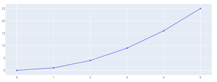
An illustration is as shown:
fig = go.Figure(data=go.Scatter(
x=[0,1,2,3,4,5],
y=[0,1,4,9,16,25]
))
fig.show()
By default, Plotly will create a scatter plot with the markers connected with lines. An example figure is shown below:
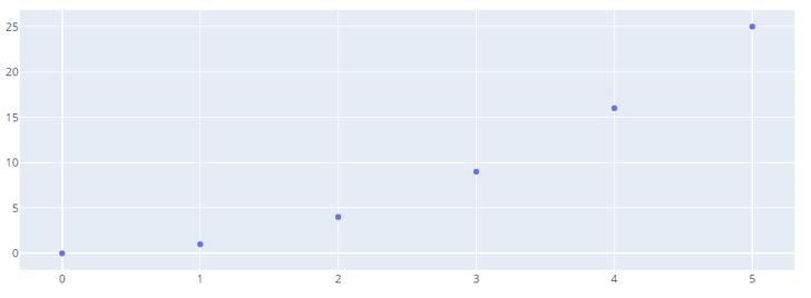
To display the markers, we can use the mode parameters as shown in the code below:
fig = go.Figure(data=go.Scatter(
x=[0,1,2,3,4,5],
y=[0,1,4,9,16,25],
mode="markers"
))
fig.show()
Output:
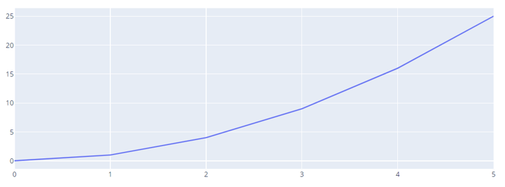
You can also specify the scatter plot to display as lines by setting the mode to lines as shown:
fig = go.Figure(data=go.Scatter(
x=[0,1,2,3,4,5],
y=[0,1,4,9,16,25],
mode="lines"
))
fig.show()
Resulting output:
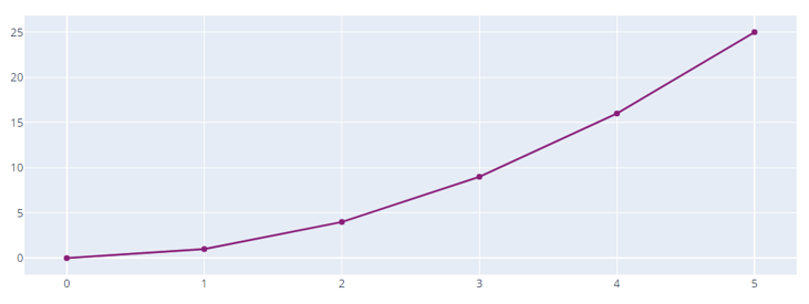
Setting Marker Color
We can set a custom color for the markers by specifying the marker_color parameter and the color as an rgb value.
For example:
fig = go.Figure(data=go.Scatter(
x=[0,1,2,3,4,5],
y=[0,1,4,9,16,25],
mode="markers+lines",
marker_color='rgb(152, 0, 123)'
))
fig.show()
Resulting figure:
You can also specify the color as an RGBA value.
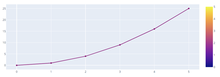
Show Colorscale
We can also set the colorscale parameter to True allow Plotly to include the colorscale with the scatter plot.
fig = go.Figure(data=go.Scatter(
x=[0,1,2,3,4,5],
y=[0,1,4,9,16,25],
mode="markers+lines",
marker = dict(
colorscale='Plasma',
showscale=True
),
marker_color='rgb(152, 0, 123)',
))
fig.show()
Output:
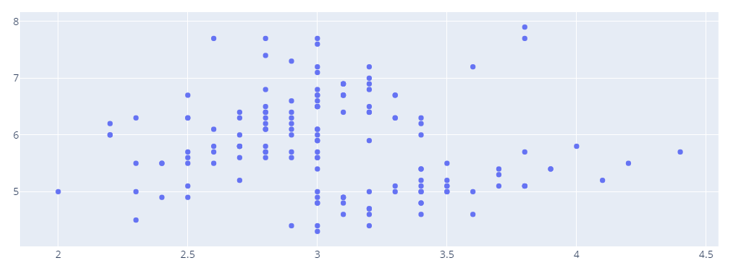
Scatter Plot From a Dataset
We can also create a scatter plot using graph_objects from a dataset. For example, the code below creates a scatter plot from the iris() dataset.
import plotly.express as px
df = px.data.iris()
fig = go.Figure(data=go.Scatter(
x=df['sepal_width'],
y=df['sepal_length'],
mode='markers'
))
fig.show()
The resulting scatter plot is as shown:
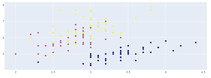
To set a color for the markers as a column within the DataFrame, we can run:
x=df['sepal_width'],
y=df['sepal_length'],
mode='markers',
marker_color=df['species_id']
))
Keep in mind that the color should correspond to a numerical value that can be an interpreter of a specific color.
Result:
Conclusion
In this article, we explored the ways of creating scatter plots using the Scatter class from plotly graph_objects.