In this article, we will focus on learning how to create the pie chart plots using Plotly graph_objects module.
Basic Chart Using go.Pie
The Pie class from Plotly graph_objects allows us to create a pie chart with low-level control and customization options compared to the high-level Plotly express module.
We can create a basic Pie chart using the Plotly graph_objects by specifying the labels and their corresponding values.
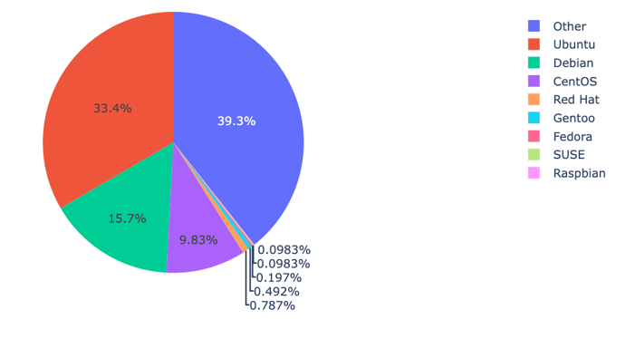
Take the following code that shows the usage of various Linux distros as a pie chart.
distros = ['Ubuntu', 'Debian', 'CentOS', 'Red Hat', 'Gentoo', 'Fedora', 'SUSE', 'Raspbian', 'Other']
usage = [34, 16, 10, .8, .5, .2, .1, .1, 40]
fig = go.Figure(data=go.Pie(
labels=distros,
values=usage
))
fig.show()
The previous code creates a pie chart representing the usage as sectors in a circular chart.
The resulting output is as shown in the following illustration:
Setting the Custom Colors
As mentioned, Plotly graph_objects module provides with much low-level controls on how to customize various plots.
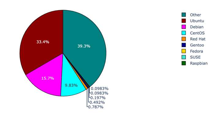
Hence, we can create a unique color for each sector using the update_traces() function and a list of colors for each sector. An example code is as shown in the following illustration:
colors = ['darkred', 'magenta', 'cyan', 'darkorange', 'darkblue', 'gold', 'turquoise', 'darkgreen', 'teal']
distros = ['Ubuntu', 'Debian', 'CentOS', 'Red Hat', 'Gentoo', 'Fedora', 'SUSE', 'Raspbian', 'Other']
usage = [34, 16, 10, .8, .5, .2, .1, .1, 40]
fig = go.Figure(data=go.Pie(
labels=distros,
values=usage
))
fig.update_traces(marker=dict(
colors=colors, line=dict(
color='black',
width=1
)))
fig.show()
The previous code set each sector with the colors as they are specified in the list. We also customize the line that separate each sector by setting the line property.
The resulting figure is as shown in the following illustration:
Showing the Text Inside Pie Sectors
We can also display the percentage and the labels of the data inside the pie sectors using the textinfo parameter of the Pie class.
An example is as shown in the following illustration:
distros = ['Ubuntu', 'Debian', 'CentOS', 'Red Hat', 'Gentoo', 'Fedora', 'SUSE', 'Raspbian', 'Other']
usage = [34, 16, 10, .8, .5, .2, .1, .1, 40]
fig = go.Figure(data=[go.Pie(
labels=distros,
values=usage,
textinfo='label+percent',
insidetextorientation='radial')])
fig.show()
The previous code allows the figure to show the labels inside the sectors using the textinfo parameter. To set the text orientation inside the sectors, you can use the insidetextorientation parameter.
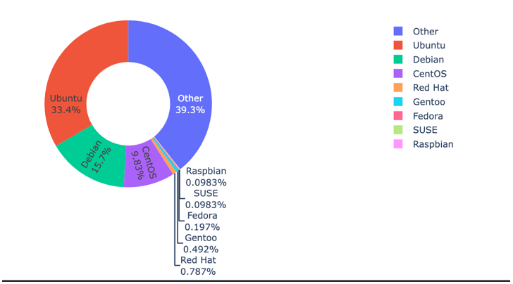
Creating Donut Pie with Plotly Graph_Objects
You can also create a donut-shaped pie chart by specifying the hole parameter. An example is as shown in the following illustration:
distros = ['Ubuntu', 'Debian', 'CentOS', 'Red Hat', 'Gentoo', 'Fedora', 'SUSE', 'Raspbian', 'Other']
usage = [34, 16, 10, .8, .5, .2, .1, .1, 40]
fig = go.Figure(data=[go.Pie(
labels=distros,
values=usage,
textinfo='label+percent',
hole=.5,
insidetextorientation='radial'),])
fig.show()
Output Figure:
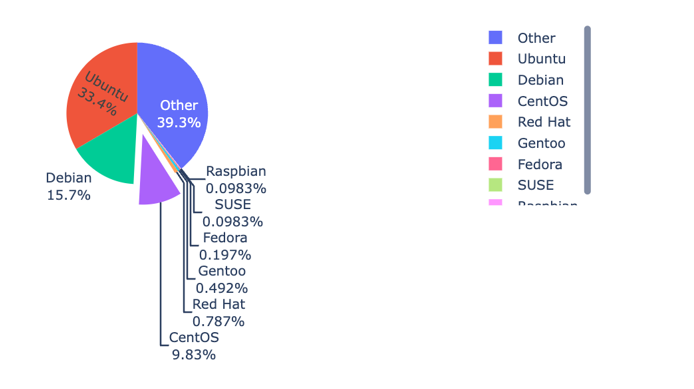
Pulling the Sector from the Center
If you wish to create a sector that is pulled from the center of the plot, you can specify the pull parameter as shown in the following code:
distros = ['Ubuntu', 'Debian', 'CentOS', 'Red Hat', 'Gentoo', 'Fedora', 'SUSE', 'Raspbian', 'Other']
usage = [34, 16, 10, .8, .5, .2, .1, .1, 40]
fig = go.Figure(data=[go.Pie(
labels=distros,
values=usage,
textinfo='label+percent',
# hole=.5,
pull=[0, 0, .3, 0],
insidetextorientation='radial'),])
fig.show()
The code pulls the specified sector outward. The pull parameter is specified as a fraction of the pie radius.
An example output is as shown in the following illustration:
Conclusion
In this article, we explored how to use the Plotly graph_objects module to create various types of Pie charts. Feel free to explore the docs for more.
Thanks for reading. Happy coding!