Graph objects provides us with low-level control and customization of the figures you can create in Plotly. However, it has a higher learning curve that Plotly express. Therefore, if you are looking for a quick and easy method to create funnel charts, check our tutorial on Plotly.express.funnel.
Basic Funnel Chart in Plotly Graph Objects
The following code illustrates how to create a basic funnel chart using the Plotly graph_objects module:
fig = go.Figure(data=go.Funnel(
x= [23.45, 16.66, 14.22, 12.44, 8.11],
y = ['development', 'database integration', 'testing_deployment', 'refactor', 'production']
))
fig.show()
The given code creates a simple funnel plot as shown in the following:
You can also create a stacked funnel plot using the graph_objects as shown in the following sample code:
fig = go.Figure()
fig.add_trace(go.Funnel(
name='AWS',
x= [23.45, 16.66, 14.22, 12.44, 8.11],
y = ['development', 'database integration', 'testing_deployment', 'refactor', 'production']
))
fig.add_trace(go.Funnel(
name='GCP',
x= [20.45, 15.66, 13.22, 10.44, 5.11],
y = ['development', 'database integration', 'testing_deployment', 'refactor', 'production']
))
fig.show()
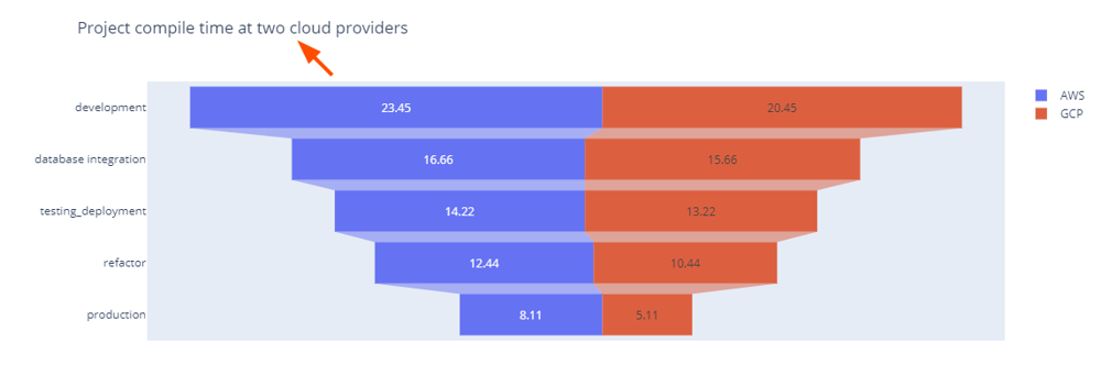
The previous code creates the stacked funnel plots indicating the compile time at various stages of a project in AWS and GCP cloud providers.
NOTE: The previous data is purely hypothetical and created purposely for this article.
The resulting figure is as shown in the following:
To add a title to the figure, we can use the update_layout function as shown in the following:
fig.show()
Output Figure:
Conclusion
In this article, we discussed the fundamentals of creating the funnel plots using the Plotly graph_objects module. Check the docs for details.


