Syntax and Parameter List
The function syntax and parameter list are as follows:
Parameters:
- arg – defines a dictionary with the properties compatible with the constructor
- x – sets the x coordinate
- y – sets the y coordinate
- z – represents the values used for the z coordinate
- colorbar – sets the dictionary with properties for customizing the figure colorbar
Basic Contour Plot With Plotly graph_objects
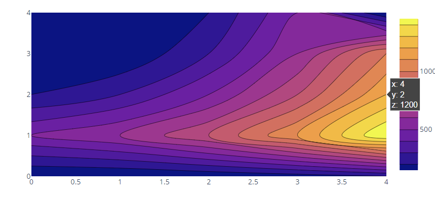
The following code illustrates creating a basic contour plot using the Plotly graph_objects module and contour class:
fig = go.Figure(data =
go.Contour(
z=[[100, 100.5, 120.5, 150.5, 200],
[500, 600, 800, 1100, 1500],
[200, 300, 500., 800, 1200],
[100, 100, 300, 600, 1000],
[100, 100, 200, 500, 100]]
))
fig.show()
The previous code should return a contour figure as follows:
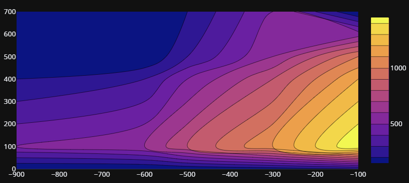
Setting the Horizontal and Vertical Axis
You can specify the values for the horizontal and vertical axis by setting the x and y coordinates.
An example is shown in the following table:
fig = go.Figure(data =
go.Contour(
z=[[100, 100.5, 120.5, 150.5, 200],
[500, 600, 800, 1100, 1500],
[200, 300, 500., 800, 1200],
[100, 100, 300, 600, 1000],
[100, 100, 200, 500, 100]],
x=[-900, -600, -500, -300, -100],
y=[0,100,400,500,700]
))
fig.show()
X values are placed on the horizontal axis while y values are set on the vertical axis as shown in the following figure:
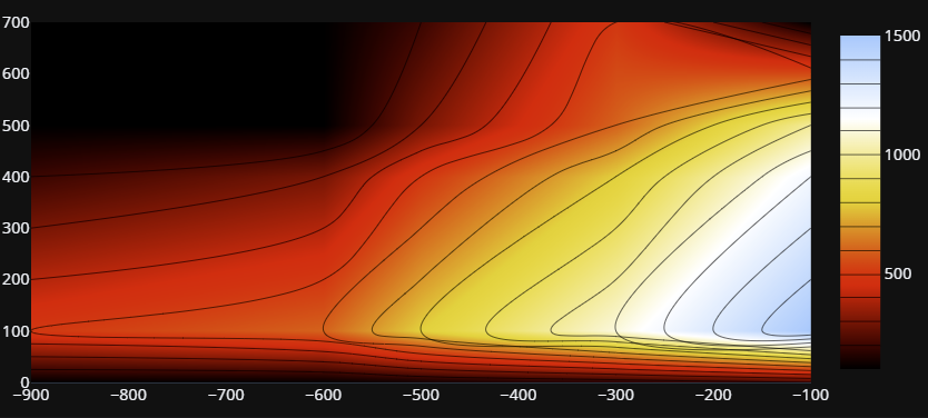
Specifying Colorscale
You can set a custom colorscale by setting the colorscale parameter. For example, the code following sets the colorscale to “Blackbody”:
importplotly.express as px
fig = go.Figure(data =
go.Contour(
z=[[100, 100.5, 120.5, 150.5, 200],
[500, 600, 800, 1100, 1500],
[200, 300, 500., 800, 1200],
[100, 100, 300, 600, 1000],
[100, 100, 200, 500, 100]],
x=[-900, -600, -500, -300, -100],
y=[0,100,400,500,700],
colorscale=px.colors.sequential.Blackbody
))
fig.show()
The output is shown in the following image:

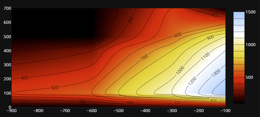
Smooth Contour Coloring
To get a smooth gradient color for the contour lines, you can use the contours_coloring parameter as follows:
importplotly.express as px
fig = go.Figure(data =
go.Contour(
z=[[100, 100.5, 120.5, 150.5, 200],
[500, 600, 800, 1100, 1500],
[200, 300, 500., 800, 1200],
[100, 100, 300, 600, 1000],
[100, 100, 200, 500, 100]],
x=[-900, -600, -500, -300, -100],
y=[0,100,400,500,700],
colorscale=px.colors.sequential.Blackbody,
contours_coloring='heatmap'
))
fig.show()
The resulting figure is shown in the following figure:
Setting Contour Line Labels
To add labels to the contour lines, we can use the “showlabels” parameter as shown in the following code:
importplotly.express as px
fig = go.Figure(data =
go.Contour(
z=[[100, 100.5, 120.5, 150.5, 200],
[500, 600, 800, 1100, 1500],
[200, 300, 500., 800, 1200],
[100, 100, 300, 600, 1000],
[100, 100, 200, 500, 100]],
x=[-900, -600, -500, -300, -100],
y=[0,100,400,500,700],
colorscale=px.colors.sequential.Blackbody,
contours_coloring='heatmap',
contours = dict(
showlabels=True
)
))
fig.show()
The resulting figure is shown in the following image:
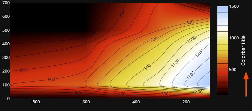
Setting Colorbar Title
You can also add a title to the colorbar using the title parameter shown in the following table:
go.Contour(
z=[[100, 100.5, 120.5, 150.5, 200],
[500, 600, 800, 1100, 1500],
[200, 300, 500., 800, 1200],
[100, 100, 300, 600, 1000],
[100, 100, 200, 500, 100]],
x=[-900, -600, -500, -300, -100],
y=[0,100,400,500,700],
colorscale=px.colors.sequential.Blackbody,
contours_coloring='heatmap',
contours = dict(
showlabels=True
),
colorbar = dict(
title="Colorbar title",
titleside='right'
)
Output:
Conclusion
This article explored various techniques for creating contour plots using Plotly graph_objects. We discussed setting the horizontal and vertical axis, specifying colorscale, setting contour line labels, and setting the colorbar title. Feel free to check other articles from Linux Hint for more.