You can then click each rectangle sector to display the nested information inside it. Therefore, it is a great tool when you have a large hierarchy.
For this tutorial, we will explore how we can utilize the functionality of Plotly Express module to create the Treemaps.
If you are ready, let’s dive in.
Plotly.Express.Treemap()
As you probably guessed, to create a treemap in Plotly, we will use the treemap() function from the Express module.
The function syntax is as shown in the following:
The function has a relatively simple syntax. The most important parameters we need to know include:
- Data_frame – Specifies the data_frame holding the column names for the plot. You can pass this value as a DataFrame, a dictionary or an array_like object.
- names – This parameter defines the values used as the labels for the sectors.
- values – Refers to the values associated with the sectors.
- parents – Defines the values used as parents.
- ids – Specifies the values used to set the IDs of the sectors.
- path – Defines the values used for the hierarchy of the sectors.
- color – Defines the values used to assign a unique color to the marks.
Example 1:
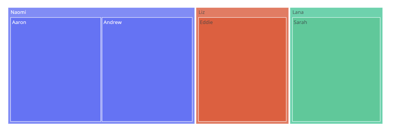
Let us create a treemap using the Plotly express. We start by defining a list of names. We then define the parents of each parent in another list. We can then create a treemap of the family.
names = ["Naomi", "Aaron", "Andrew", "Eddie", "Sarah", "Liz", "Lana"]
parents = ["", "Naomi", "Naomi", "Liz", "Lana", "", ""]
fig = px.treemap(names=names, parents=parents)
fig.show()
Once we run the code above, we see a treemap as shown in the following:
Example 2:
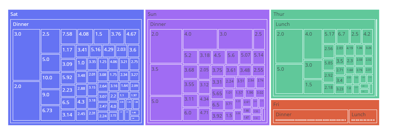
We can create the hierarchical treemap by specifying the different levels of hierarchy as a list of columns.
We can use the tips() data to illustrate this:
fig = px.treemap(df, path=['day', 'time', 'tip'], values='total_bill', color='day')
fig.show()
The resulting figure is as follows:
And that’s it.


