Let us explore how we can create a scatter matrix with Plotly express.”
Function Syntax and Parameter List
The function takes on syntax as expressed below:
size=None, hover_name=None, hover_data=None, custom_data=None, text=None,
facet_row=None, facet_col=None, facet_col_wrap=0, facet_row_spacing=None,
facet_col_spacing=None, error_x=None, error_x_minus=None, error_y=None,
error_y_minus=None, animation_frame=None, animation_group=None,
category_orders=None, labels=None, orientation=None, color_discrete_sequence=None,
color_discrete_map=None, color_continuous_scale=None, range_color=None,
color_continuous_midpoint=None, symbol_sequence=None, symbol_map=None,
opacity=None, size_max=None, marginal_x=None, marginal_y=None, trendline=None,
trendline_options=None, trendline_color_override=None, trendline_scope='trace',
log_x=False, log_y=False, range_x=None, range_y=None, render_mode='auto',
title=None, template=None, width=None, height=None)
The following outlines the list of most important function parameters you will need to know:
- data_frame – specifies the data frame containing the columns used in the plot.
- x – specifies the values used to position the marks along the x-axis in the cartesian plane.
- y – specifies the values used to position the marks along the y axis.
- color – sets the values used to assign a unique color to the marks of the plot.
- symbol – defines the values used to assign a symbol to the marks.
Example
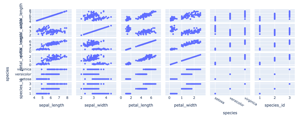
The following code creates a basic scatter matrix plot:
df = px.data.iris()
fig = px.scatter_matrix(df)
fig.show()
The code above should return a figure as shown:
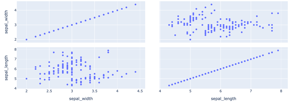
To specify the columns, you wish to plot; you can use the dimensions parameter:
df = px.data.iris()
fig = px.scatter_matrix(df, dimensions=['sepal_width', 'sepal_length'])
fig.show()
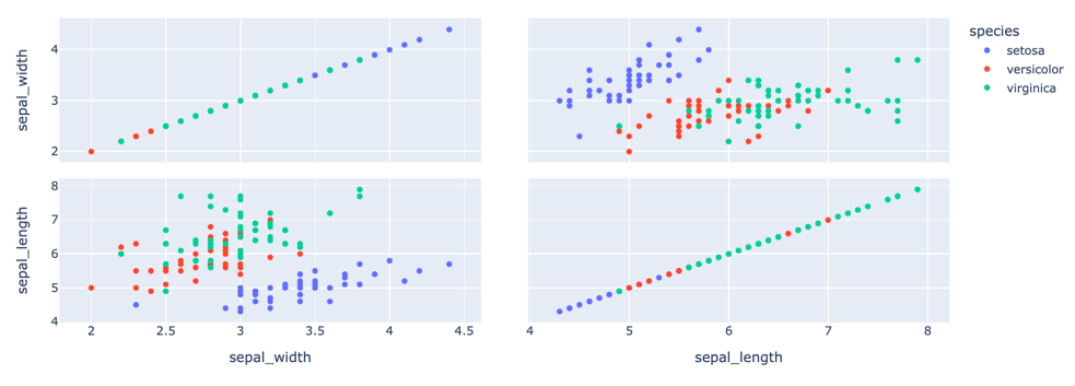
To assign a color to the scatter marks, you can specify the column to the color parameter as:
from pyparsing import col
df = px.data.iris()
fig = px.scatter_matrix(df, dimensions=['sepal_width', 'sepal_length'], color='species')
fig.show()
The resulting figure is as shown:
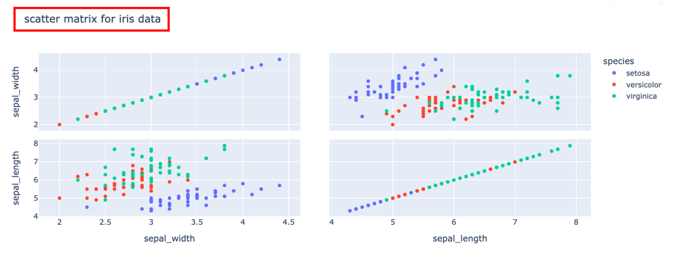
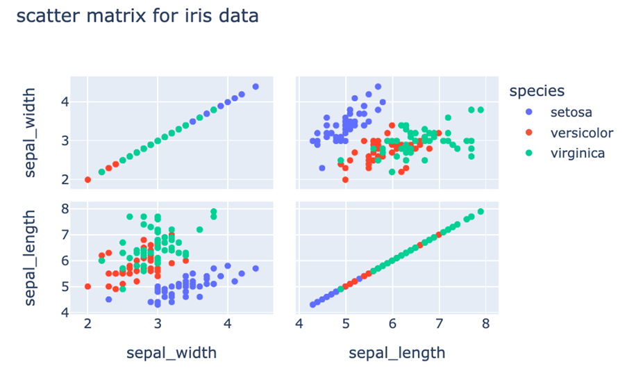
To set the title for your scatter matrix plot, you can use the title parameter:
from pyparsing import col
df = px.data.iris()
fig = px.scatter_matrix(df, dimensions=['sepal_width', 'sepal_length'], color='species', title='scatter matrix for iris data')
fig.show()
Output:
To set the width and height of your figure, use their respective parameters and set the desired dimensions in pixels.
from pyparsing import col
df = px.data.iris()
fig = px.scatter_matrix(df, dimensions=['sepal_width', 'sepal_length'], color='species', title='scatter matrix for iris data', width=600, height=400)
fig.show()
Output:
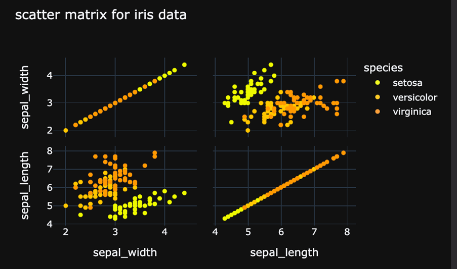
You can also set a discrete color as shown in the code below:
from pyparsing import col
df = px.data.iris()
fig = px.scatter_matrix(df, dimensions=['sepal_width', 'sepal_length'], color='species', title='scatter matrix for iris data', width=600, height=400, color_discrete_sequence=px.colors.sequential.Plasma_r, template='plotly_dark')
fig.show()
Output:
Conclusion
This article covers the various methods and techniques for creating scatter matrix plots using Plotly Express Module.
Happy coding!!