Let’s dive in.
Scatter Plots with Plotly.Express.Scatter()
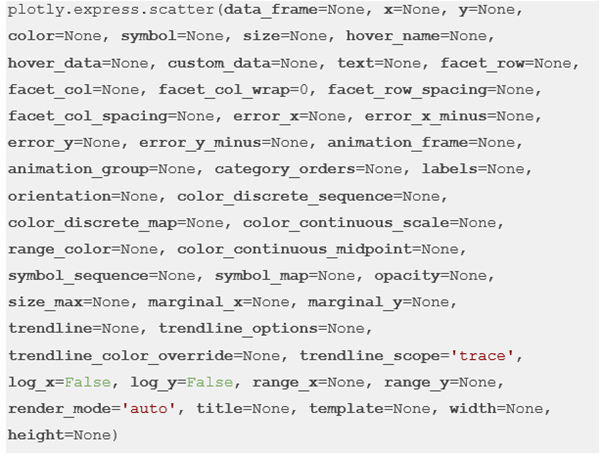
Before we explore how to create the scatter plots, let us look at the syntax of the function and the parameters we require.
The function syntax can be expressed as shown in the following:
Despite the massive parameter list, the function is very easy to use and requires only a handful of parameters.
The list of the most important parameters that you use is as follows:
- Data_frame – This parameter specifies the data frame or array-like object which is used as the column names.
- X – Specifies either a name of a column in the data frame or a Pandas series. From this, the column or array_like are used to position the marks along the x axis in Cartesian coordinates.
- Y – Specifies either a name of a column in the data frame or a Pandas series. From this, the column or array_like are used to position the marks along the y axis in Cartesian coordinates.
- Color – Species the color to the marks in the plot.
- Symbol – Specifies the symbols to the marks.
The function is the scatter plot figure of typye graph_objects.Figure.
Example 1: Simple Scatter Plot with Plotly Express
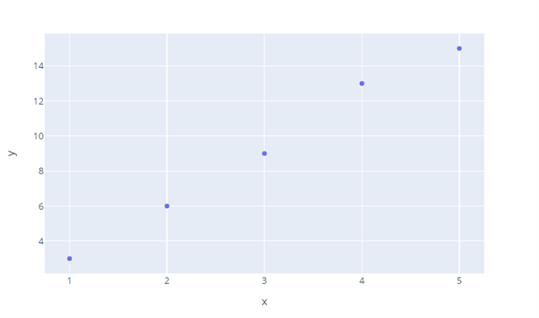
Let us now discuss how we can create a simple scatter plot with Plotly express. Consider the following code:
fig = px.scatter(x=[1,2,3,4,5], y=[3, 6, 9, 13, 15])
fig.show()
In the given example, we start by importing the Plotly express module as px. We then create a scatter plot using the px.scatter() function and pass the x and y values as array_like objects.
The following code returns a figure as shown in the following:
Example 2: Scatter Plot with x and y as DataFrames
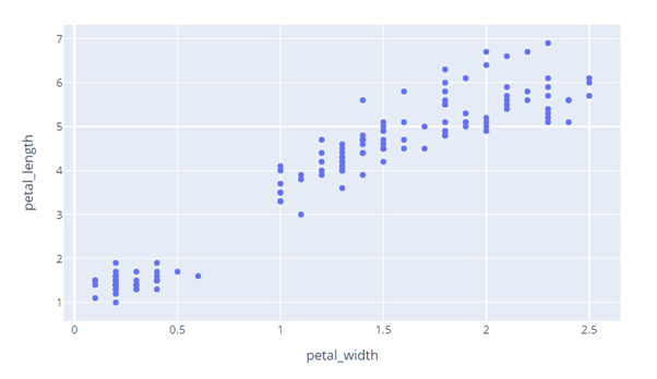
We can also create a scatter plot where x and y are the DataFrames. In this example, we use the iris data from Plotly. Iris is a Pandas DataFrame which is perfect for our use case.
The code is as follows:
df = px.data.iris()
fig = px.scatter(df, x='petal_width', y='petal_length')
fig.show()
The given code returns the data as shown in the following:
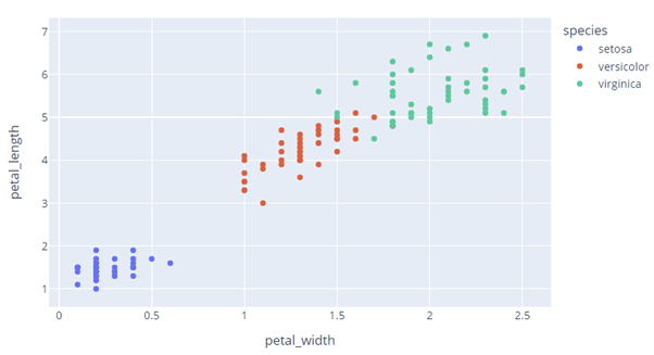
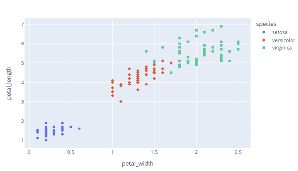
We can also set the color using the existing columns as shown in the following code:
df = px.data.iris()
fig = px.scatter(df, x='petal_width', y='petal_length', color='species')
fig.show()
Here, we set the color parameter “species” column. The resulting figure is as follows:
We can also set the symbol parameter to a column within the DataFrame as shown in the following:
The code returns a scatter plot as shown in the following:
And that’s it.
Conclusion
For this one, we explored how we can create the scatter plots using the plotly.express module.
Happy coding!