For this one, we will learn how we can create Pie plots using the Plotly Express module.
Plotly.express.pie()
To create a pie chart in Plotly, we use the pie() function. The function syntax is expressed as below:
Despite the massive parameter list, the pie function is very simple. The following are the most essential parameters you need to know.
- Data_frame – specifies the columns names for the plot. If you pass the values as a dictionary or array_like object, they are internally converted to a Pandas DataFrame.
- Names – species the values used as labels for the sectors of the pie chart.
- Values – specifies the values used as the values associated with the sectors of the plot.
- Color – defines the values used to assign unique colors to the marks of the plot.
- Title – sets the title for the figure.
- Width/height – specifies the width and height of the plot in pixels.
Example 1 – Simple Pie
We can construct a simple pie chart using the pie() function as depicted in the code below:
browser = ['Chrome', 'Safari', 'Edge MS', 'Firefox', 'Samsung Browser', 'Opera']
percentage_usage = [65.87, 18.61, 4.13, 3.26, 2.87, 2.11]
fig = px.pie(labels=browser, values=percentage_usage)
fig.show()
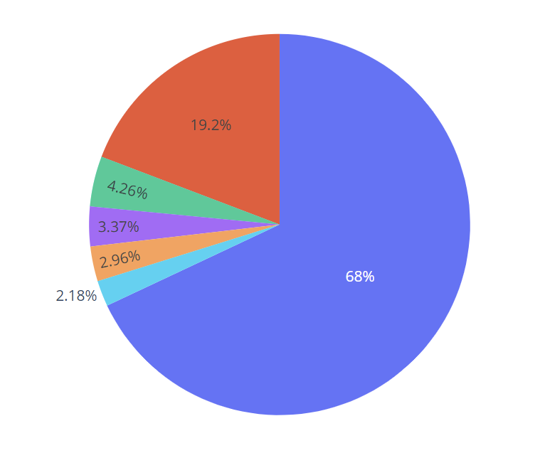
In the example above, we have data showing the browser market share as of 2022. We can then create a pie chart based on this data using the pie() function.
We pass the labels as the name of the browsers and the values as the percentage usage.
Running the code above should return the figure:
Example 2
We can improve the quality of the pie above by setting the names of the values. This will allow us to determine which sector represent which value. An example code is as shown:
browser = ['Chrome', 'Safari', 'Edge MS', 'Firefox', 'Samsung Browser', 'Opera']
percentage_usage = [65.87, 18.61, 4.13, 3.26, 2.87, 2.11]
fig = px.pie(labels=browser, values=percentage_usage, names=browser)
fig.show()
The code above should return the figure as shown:
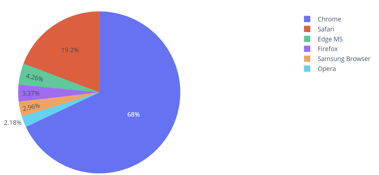
In this case, we can easily interpret which sector (color) represent which value.
Example 3
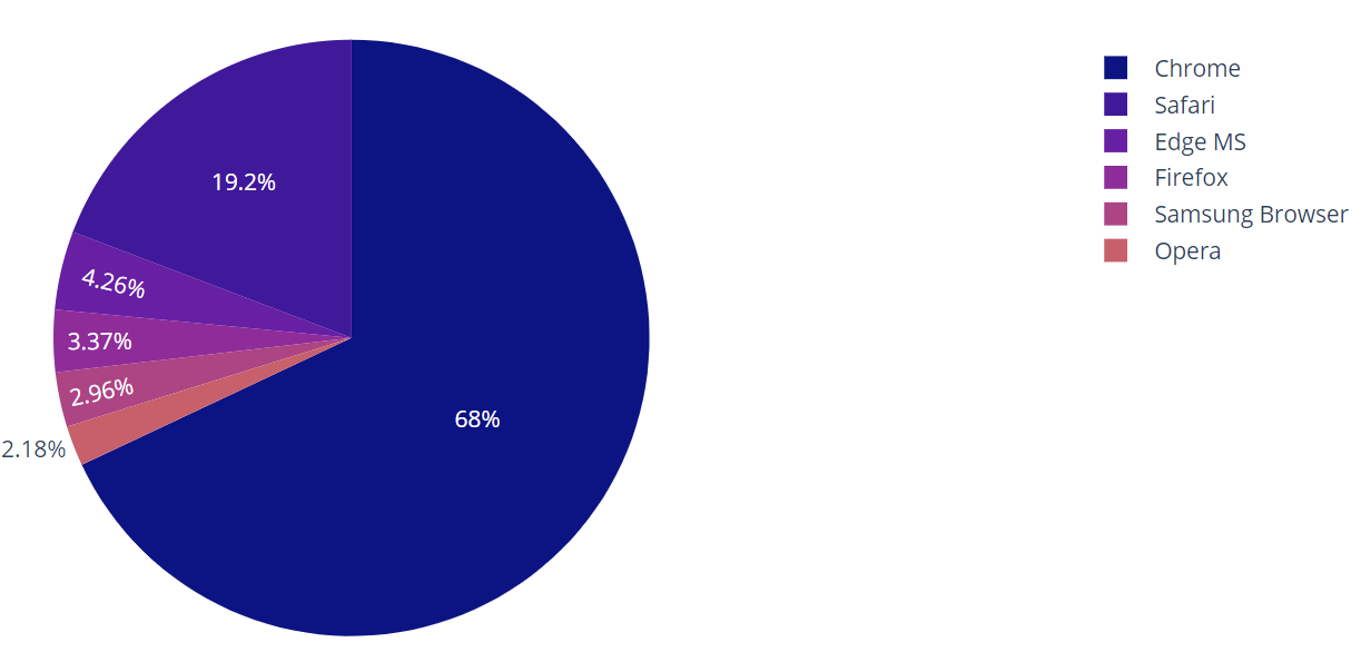
Plotly also allows setting the color of pie sectiors using the px.colors object. For example:
In this example, we customize the colors of the pie chart by setting the color_discrete_sequence parameter as px.colors.sequential.Plasma. This one of the built-in discrete colors in Plotly.
The resulting figure is as shown:
You can view the available color values by running:
fig.show()
Running the code above should show a color swatch with the available colors and their respective names.

Example 4
Using the title parameter, we can assign a title to the plot as shown:
fig.show()
The above code should return a figure:
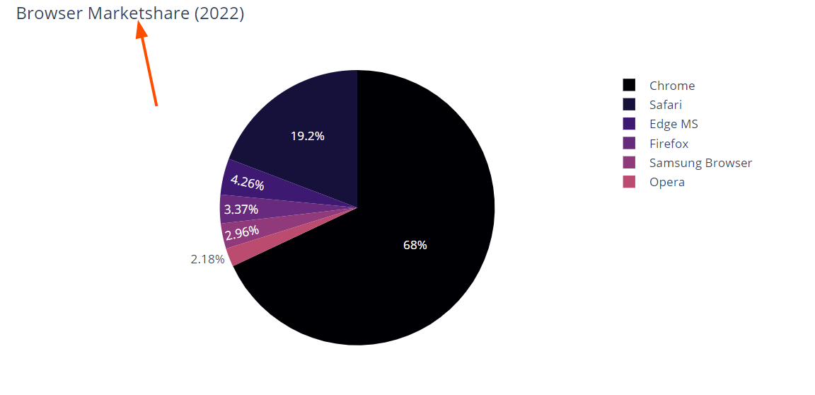
We can see the figure contains the title as specified.
Closing
In this guide, you learned how to create and customize Pie charts using Plotly Express module.