In this tutorial, we will show you how you can create geographical lines using the Plotly Express module.
Geographical Lines Using Plotly Express
In Plotly, we can use the line_geo() function from the express module. The function syntax is shown below:
Below is a list of the most useful parameters you need to know when working with the line_geo() function:
- Data_frame – specifies the DataFrame containing the list of columns to be used in the plot.
- lat – specifies the column name whose values are used to position the marks according to latitude on the map.
- Lon – specifies the position of the marks on the longitude on the map.
- Locations – specifies the column whose values are interpreted according to the location mode and mapped to the lat/lon parameters.
- Locationmode – specifies the set of locations.
Example
Let us illustrate how to create geographical lines using the line_geo() function. Take the code sample provided below:
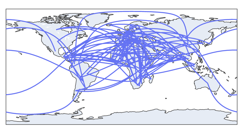
df = px.data.gapminder().query("year==2007")
fig = px.line_geo(df, locations='iso_alpha')
fig.show()
In the example above, we start by importing the Plotly Express module. We then import the gapminder data and query the 2007 dataset.
We then plot line maps using the line_geo() function with the specified dataset. This should return a figure as shown below:
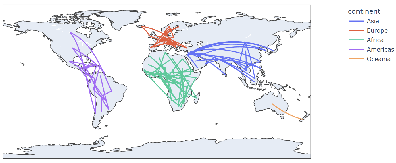
To add unique color to the marks on the map, we can use the color parameter as shown in the example code below:
df = px.data.gapminder().query(“year==2007”)
fig = px.line_geo(df, locations=’iso_alpha’, color=’continent’)
fig.show()
In this case, the code above will return line maps with unique colors for each continent.
An example resulting figure is shown below:
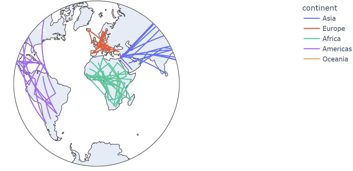
Plotly also allows you to specify the projection of the map using the projection parameter.
For example, to display the map in a stereographic projection, we can run the following code:
df = px.data.gapminder().query("year==2007")
fig = px.line_geo(df, locations='iso_alpha', color='continent', projection='stereographic')
fig.show()
The resulting figure, as shown below:
To specify the custom width and height of the figure, we can use the width and height parameters as shown in the following example:
df = px.data.gapminder().query("year==2007")
fig = px.line_geo(df, locations='iso_alpha', color='continent', projection='stereographic', width=1200, height=600)
fig.show()
Resulting figure:
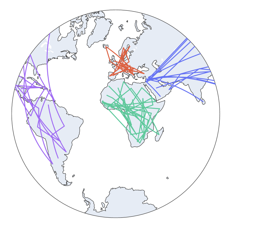
Keep in mind that the previous diagram does not represent the actual dimensions.
Conclusion
In this article, we explored how we can create geographical lines on a map using the Plotly Express module and the line_geo() function.