Polar charts are types of plots that visualize data along a radial and angular axis. Using plotly express, you can represent polar data as lines using the line_polar() function.
Function Syntax and Parameter
The function syntax and parameter list are as shown:
The following are some of the important function parameters you will need to know:
- data_frame – specifies the data_frame containing the column names used in the plot.
- r – sets the values used to position the marks along the radial axis in the polar coordinate.
- theta – sets the values used to position the marks along the angular axis on the polar coordinate.
- color – specifies the values used to assign a unique color to the marks.
- line_dash – specifies the values used to assign dash patterns to the lines.
- start_angle – sets the start angle for the angular axis.
- line_shape – specifies the line shape either linear or spline.
- title – sets the title for the figure.
- width/height – defines the width and height of the figure in pixels.
Example
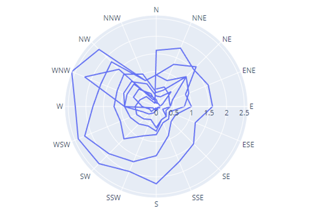
The example below illustrates how to create a line polar plot.
df = px.data.wind()
fig = px.line_polar(df, r='frequency', theta='direction')
fig.show()
The code above should return a figure as shown:
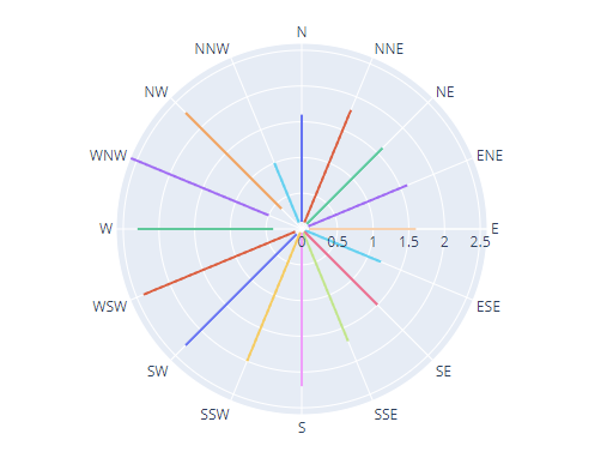
You can also specify the color of the lines by setting the color parameter to a column within the DataFrame.
df = px.data.wind()
fig = px.line_polar(df, r='frequency', theta='direction', color='direction')
fig.show()
The code above should assign a unique color to the lines based on the wind direction. The resulting figure is shown below:
To change the background and color sequence of the plot, you can use the color_discrete_sequence parameter as shown in the code below:
df = px.data.wind()
fig = px.line_polar(df, r='frequency', theta='direction', color='direction', color_discrete_sequence=px.colors.sequential.Blackbody_r)
fig.show()
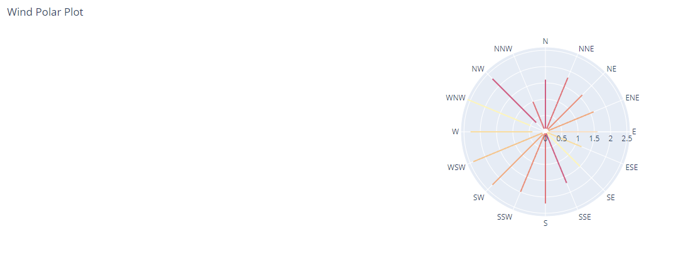
The resulting figure:
Set a dark background using the template parameter:
df = px.data.wind()
fig = px.line_polar(df, r='frequency', theta='direction', color='direction', color_discrete_sequence=px.colors.sequential.Pinkyl_r, template='plotly_dark')
fig.show()
Output:
To set the title for your Polar plot:
fig.show()
Output:
That’s it for this tutorial.


