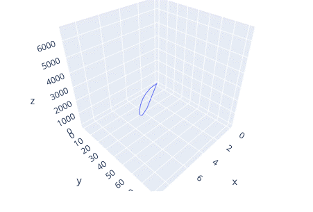
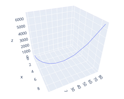
However, no figure can portray the information visually as accurate as a 3-dimensional figure.
In this tutorial, we will learn how you can transform a simple line plot to a 3D figure that turn people’s heads using Plotly express module.
Let’s get started.
Plotly.Express.Line_3D
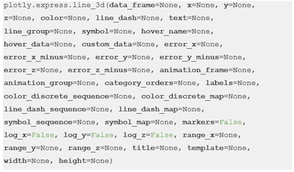
To create a 3D line plot, we use the line_3d() function from the Plotly express module. The function syntax is as shown in the following:
The following are some important parameters that you need to know:
- Data_frame – Specifies the dataframe used as the column names. You can add a DataFrame or an array_like object.
- X – Specifies the values passed as the position marks for the x axis.
- Y – Similar to x but points are used for the y axis.
- Z – Similar to z but points are used for the z axis.
- Color – Specifies the values used for color marks.
Example 1: Creating a 3D Line Plot
The following example shows how to create a 3D line plot using the Plotly express module:
df = px.data.gapminder().query("continent=='Asia'")
fig = px.line_3d(df, x='year', y='lifeExp', z='year')
fig.show()
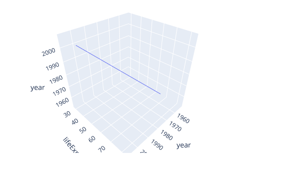
In the given example, we use the line_3d function to plot a 3D line plot of the country Life expectancy data in the Asia continent.
The previous code returns a figure as shown (at default camera perspective) in the following:
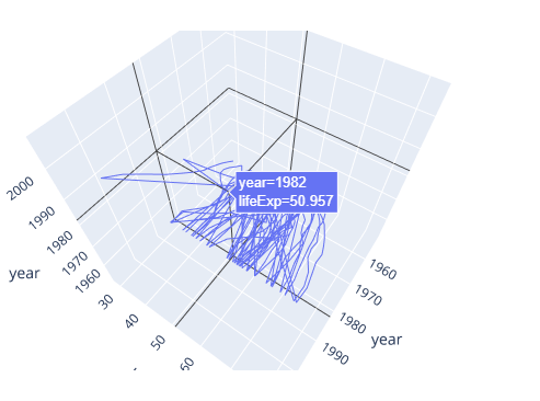
You can rotate the resulting figure along any axis and view the data as you see fit. The following is a simple turntable rotation of the figure:
Example 2: Specifying the Color
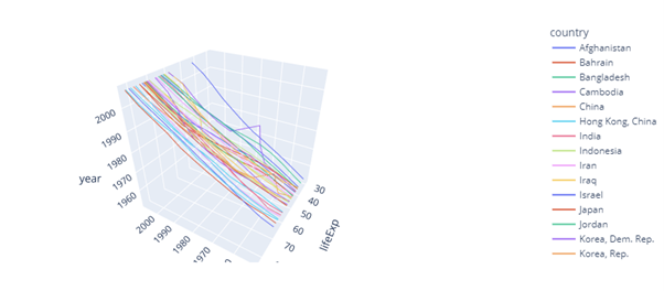
Although the previous plot does how the data does, it’s not easily interpreted. We can tell Plotly to show each line with a different color based on the country by passing the color parameter as the “country” column.
An example is as follows:
df = px.data.gapminder().query("continent=='Asia'")
fig = px.line_3d(df, x='year', y='lifeExp', z='year', color='country')
fig.show()
The given code returns a figure as shown in the following (rotated clockwise):
Example 3: Simple Line 3D Plot
We can simplify things and create a 3D line plot of evenly distributed data using NumPy. An example is as follows:
import numpy as np
x = np.arange(10)
y = x**2
z = y**2
fig = px.line_3d(df, x=x, y=y, z=z)
fig.show()
This returns a figure shown in the following illustration:
You can rotate the plot for better view as follows:
Conclusion
In this tutorial, you learned the fundamentals of creating a 3D line plot using Plotly express module.

