In this tutorial, we will learn how we can create a histogram plot using the Plotly Express module.
Plotly.express.histogram()
In Plotly Express, we use the histogram() function to create histogram plots. The function provides a syntax as shown:
The following are the most useful function parameters you will need to know:
- Data_frame – specifies the data frame containing the column names. You can pass this value as a DataFrame, a dictionary, or an array_like object.
- x – specifies the values used to position the marks along the x axis along the cartesian coordinate. This can be a column name within a data frame or a Pandas series.
- y – similar to x but the values specified in this parameter are used to position the marks along the y axis.
- color – defines the values used to assign a unique color to the marks.
- Cumulative – specifies if the values of the histogram are cumulative.
- Nbins – specifies the number of bins.
- Histnrom – specifies the mode in which the bins are created. Accepted values include:
- ‘percent’
- ‘probability’
- ‘density’
- ‘probability density’
The function will then return a Histogram plot of type graph_objects.Figure.
Example – Using the gapminder() data
We can create a histogram using the gapminder data in Plotly. Take the example code shown below:
df = px.data.gapminder().query("continent=='Europe'")
fig = px.histogram(df, x='gdpPercap')
fig.show()
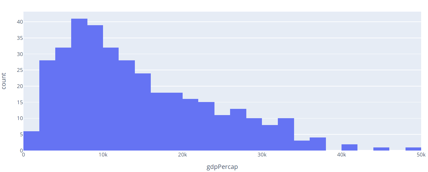
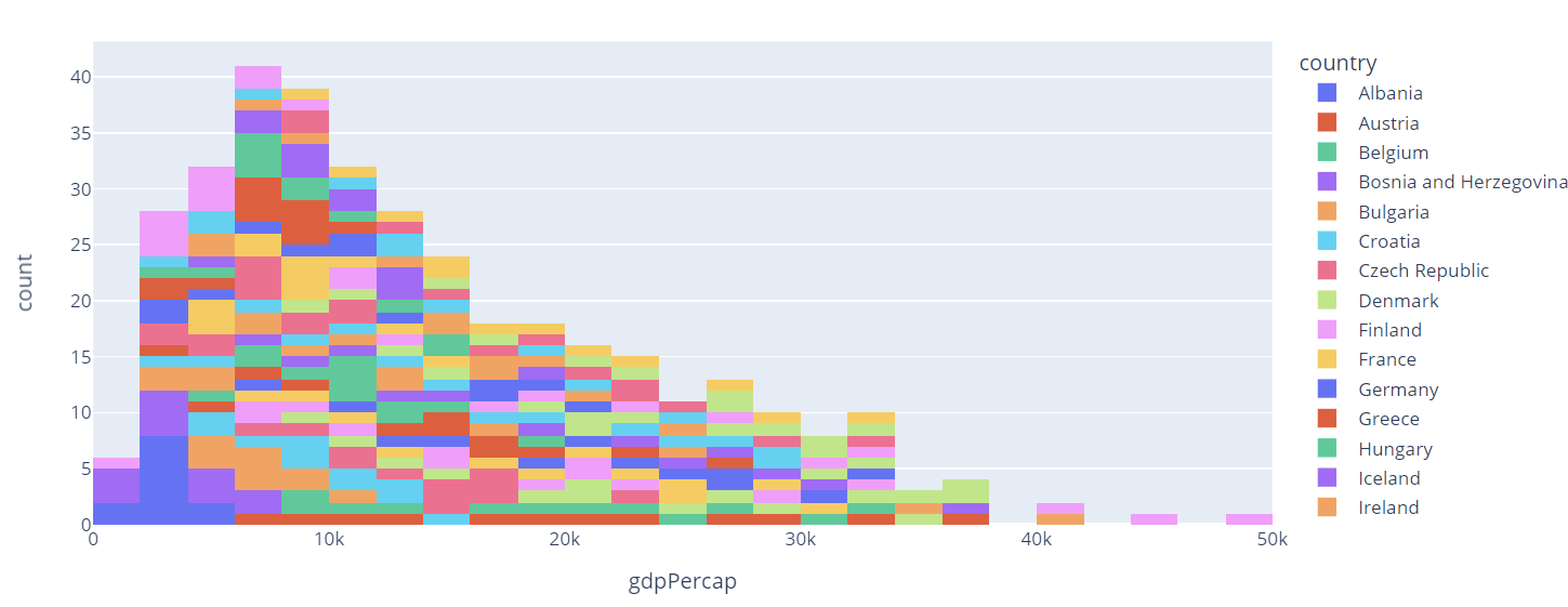
In the example above, we are using the gapminder() data from Plotly Express. We then plot a histogram showing the distribution of gdp Per Capita of the countries in the Europe continent.
Once we run the code above, we should see a histogram as shown:
Example 2 – Using categorical Data
We can also create a histogram of categorical data by specifying the x and y parameters.
Take the example code shown below:
df = px.data.gapminder().query("continent=='Europe'")
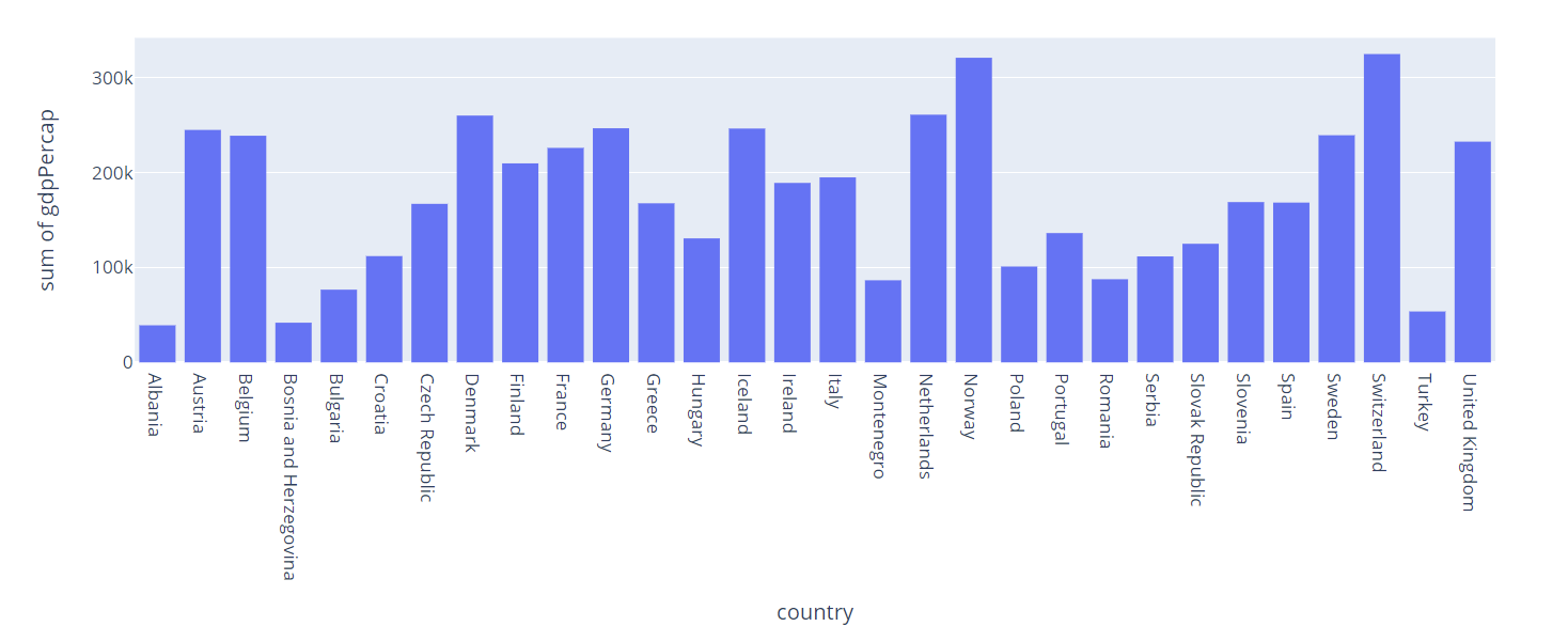
fig = px.histogram(df, x='country', y='gdpPercap')
fig.show()
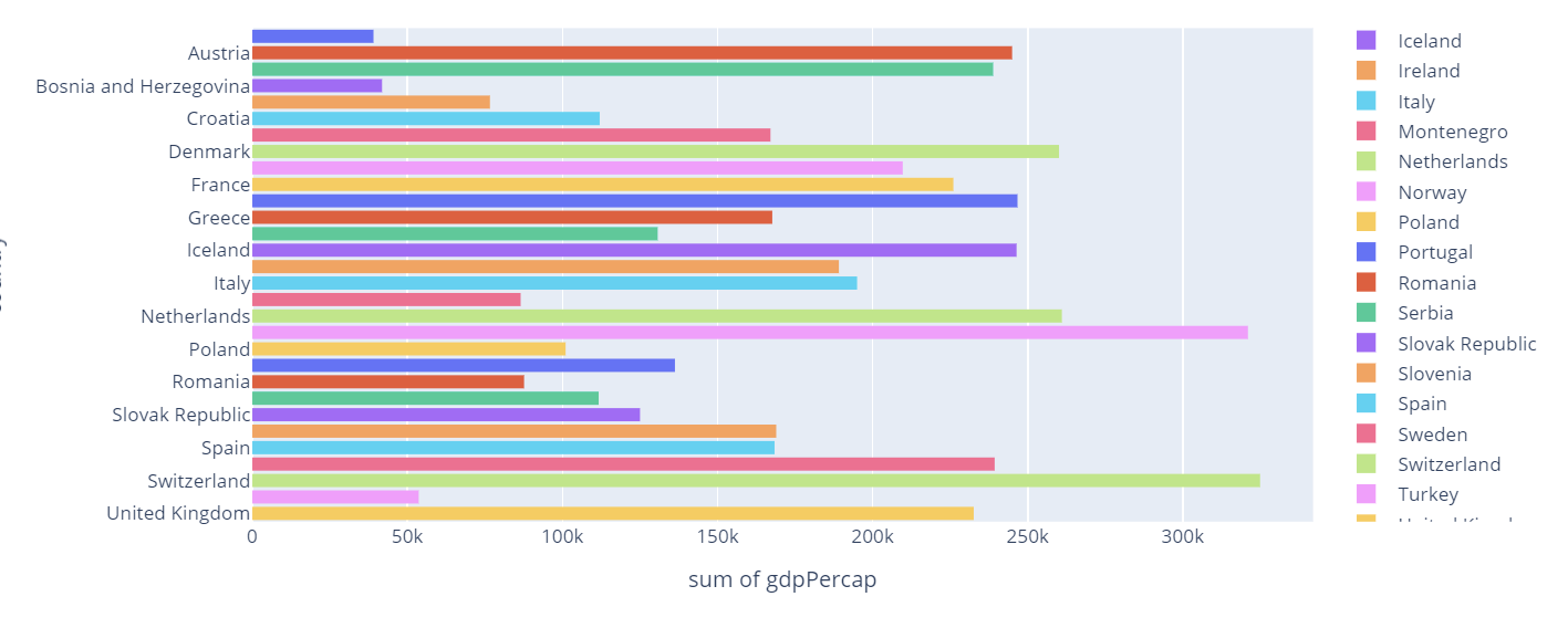
In this case, the histogram will show each country and the sum of the GDP Per Capita value as shown in the figure below:
Example 3 – Specifying Type of Normalization
By default, Plotly will create a histogram with each sample in each bin. However, we can specify the mode in which we wish to present the bins using the histnorm parameter.
Let us look at various examples:
Probability Density
fig.show()
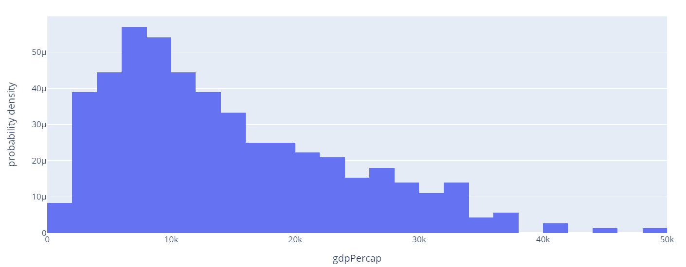
In this example, we create a probability density histogram which is a sum of the bar areas equal to 1.
The resulting figure is as shown:
Check the parameter list to learn the various types you can specify.
Example 4 – Specify the Number of Bins
By default, Plotly will choose the number of bins so that its comparable to the number of samples in a bin. However, we can specify the number of bins using the nbins parameter.
An example is as shown:
fig.show()
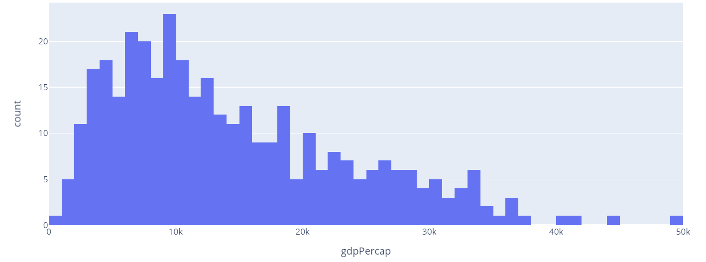
In the example above, we specify the number of bins to 50. This should return a figure as shown:
Example 5 – Specify the color parameter
We can also specify the color parameter. This will assign a unique color based on the specified columns name.
Example code is as shown:
fig.show()
The resulting figure:
In this case, Plotly will assign a unique color to each country in the plot as specified by the color parameter.
Example 6 – Horizontal Histogram
Plotly also allows us to create horizontal histograms. Take a look at the code below:
fig.show()
In this case, we are plotting a histogram of the sum of GDP per Capita of each country. The code above should return a figure as shown:
Example 7 – Sorting by Category Order
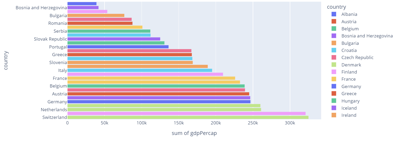
In some cases, we may wish to sort the resulting plot based on a specific value. For example, in the histogram above, we can sort the histogram based on the total gdpPerCap in ascending order.
Using the update_xaxes or update_yaxes function, we specify how we wish to sort the data.
In our example, we wish to sort the y axis. Hence, we will use the update_yaxes() function. In the function, we can specify the categoryorder parameter and method in which we wish to sort the data. In this case, ‘total descending’.
We can run the code as shown:
fig.show()
The code above should result in a figure as shown:
Conclusion
In this article, we explored how to use the histogram() function from Plotly Express module. The function allows us to create histograms of various data.

