Let’s dive in.
Create a Figure With Trendline
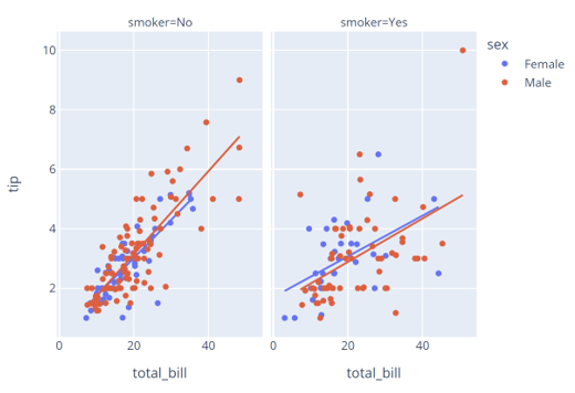
The first step is to create a figure with trendlines. For this example, we will use a simple scatter plot using the tips data as shown in the code below:
df = px.data.tips()
fig = px.scatter(df, x='total_bill', y='tip', facet_col='smoker', color='sex', trendline='ols')
fig.show()
The code above should return a figure as shown:
Once we have the figure with trendlines in the trace, we can extract the underlying model parameters using the get_trendlines_results() function.
The function syntax is as shown:
Parameters:
- fig – specifies the figure from which we wish to extract the fit statistics. The figure must have the trendline parameter set to ‘ols.
The function will then return a Pandas DataFrame with the px_fit_results columns containing the statsmodels object.
Example
Let us see how we can extract the fit stats using the figure we created earlier. The code is as shown:
print(result)
Output:
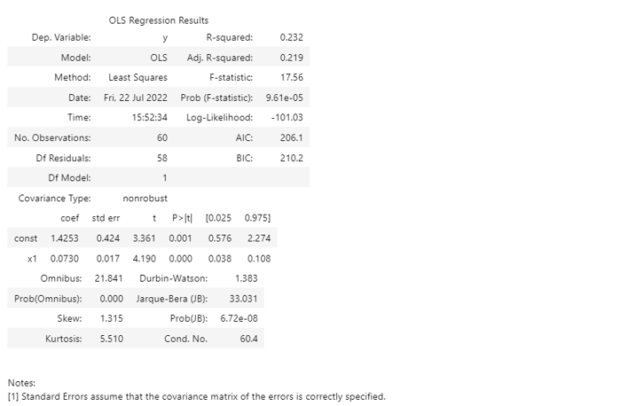
We can then access the model parameter as shown in the query below:
df = px.data.tips()
fig = px.scatter(df, x='total_bill', y='tip', facet_col='smoker', color='sex', trendline='ols')
result = px.get_trendline_results(fig)
result.query("sex == 'Male' and smoker == 'Yes'").px_fit_results.iloc[0].summary()
Result:
Closing
This article covers the basics of using the get_trendline_results function to extract fit statistics for trendlines.


