Each stage within a funnel plot is represented as a percentage of the overall total values.
In this article, we will explore how we can create various types of funnel plots using the Plotly express module.”
Plotly.express.funnel() Function Syntax
The syntax of the funnel() function is as shown:
facet_col=None, facet_col_wrap=0, facet_row_spacing=None, facet_col_spacing=None,
hover_name=None, hover_data=None, custom_data=None, text=None,
animation_frame=None, animation_group=None, category_orders=None, labels=None,
color_discrete_sequence=None, color_discrete_map=None, opacity=None,
orientation=None, log_x=False, log_y=False, range_x=None, range_y=None, title=None,
template=None, width=None, height=None)
The following are the most important parameters you will need to understand when working with the funnel function.
- data_frame – this defines the data frame containing the column names used in the plot.
- x – sets the values used to position the marks along the x-axis in the cartesian plane.
- y – defines the values used to position the marks along the y axis of the cartesian coordinate.
- color – defines the values used to assign unique colors to the marks of the plot.
- opacity – sets the opacity for the markers. The values range between 0 and 1
- orientation – sets the orientation of the plot. “h” for horizontal orientation and “v” for vertical orientation.
Practical Example
Let us look at various code samples for creating funnel plots in Plotly express.
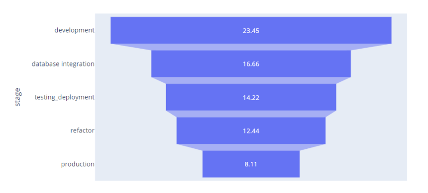
Let’s start by creating a simple funnel plot as shown in the code below:
data = dict(
compile_time = [23.45, 16.66, 14.22, 12.44, 8.11],
stage = ['development', 'database integration', 'testing_deployment', 'refactor', 'production']
)
fig = px.funnel(data, x='compile_time', y='stage')
fig.show()
The code above creates a funnel illustrating the project compile time at various development stages.
The resulting figure is as shown:
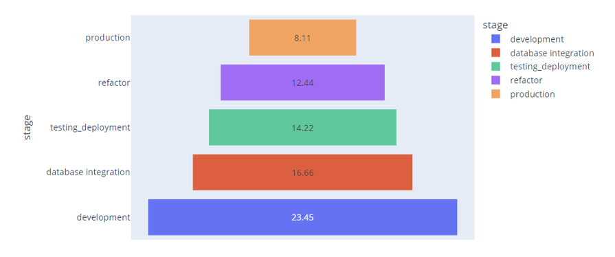
To assign a unique color to each sector of the funnel based on the stage, we can use the color argument as:
data = dict(
compile_time = [23.45, 16.66, 14.22, 12.44, 8.11],
stage = ['development', 'database integration', 'testing_deployment', 'refactor', 'production']
)
fig = px.funnel(data, x='compile_time', y='stage', color='stage')
fig.show()
Output:
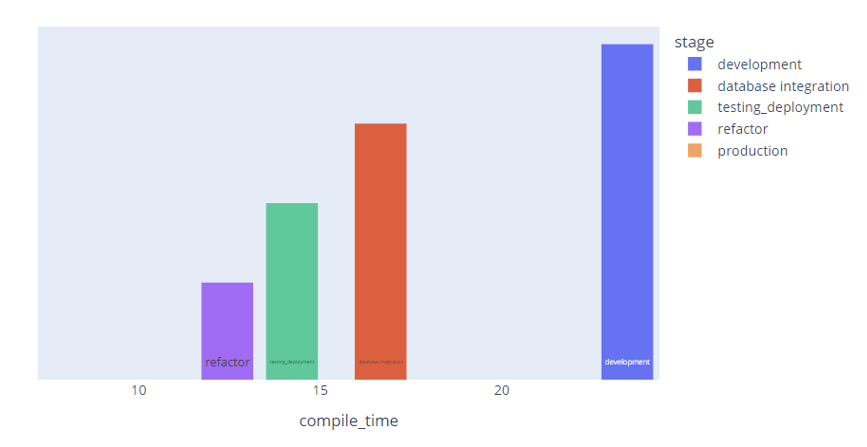
To change the orientation, we can use the orientation argument as shown:
data = dict(
compile_time = [23.45, 16.66, 14.22, 12.44, 8.11],
stage = ['development', 'database integration', 'testing_deployment', 'refactor', 'production']
)
fig = px.funnel(data, x='compile_time', y='stage', color='stage', orientation='v')
fig.show()
Output:
Termination
This article describes the basics of creating a funnel plot using the Plotly express module.