Let’s dive in.
Function Syntax
The density_heatmap() function has a syntax as shown in the following:
The following is a list of the most useful parameters that you need to know when creating the density heatmaps using the density_heatmap() function:
- data_frame – Specifies the data frame containing the column names used in the plot.
- x – Sets the values used to position the marks along the x axis in the cartesian plane.
- y – Sets the values used to position the marks along the y axis in the cartesian plane.
- z – Positions the the marks along the z axis.
- facet_row – Sets the values used to assign the marks to facetted subplots in the vertical direction.
- facet_col – Sets the values used to assign the marks to facetted subplots along the horizontal direction.
- orientation – Defines the orientation for the plot.
- histfunc – Defines the aggregate function used in the plot.
- title – Sets the title for the figure.
- width/height – Defines the width and height of the resulting figure in pixels.
Practical Example
The following code illustrates how to create a density heatmap using the density_heatmap() function:
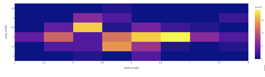
df = px.data.iris()
fig = px.density_heatmap(df, x='sepal_length', y='sepal_width')
fig.show()
The previous code returns the density heatmap as shown in the following:
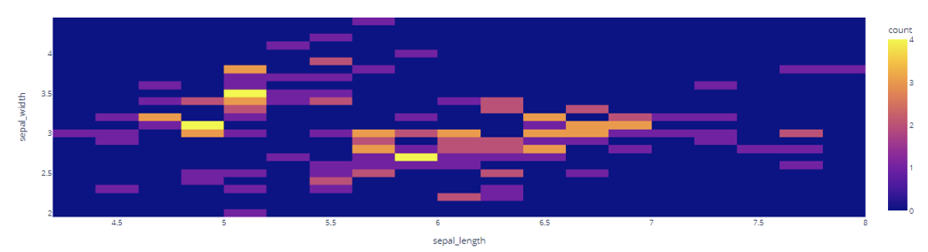
Setting the Number of Bins
We can specify the number of bins that we wish to display using the nbinsx and nbinsy parameters as shown in the following:
df = px.data.iris()
fig = px.density_heatmap(df, x='sepal_length', y='sepal_width', nbinsx=30, nbinsy=30)
fig.show()
The resulting figure is as follows:
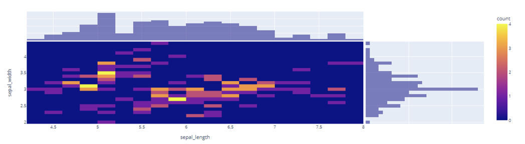
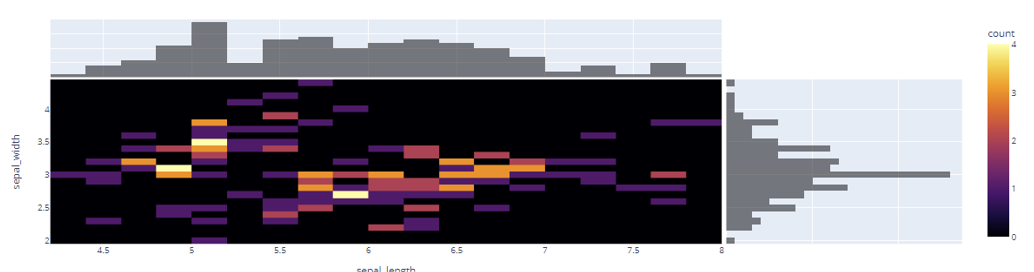
Adding Marginal Plots
You can add the marginal plots to a density heatmap using the marginal_x and marginal_y parameters as shown in the following:
df = px.data.iris()
fig = px.density_heatmap(df, x='sepal_length', y='sepal_width', nbinsx=30, nbinsy=30, marginal_x='histogram', marginal_y='histogram')
fig.show()
The previous code adds the marginal histograms on both x and y axis of the density heatmap.
The resulting figure is as follows:
Specifying a Color Scale
We can also specify a desired colorscale for the heatmap using the color_continous_scale parameter as shown in the following:
fig.show()
Output Figure:
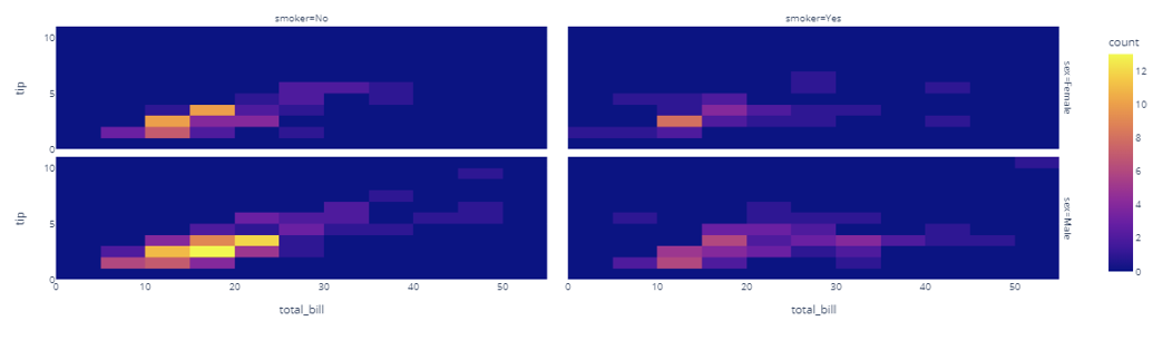
Creating Facetted Density Heatmap
You can also create the facetted density subplots using the facet_row and facet_col parameters as illustrated in the following code:
df = px.data.tips()
fig = px.density_heatmap(df, x="total_bill", y="tip", facet_row="sex", facet_col="smoker")
fig.show()
Output Figure:
And that’s it.
Conclusion
This article explores how you can create the various types of density heatmaps using Plotly Express. Check the document for more.