Let’s discuss how to create a density contour plot using Plotly express.”
Function Syntax
The function syntax is as shown:
Function parameters:
- data_frame – specifies the data containing the columns used in the plot.
- x – defines the values used to position the marks along the x-axis.
- y – sets the values used to position the marks along the y axis.
- z – defines the values used to position the marks along the z-axis.
- color – defines the values used to assign a unique color to the marks of the plot.
- orientation – defines the orientation of the plot.
- title – sets the title for the figure.
- template – defines the plotly template used in the figure.
- width/height – sets the width and height of the figure in pixels.
Practical Example
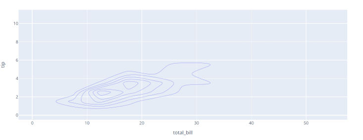
The code below shows how to create a density contour plot using Plotly Express and the iris data.
df = px.data.tips()
fig = px.density_contour(df, x='total_bill', y='tip')
fig.show()
Output:
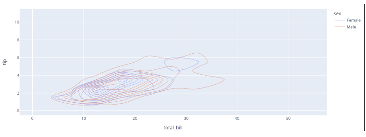
Color Contours
To color the contours, you can specify the color parameter as shown in the example below:
df = px.data.tips()
fig = px.density_contour(df, x='total_bill', y='tip', color='sex')
fig.show()
The resulting figure is shown below:
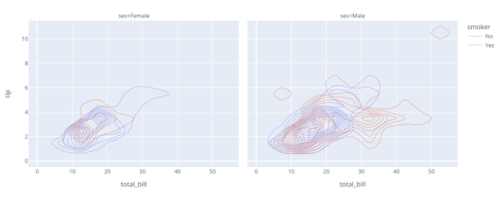
Facetted Density Contour
You can also create a facetted contour plot by setting the facet_col parameter as shown:
df = px.data.tips()
fig = px.density_contour(df, x='total_bill', y='tip', facet_col='sex', color='smoker')
fig.show()
This should display a plot as shown:
Showing Labels
To display the labels in the plot, we can set the contours_showlabels.
fig.update_traces(contours_showlabels=True)
fig.show()
The code above shows the return of the contour with the data labels included.
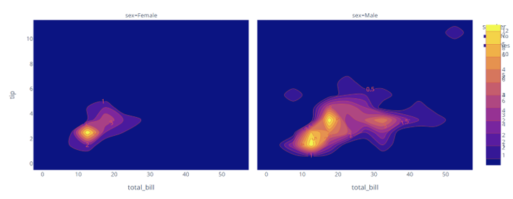
Continuously Colored Contour
If you wish to create a contour that is continuously colored, you can set he contours_coloring parameter to fill as:
fig.update_traces(contours_showlabels=True, contours_coloring='fill')
fig.show()
The resulting figure is as shown:
Specifying Aggregate Function
You can also specify an aggregate function to the density contour by setting the z parameter and the histfunc parameters.
An example code is as shown:
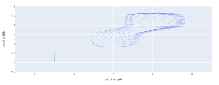
df = px.data.iris()
fig = px.density_contour(df, x='petal_length', y='petal_width', z='sepal_length', histfunc='max')
fig.show()
The code above will return a density contour as shown:
Conclusion
This article explores the density_contour() function, which allows you to create 2d histogram plots.
Happy coding!!