One of the most common statistical plots is a box plot. A box plot is used to show the distribution of numerical data using quartiles. The end of a box represents the lower and upper quartiles, and the box shows the second quartile by the line.
Although it may seem different, a box plot shares various features with a violin plot with certain exceptions.
This article will explore how to create box plots using the Plotly express module.
Function Syntax
The syntax for the box() function is shown below:
Function parameter list:
- data_frame – specifies the data frame containing the column names used in the plot
- x – sets the values to position the marks along the x-axis in the cartesian system
- y – specifies the values used to position the marks along the y-axis in the cartesian coordinate system
- color – sets the values used to assign a unique color to the marks of the plot
- notched – defines if the boxes are drawn with notches or not
- title – represents the title for the plot
- width/height – defines the width and height of the figure in pixels
Example
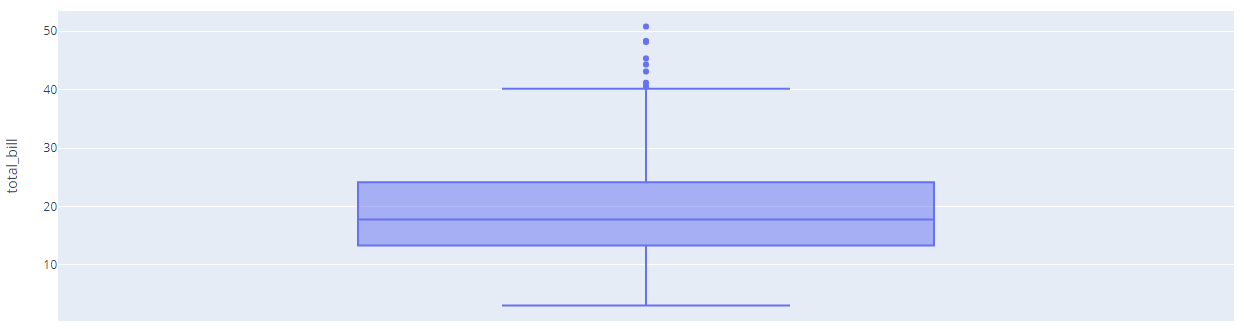
The following code shows how to create a basic box plot:
df = px.data.tips()
fig = px.box(df, y='total_bill')
fig.show()
Output:
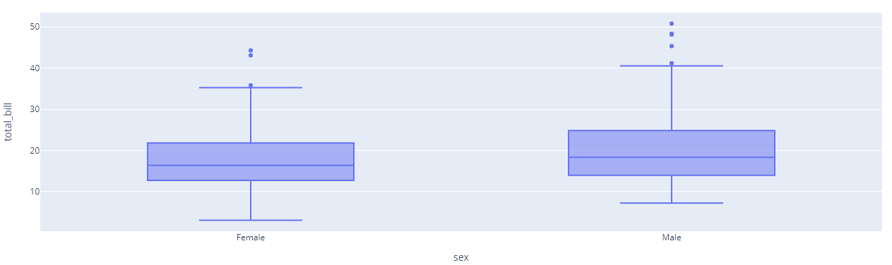
To create multiple box plots, you can specify the x and y parameters;
df = px.data.tips()
fig = px.box(df, x='sex', y='total_bill')
fig.show()
Resulting figure:
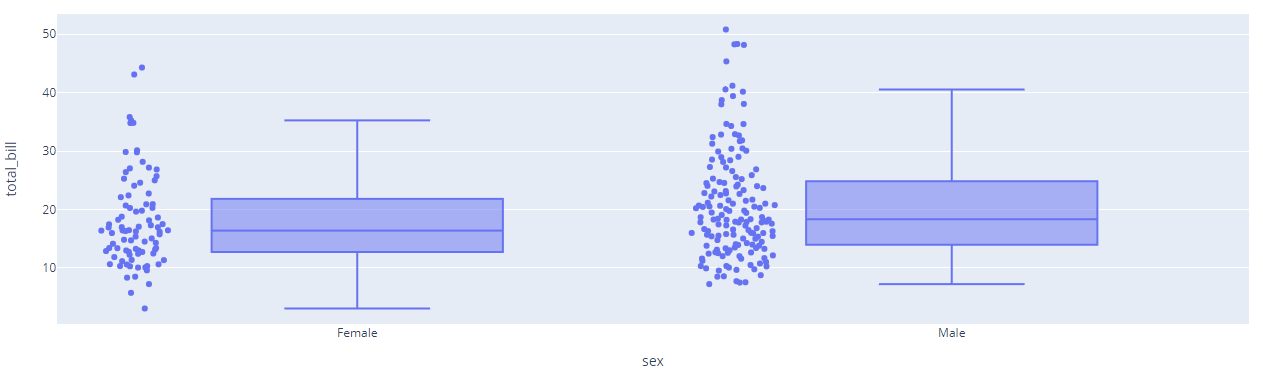
To display the underlying data points, you can set the points parameter to all as shown below:
df = px.data.tips()
fig = px.box(df, x='sex', y='total_bill', points='all')
fig.show()
Output:
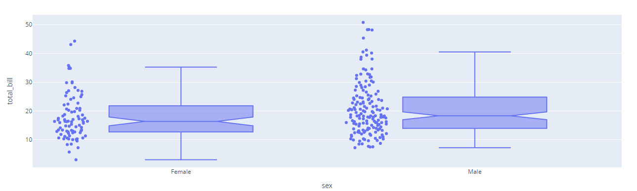
To create notched boxes:
df = px.data.tips()
fig = px.box(df, x='sex', y='total_bill', points='all', notched=True)
fig.show()
The resulting figure:
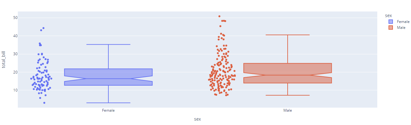
To assign unique colors to the marks:
df = px.data.tips()
fig = px.box(df, x='sex', y='total_bill', points='all', notched=True, color='sex')
fig.show()
Output figure:
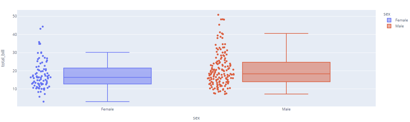
You can also change the algorithm for calculating quartiles. The following example uses the inclusive algorithm:
df = px.data.tips()
fig = px.box(df, x='sex', y='total_bill', points='all', notched=False, color='sex')
fig.update_traces(quartilemethod='inclusive')
fig.show()
The output figure is provided below:
You can check the following resource to learn about various quartile algorithms.
https://en.wikipedia.org/wiki/Quartile
Conclusion
This article covers the importance of the box plot since it shows the distribution of numerical data using quartiles. In addition, this guide discussed the various methods and techniques of creating box plots using the Plotly express module.