This article will discuss creating heatmap plots using the Plotly graph_objects module.
Parameter and Syntax
To create a heatmap plot using plotly graph_objects, you can follow the following syntax:
Parameter list:
- Arg – This defines a dictionary with compatible properties with the Heatmap constructor.
- autocolorscale – This sets whether the colorscale uses the default palette or determine by the colorscale parameter.
- colorbar – A dictionary containing compatible properties of the colorbar instance.
- colorscale – This determines the colorscale as an RGB, RGBA, hex, HSL, HSV, or named color string.
- x – This sets the values for the x coordinate.
- y – This defines the values for the y coordinate.
- z – This sets the values for the z coordinate.
Basic Heatmap Using Plotly Graph Objects
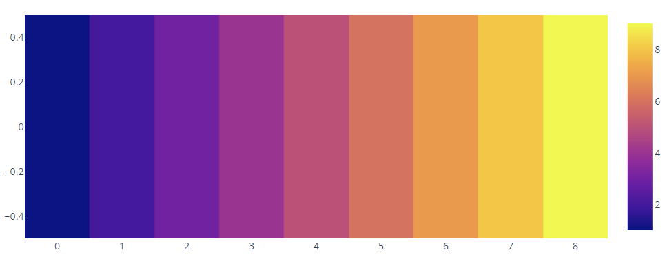
The following code shows how to create a simple heatmap plot using Plotly graph_objects:
fig = go.Figure(data=go.Heatmap(
z=[[1,2,3,
4,5 ,6,
7,8,9]]
))
fig.show()
The previous code should create a heatmap plot as follows:
Adding Axis Labels
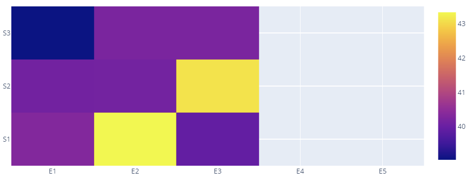
We can add categorical axis labels by adding the x and y parameters, as shown in the following code:
x = ['E1', 'E2', 'E3', 'E4', 'E5']
y = ['S1', 'S2', 'S3']
z = [[40.32, 43.33, 39.94], [40.12, 40.13, 43.12], [39.03, 40.23, 40.22]]
fig = go.Figure(data=go.Heatmap(
x=x,
y=y,
z=z,
hoverongaps = False
))
fig.show()
An example output figure is as follows:
Adding Text on Heatmap Points
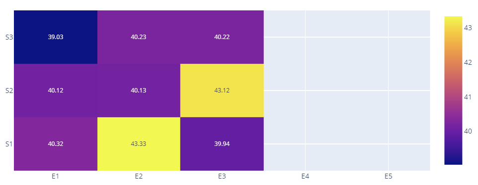
You can add text on heatmap points by specifying the text parameter, as illustrated in the following code:
x = ['E1', 'E2', 'E3', 'E4', 'E5']
y = ['S1', 'S2', 'S3']
z = [[40.32, 43.33, 39.94], [40.12, 40.13, 43.12], [39.03, 40.23, 40.22]]
fig = go.Figure(data=go.Heatmap(
x=x,
y=y,
z=z,
text=[[40.32, 43.33, 39.94], [40.12, 40.13, 43.12], [39.03, 40.23, 40.22]],
texttemplate="%{text}",
textfont={"size": 10},
hoverongaps = False
))
fig.show()
Output figure:
Setting Colorscale
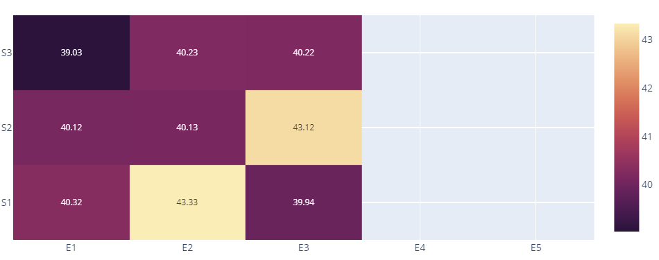
We can also specify a custom color scale by setting the colorscale parameter, as shown in the following code sample:
import plotly.express as px
x = ['E1', 'E2', 'E3', 'E4', 'E5']
y = ['S1', 'S2', 'S3']
z = [[40.32, 43.33, 39.94], [40.12, 40.13, 43.12], [39.03, 40.23, 40.22]]
fig = go.Figure(data=go.Heatmap(
x=x,
y=y,
z=z,
text=[[40.32, 43.33, 39.94], [40.12, 40.13, 43.12], [39.03, 40.23, 40.22]],
texttemplate="%{text}",
textfont={"size": 10},
hoverongaps = False,
colorscale=px.colors.sequential.matter_r
))
fig.show()
The resulting figure is as follows:
Conclusion
This article describes creating a heatmap plot using the Plotly graph_objects module. We showed how to add axis labels, add text on heatmap points, and set colorscales.
For articles like this, check out more from Linux Hint.


