In this article, we will explore how we can create ternary plots using the Plotly express module.
Plotly.express.scatter_ternary()
To create a ternary plot in Plotly, we use the scatter_ternary() function. The function syntax is as shown below:
The function parameters are expressed as shown below:
- Data_frame – specifies the data frame, dictionary or array_like object to be used as the column names.
- a – specifies the values used to position the marks along the a axis in the ternary coordinate. You can pass the values as a column within a data frame, a Pandas series or an array_like object.
- b – similar to a but the values are used to place the marks along the b axis in the ternary coordinate.
- c – similar to a and b but specifies the values used to position the marks along the c axis.
- color – specifies the values used to assign a unique color to the marks.
- symbols – specifies the values used to assign unique symbols to the marks.
- Title – specifies the title of the figure.
- width/height – specifies the width and height dimensions of the figure in pixels.
Example 1: Simple Ternary Plot
Take the example code below that shows how we can create a simple ternary plot using the scatter_ternary() function.
import pandas as pd
candidate_1 = [10000, 20000, 1000, 50000, 40000]
candidate_2 = [50000, 5000, 3000, 22000, 10000]
candidate_3 = [40000, 5500, 55000, 33000, 23333]
df = pd.DataFrame({'candidate_1': candidate_1,
"candidate_2": candidate_2, "candidate_3": candidate_3})
fig = px.scatter_ternary(df, a="candidate_1", b="candidate_2", c="candidate_3")
fig.show()
In the example above, we start by importing the plotly express module as px. We also import pandas to create a data frame from the data.
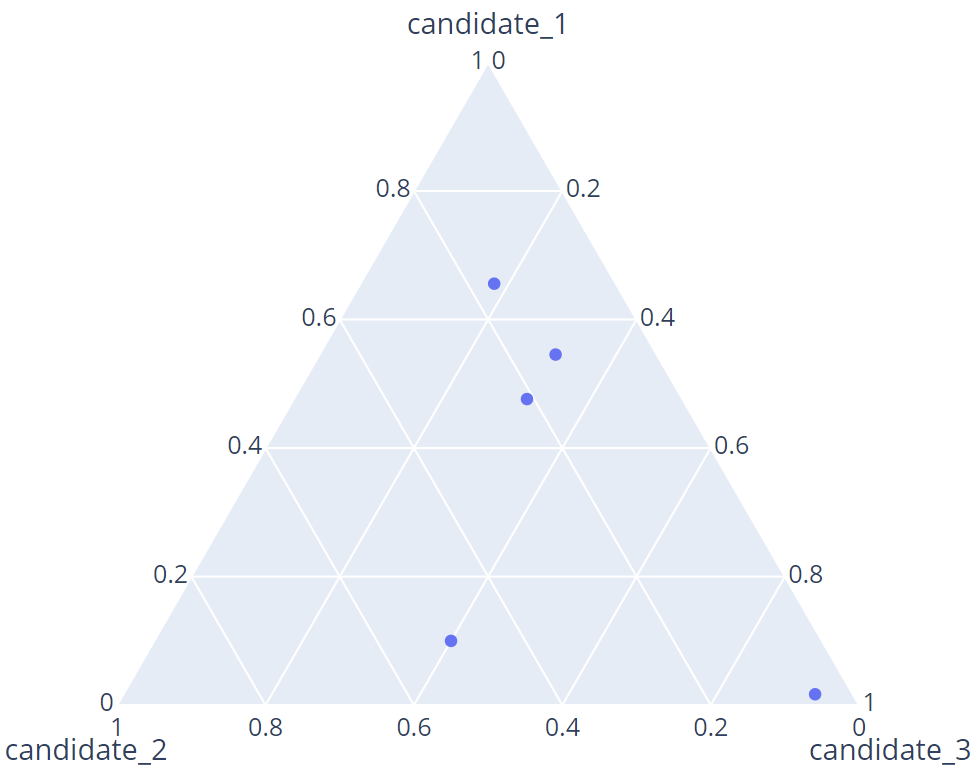
Once we have the DataFrame, we use the scatter_ternary() function to create a ternary plot of the election candidates.
The resulting figure is as shown:
Example 2
Suppose we want to label the marks based on the area of the election. We can update our DataFrame to include the area column as shown:
candidate_2 = [50000, 5000, 3000, 22000, 10000]
candidate_3 = [40000, 5500, 55000, 33000, 23333]
areas = ['area1', 'area2', 'area3', 'area4', 'area5']
df = pd.DataFrame({'candidate_1': candidate_1,
"candidate_2": candidate_2, "candidate_3": candidate_3, "areas": areas})
fig = px.scatter_ternary(df, a="candidate_1", b="candidate_2", c="candidate_3", color='areas')
fig.show()
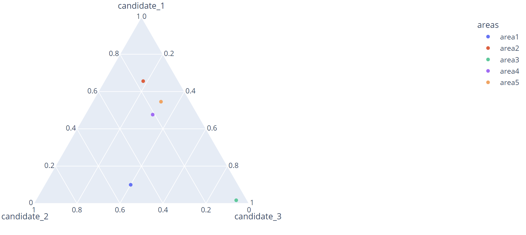
Once we run the code above, we should see a plot as shown:
In this example, we specify the color parameter based on the area of votes.
Example 3
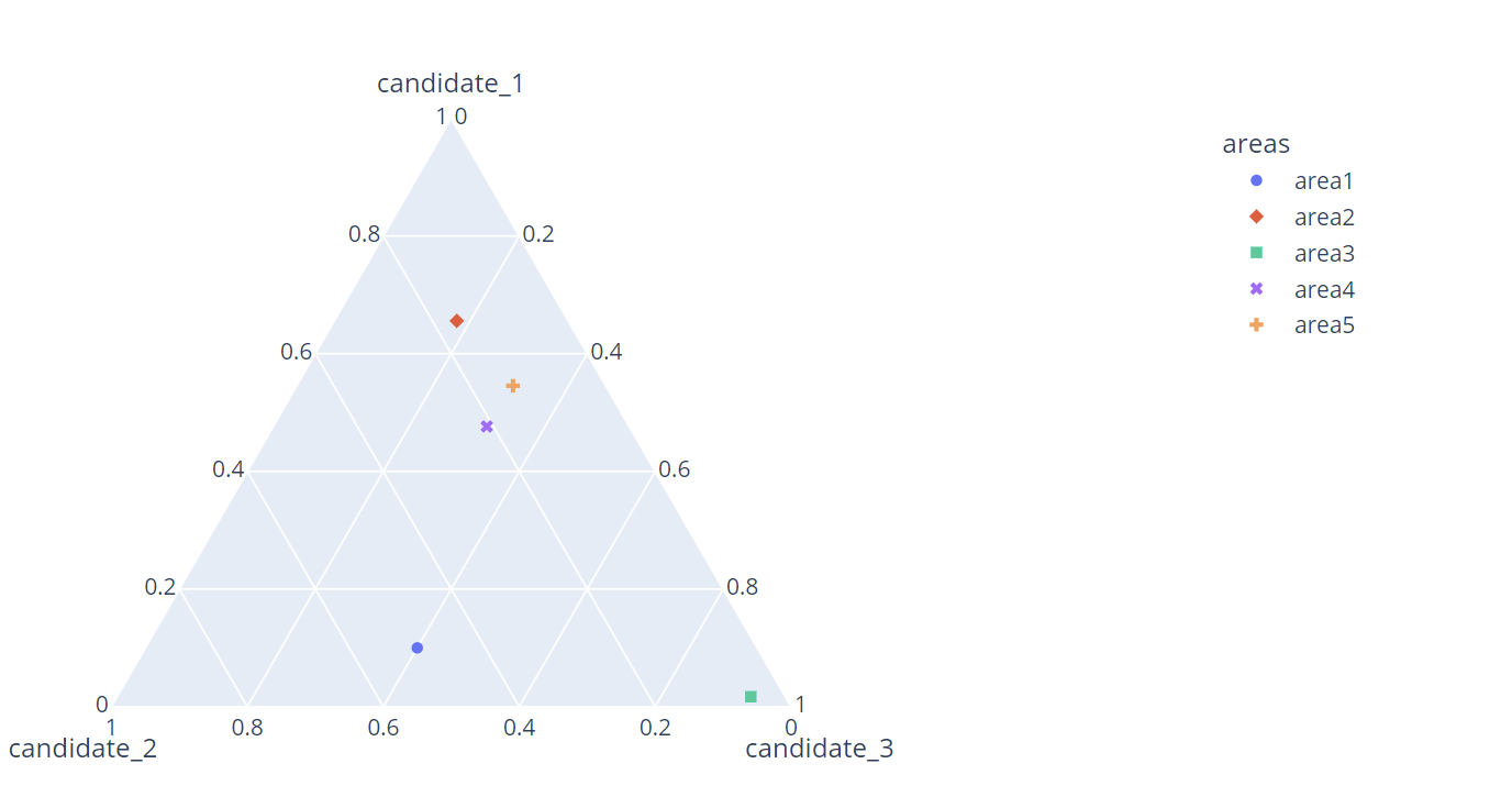
We can also assign the marks a distinct symbol by setting the symbol parameter.
Running the code above should assign a unique mark based on the area.
The resulting figure is as shown:
Conclusion
This article covers the fundamentals of creating and working with ternary plots in Plotly express.


