Keep in mind that this may require you to have a Mapbox account and access Token.
Basic Hexbin Plot
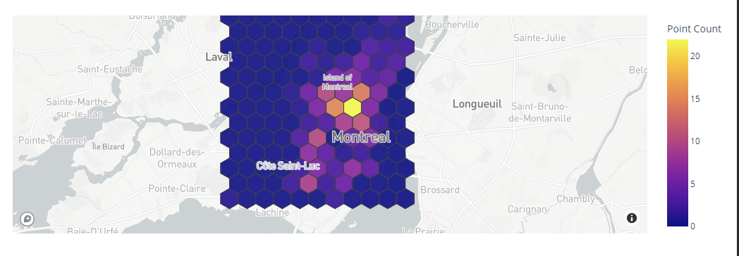
The following code shows how to use the figure_factory module to create a basic hexbin plot using the Mapbox API.
import plotly.express as px
px.set_mapbox_access_token(open("mapbox.mapbox_token").read())
df = px.data.carshare()
fig = create_hexbin_mapbox(
data_frame=df, lat="centroid_lat", lon="centroid_lon",
nx_hexagon=10, opacity=0.9, labels={"color": "Point Count"},
)
fig.show()
The given example uses the carshare data from Plotly express to create a simple hexbin plot. Ensure to replace the mapbox.mapbox_token with the file containing your Mapbox access token.
Output Figure:
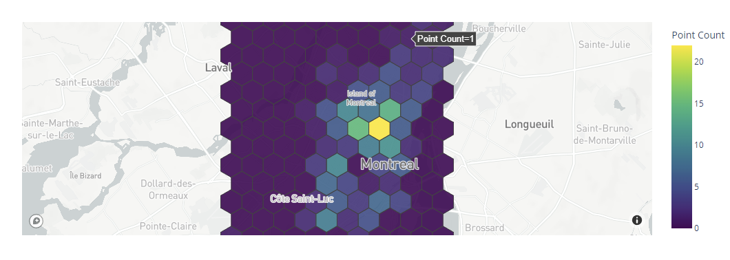
You can change the colorscale by setting a different value to the colorscale_continous_scale parameter as shown in the following:
import plotly.express as px
px.set_mapbox_access_token(open("mapbox.mapbox_token").read())
df = px.data.carshare()
fig = create_hexbin_mapbox(
data_frame=df, lat="centroid_lat", lon="centroid_lon",
nx_hexagon=10, opacity=0.9, labels={"color": "Point Count"},
color_continuous_scale='viridis'
)
fig.show()
This sets the colorscale to viridis as shown in the following output:
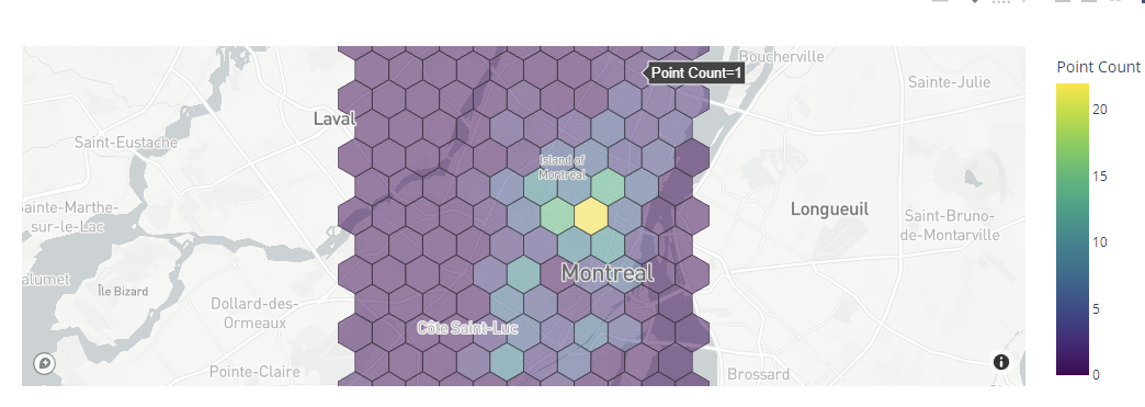
To customize the opacity of the bins, you can customize the opacity parameter as shown in the following:
data_frame=df, lat="centroid_lat", lon="centroid_lon",
nx_hexagon=10, opacity=0.5, labels={"color": "Point Count"},
color_continuous_scale='viridis',
)
fig.show()
In this case, the plot uses a .5 opacity as shown in the following:
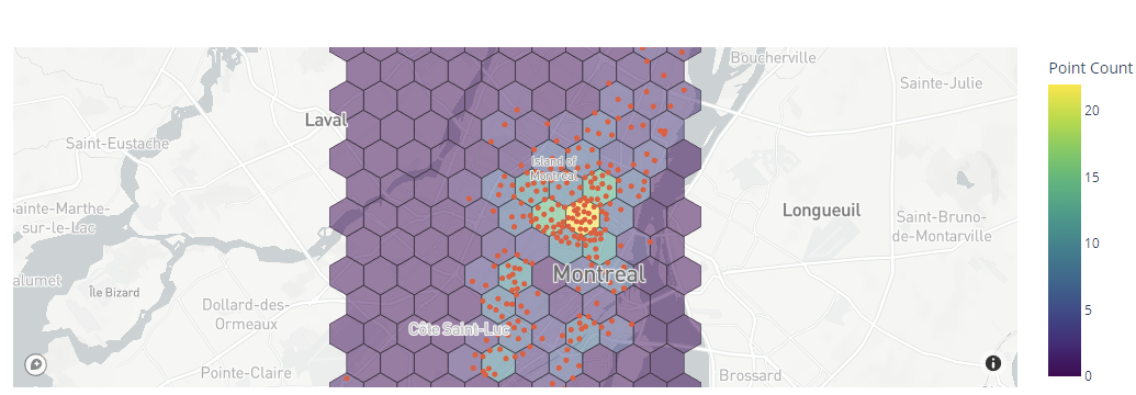
To display the underlying data within the plot, you can use the show_original_data parameter as follows:
data_frame=df, lat="centroid_lat", lon="centroid_lon",
nx_hexagon=10, opacity=0.5, labels={"color": "Point Count"},
color_continuous_scale='viridis',
show_original_data=True
)
fig.show()
Output:
Conclusion
In this article, we explored how to use the Plotly figure_factory module and the Mapbox API to create the hexbin plots. Check the docs for more.


