Let’s dive in and discuss how we can use the scatter3d class to create 3d scatter plots.
Basic Scatter 3D Plot With plotly graph_objects
We will start with a simple example that allows us to create a simple 3d scatter plot using graph_objects.
The sample code is provided below:
fig = go.Figure(data=go.Scatter3d(
x=[0, 1, 2, 3, 4],
y=[0, 1, 4, 9, 16],
z=[0, 1, 8, 27, 64],
mode='markers'
))
fig.show()
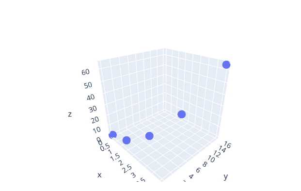
The code above will create a simple scatter plot in 3d as specified by the x, y, and z parameters.
An example output figure is as shown:
Keep in mind that it is a rotated figure. By default, Plotly will set the camera view to 1.
3D Scatter Plot Using A DataFrame
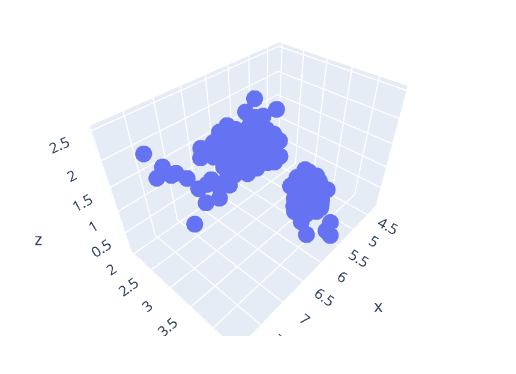
We can also use Plotly graph_objects and a DataFrame to create a 3d scatter plot. For example, in the code below, we use the iris() data to create 3d scatter plots based on the available columns.
import plotly.express as px
df = px.data.iris()
fig = go.Figure(data=go.Scatter3d(
x=df['sepal_length'],
y=df['sepal_width'],
z=df['petal_width'],
mode='markers'
))
fig.show()
The resulting figure is as shown:
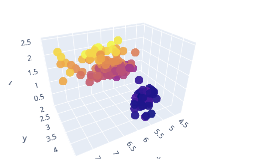
We can also define the unique color for the markers by customizing the marker property. An example code is shown below:
import plotly.express as px
df = px.data.iris()
fig = go.Figure(data=go.Scatter3d(
x=df['sepal_length'],
y=df['sepal_width'],
z=df['petal_width'],
mode='markers',
marker = dict(
size=8,
color=df['petal_width'],
opacity=.9
)
))
fig.show()
In this case, we are customizing the marker properties as defined in the dictionary. For example, we set the size of the markers to 8 and the color to the petal_width column in the data frame. We can also customize the color opacity by setting the opacity value between 0 and 1.
The resulting figure is as shown:
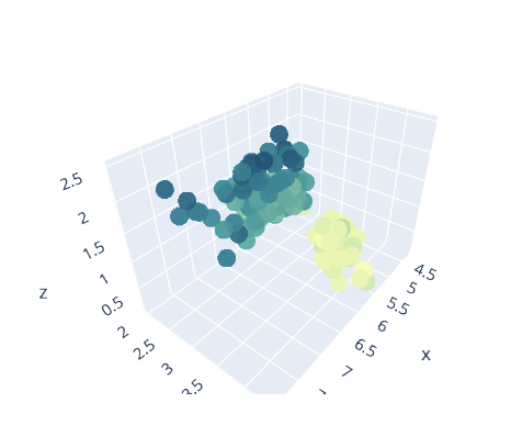
You can also specify a custom colorscale as shown:
x=df['sepal_length'],
y=df['sepal_width'],
z=df['petal_width'],
mode='markers',
marker = dict(
size=8,
color=df['petal_width'],
opacity=.9,
colorscale=px.colors.sequential.Bluyl
)
Output:
Closing
In this article, you have learned how to use the Scatter3d class in the Plotly graph_objects module to create 3d scatter plots of various types. Feel free to explore the docs for more.
Thanks for reading & Happy coding!!


