Let us discuss how we can use the Plotly graph_objects module to create OHLC charts.
Simple OHLC Chart
To illustrate how to create an OHLC chart, we will use the Plotly finance dataset in the resource below:
https://github.com/plotly/datasets/blob/master/finance-charts-apple.csv
We can then run the code as shown:
import pandas as pd
df = pd.read_csv('https://raw.githubusercontent.com/plotly/datasets/master/finance-charts-apple.csv')
fig = go.Figure(data=go.Ohlc(
x=df['Date'],
open=df['AAPL.Open'],
high=df['AAPL.High'],
low=df['AAPL.Low'],
close=df['AAPL.Close']
))
fig.show()
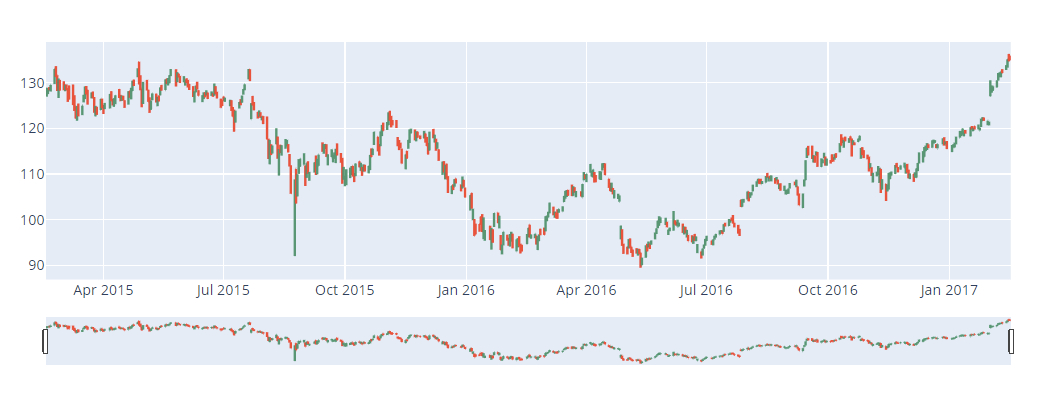
The code above should use the provided dataset to create an OHLC chart. The resulting figure is as shown:
You can use the Rangeslider to choose a specific date range.
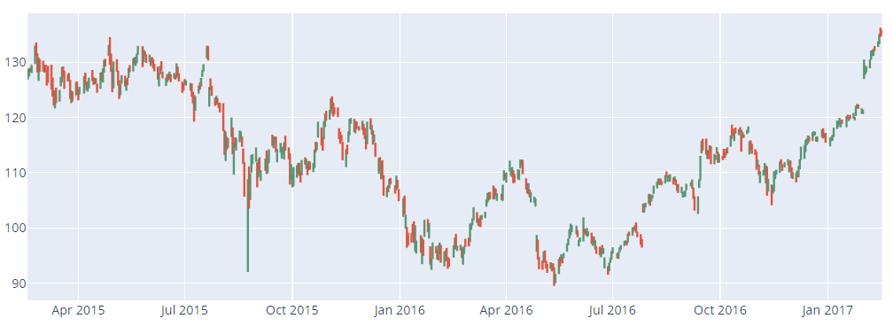
To hide the Range slider, you can run the code as:
This should return the OHLC Figure without the Range Slider as shown:
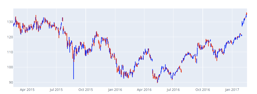
You can also set custom colors for increasing and decreasing points, as shown in the code below:
import pandas as pd
df = pd.read_csv('https://raw.githubusercontent.com/plotly/datasets/master/ finance-charts-apple.csv')
fig = go.Figure(data=go.Ohlc(
x=df['Date'],
open=df['AAPL.Open'],
high=df['AAPL.High'],
low=df['AAPL.Low'],
close=df['AAPL.Close'],
increasing_line_color='blue', decreasing_line_color='red'
))
fig.update_layout(xaxis_rangeslider_visible=False)
The resulting figure is depicted below:
Closing
In this article, we covered the basics of creating OHLC Charts using the Plotly graph_objects package. Explore the docs for more.


