Indicator Attributes
To create an indicator chart with Plotly, you need to specify three main attributes. These include:
- value – defines the value to visualize.
- mode – specifies the visual element to draw.
- align – specifies the alignment of the number and delta value. The accepted values are left, center and right.
- domain – this sets the extent of the resulting indicator plot.
Gauge Chart Using Plotly Graph Objects
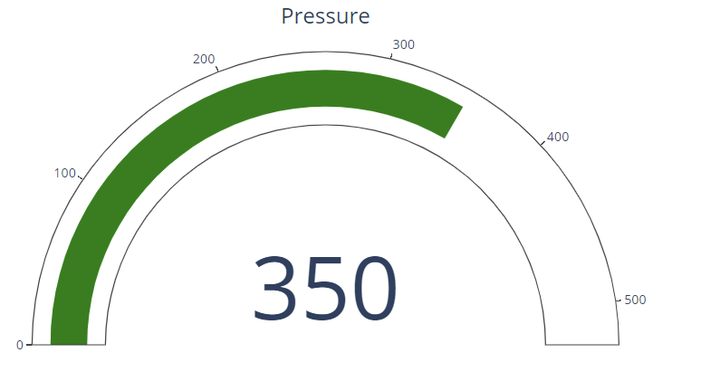
The code below illustrates how we can create a simple gauge chart using the Plotly graph_objects module.
fig = go.Figure(data=go.Indicator(
mode="gauge+number",
value=350,
title= {"text": "Pressure"},
domain={'row': 0, 'column': 0}
))
fig.show()
The code above should return a gauge indicator with the max value specified in the value parameter.
An example output is as shown:
Simple Bullet Gauge
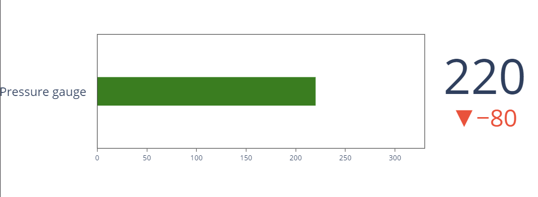
You can also create a simple bullet gauge plot as shown in the code below:
fig = go.Figure(go.Indicator(
mode = "number+gauge+delta",
gauge = {'shape': "bullet"},
delta = {'reference': 300},
value = 220,
domain = {'x': [0.1, 1], 'y': [0.2, 0.9]},
title = {'text': "Pressure gauge"}))
fig.show()
Output:
Closing
This short article describes how you can create indicator charts using the plotly graph_objects module. Explore the docs for more.


