Dash also offers unparalleled customization for the plots and figures in a simple config entry. In this tutorial, we will learn how to use the Dash configuration features to hide the modebar.
Let’s get started.
Installing Plotly Dash
Before getting started on the Dash configuration features, it is good to ensure that Dash is installed and available on your system.
We can do by running pip as shown:
If you are using Jupyter Notebook or a similar Jupyter environment, you can install Dash by running the command:
Keep in mind that you will require Pandas to use Plotly Express.
Creating a Simple Dash App
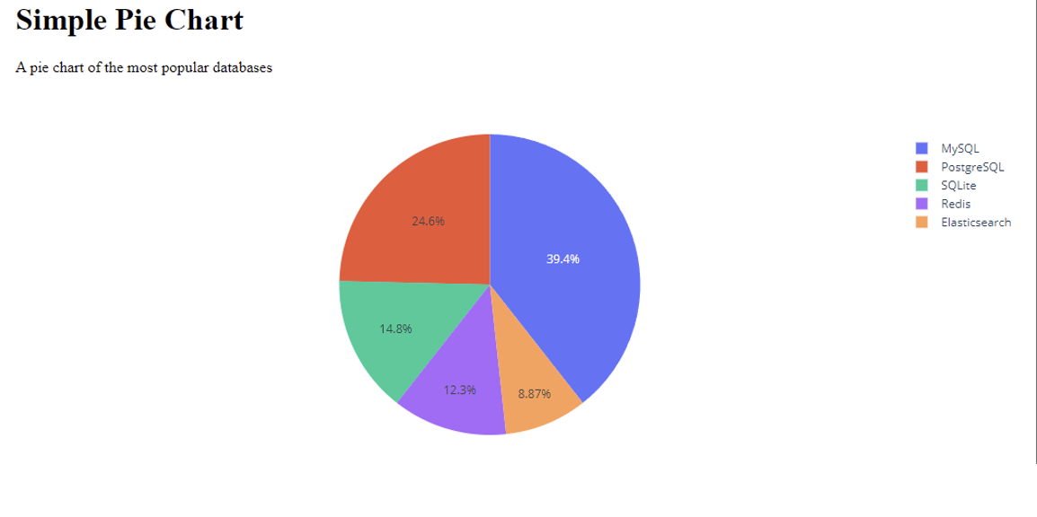
The next step is to create a simple web application using Dash. For this tutorial, we will use a Pie chart which is both simple and informative.
Consider the source code as shown:
import plotly.express as px
import pandas as pd
app = Dash(__name__)
databases = ['MySQL', 'PostgreSQL', 'SQLite', 'Redis', 'Elasticsearch']
usage = [8000, 5000, 3000, 2500, 1800]
fig = px.pie(labels=databases, values=usage, names=databases)
app.layout = html.Div(children=[
html.H1(children='Simple Pie Chart'),
html.Div(children='''A pie chart of the most popular databases'''),
dcc.Graph(
id='pie',
figure=fig
)
])
if __name__ == '__main__':
app.run_server(debug=True)
In the code above, we start by importing the required module. We import Dash, html, and dcc from dash,. These modules will allow us to create a simple web app and plot the figure on the client.
Next, we create an app instance using Dash class.
In the next step, we create the data we wish to use. Since we are creating a simple pie chart, we set the labels and values as a list.
The next step is composing the layout. Here, we use various components such as html.Div., html.H1, and dcc.Graph.
The Dash component module provides us with useful components for popular HTML tags. For example, the html.H1 is a simple <h1> tag.
Keep in mind that not all components are HTML elements. For example, Dash core components are high-level components generated through the React.js library
The children property allows us to pass the data that we wish to display. This is the first attribute which means you can skip it.
Once completed, we can run the app with the command:
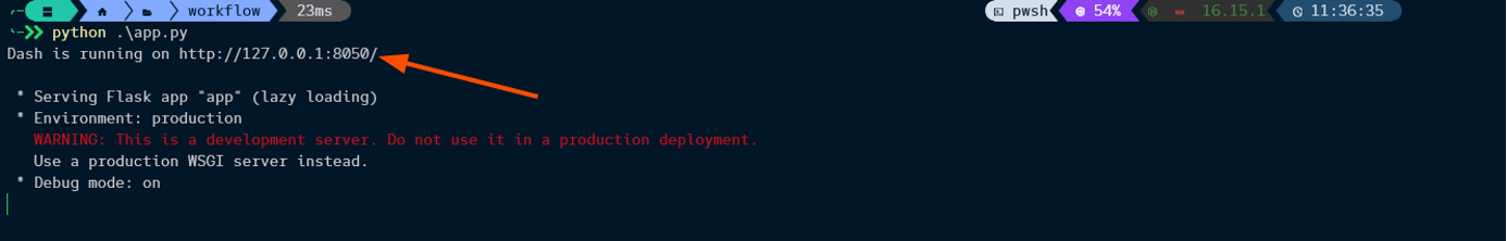
We can then visit the target URL to view the plot as:
Dash Hide Modebar
You will notice that the Modebar appears on hover. Although this can be useful, it can also result in poor visibility, especially on small devices.
To hide the modebar in Plotly Dash, we can use the config parameter and set the displayModeBar to false as shown:
id='pie',
figure=fig,
config={
'displayModeBar': False
}
Using the config parameter in the dcc.Graph component, we can specify the ‘displayModeBar’ property to False. This should remove the Modebar from the figure.
Closing
In this tutorial, you learned the basics of customizing Plotly dash components. We also covered how to disable the modebar from Figures in Dash.