In this article, we will explore how you can work with legends in your Plots using Plotly.
Let’s get started.
Plotly Show Legend
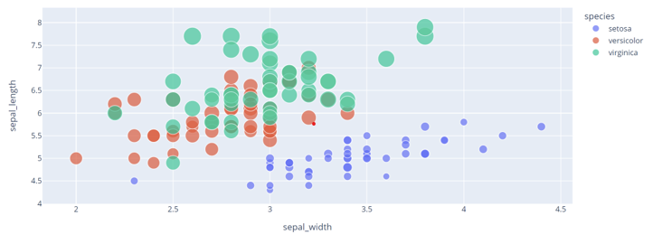
By default, Plotly will include a legend for any plot that supports it. We can illustrate this as shown in the scatter plot below:
df = px.data.iris()
fig = px.scatter(df, x="sepal_width", y="sepal_length", size="petal_length", color="species")
fig.show()
Using a simple scatter plot using the Iris data, we can get a scatter plot as shown below:
Note that the Legend is shown by default.
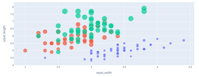
To disable the Legend, we can use the update_layout() function and set the showlegend parameter to false.
The code is as shown below:
In this cases, running the code above should print the Scatter plot without the Legend map as shown below:
Set Legend Title – Plotly Express
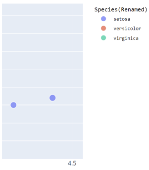
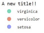
To change the title of a legend, we can use the update_layout() parameter and set the title value as shown in the example code below:
title="Species(Renamed)"
))
In these cases, we use the update_layout() function and pass the values to customize the Legend as a dictionary.
The code above should set a new legend title, as shown in the resulting figure below:
If you do not wish to update multiple parameters of the plot, you can use the legend_title_text parameter to set the legend title as shown:
This removes the need to specify the title as a dictionary and only update the legend title.
The resulting figure:
Customize Legend Title
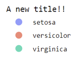
We can also customize other aspects of a legend title, such as color, font, and size, as shown:
title="Species(Renamed)",
font=dict(
family="Consolas",
size=10,
color="black"
)
))
You will notice that we also specify the font parameters as a dictionary. The code above should set the legend title to the font “Consolas” with size ten and the color black.
Customize Legend Order
Sometimes, you may want to modify the order in which the items appear on the Legend. You can accomplish this using the legend_traceorder parameter.
An example code is as shown below:
Setting the trace order reverses the order in which the items appear.
Customize Legend Item Gap
To modify the gap between the legend items, use the legend_tracegroupgap parameter. For example:
The code above should update the legend items with the specified value.
Plotly Legend Using Graph Objects
Graph Objects provide more control over your plots. However, the ability to create legends for your plots does not differ very much.
For example, the code below creates a scatter plot using Plotly graph_objects.
fig = go.Figure(data=go.Scatter(
x=[10,20,30,40,50],
y=[10,20,30,40,50],
name="sample1"
))
fig.add_trace(go.Scatter(
x=[10,20,30,40,50],
y=[50,40,30,20,10],
name="sample2"
))
fig.update_layout(legend_title_text="sample data")
fig.show()
In the code above, we start importing Plotly’s graph_objects as go.
We then use the Figure class to create a Scatter plot with random data. Next, we add a new scatter using the add_trace() function.
Finally, we set the legend title using the update_layout() function.
Similarly, the show legend parameter is set to true by default in both Plotly Express and Graph Objects.
Conclusion
In this article, you explored how to work with Legends in Plotly. You also learned how to show and hide legends, customizing the title, font, size, color, etc.

