In this article, we will explore how to create icicle plots using the Plotly Express module.
Plotly.express.icicle()
To create an icicle plot with plotly, we use the icicle() function. The function syntax is as shown:
The following are the most common parameters you will need to use when working with the icicle plots:
- Data_frame – specifies data frame whose values are used as column names for the plot.
- Names – specifies the values used as labels for the sectors. You can pass this as column name within a data frame or a Pandas Series.
- Values – specifies the values used to set the values associated with the sectors. Similar to the names parameter, you can pass this value as a column name or a Pandas Series.
- Parents – specifies the values used as the parents.
- Path – defines the values used for defining the hierarchy of the sectors.
- Ids – sets the values used to set the ids of the sectors. You can pass this value either as a column within a DataFrame or a Pandas Series.
- Color – defines the values used to assign a unique color to the marks of the plot.
- Title – sets the title for the figure.
- Width/height – sets the width and height of the figure in pixels.
The function will return the icicle chart as graph_objects.Figure type.
Basic icicle Plot
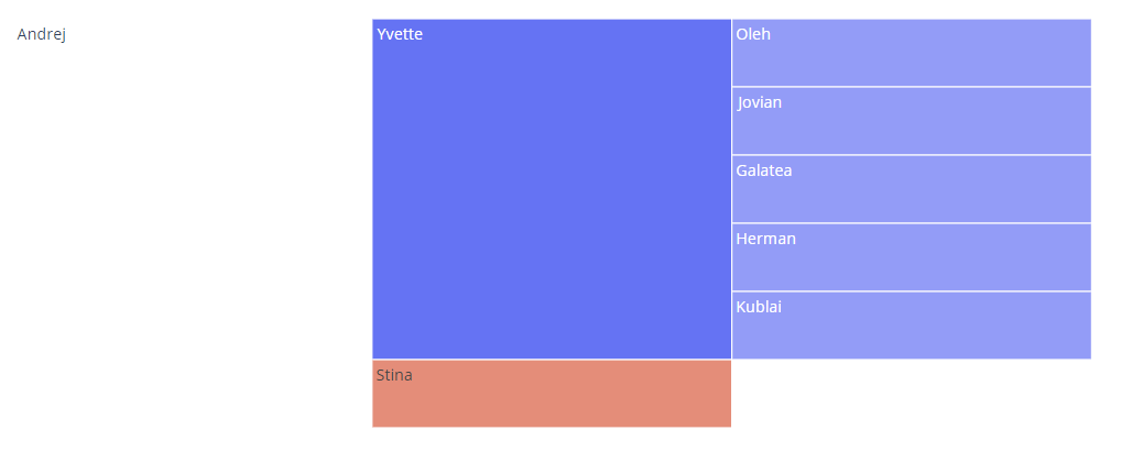
To illustrate how to create an icicle chart using Plotly Express, we can run a sample code as shown:
df = dict(
names = ['Oleh', 'Jovian', 'Galatea', 'Herman', 'Kublai', 'Yvette', 'Stina', 'Andrej'],
parents=['Yvette', 'Yvette', 'Yvette', 'Yvette', 'Yvette', 'Andrej', 'Andrej', ''],
)
fig = px.icicle(df, names='names', parents='parents')
fig.show()
The code above should return a figure as shown:
Specifying Path
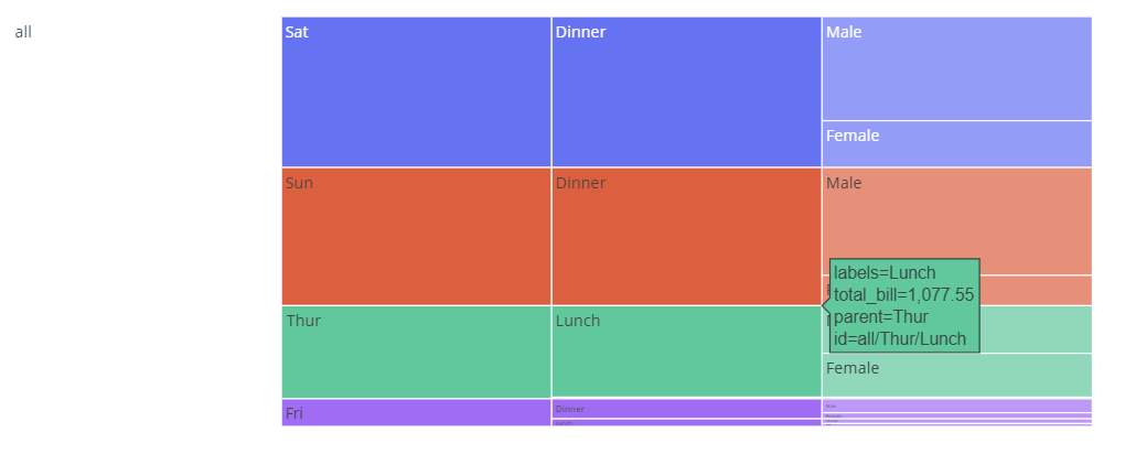
We can represent hierarchical data with each column representing a different level of hierarchy. We can use the path parameter to represent to path for the data as shown:
fig = px.icicle(df, path=[px.Constant('all'), 'day', 'time', 'sex'], values='total_bill')
fig.show()
The resulting figure:
Set Color
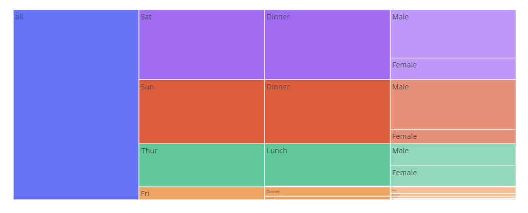
We can also specify the column which we wish to use as the color for the sectors. Example:
fig = px.icicle(df, path=[px.Constant('all'), 'day', 'time', 'sex'], values='total_bill', color='day')
fig.show()
Figure:
And that’s it for this one.


