In this article, we explore how we can create the choropleth maps using the Plotly express module.
Plotly.express.choropleth()
To create a choropleth map using the express module, we use the choropleth() function. The function takes on a syntax as shown in the following:
The following are the most common function parameters that you need to know:
- data_frame – Specifies the variable holding the column used in the plot. You can pass this value as a DataFrame, a dictionary, or an array like object.
- Lat -Specifies the values used to position the marks along the latitude marks on a map. You can pass this value as a column name within the DataFrame or a Pandas Series.
- Lon – Similar to lat but the values of this parameter are used to place the marks along the longitude on the map.
- locations – Specifies the values interpreted according to the locationmode parameter and mapped to the longitude and latitude.
- locationmode – Specifies the set of locations used to match the entries in the locations to the regions of the map.
- Geojson – Specifies the collection containing the IDs which are referenced by the locations.
- color – Specifies the values used to assign a unique color to the marks.
- scope – Specifies the map scope. The default values are set to world. The accepted values are as follows:
- ‘world’
- ‘usa’
- ‘europe’
- ‘asia’
- ‘africa’
- ‘north america’
- ‘south america’
- center – Sets the center point of the map.
- title – Provides a title for the choropleth map.
- width/height – Sets the width and height of the figure in pixels.
Basic Choropleth Map
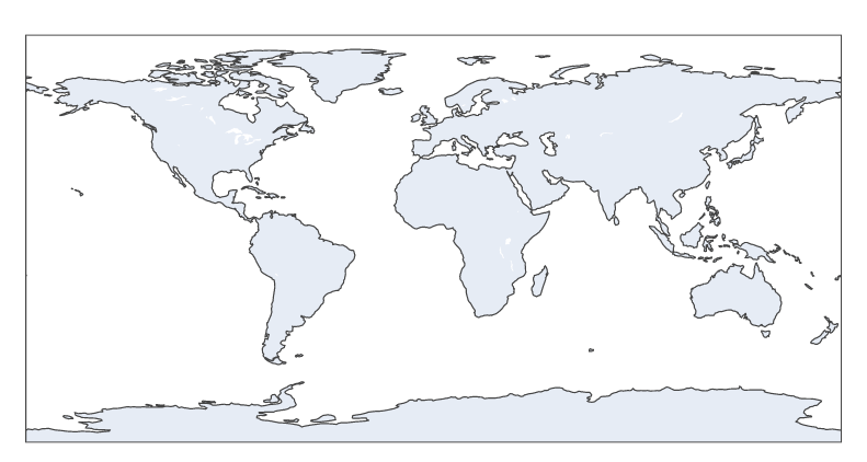
We can create a world map using the choropleth function as shown in the following:
fig = px.choropleth(locationmode='USA-states', scope='world', color=[1])
fig.show()
The previous code creates a world map as shown in the following:
Highlight Specific Areas
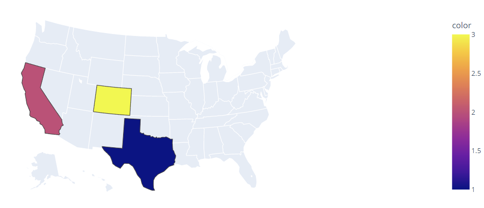
We can highlight some specific areas on a map using the locations parameter. For example, to highlight the various states, we can run the following code:
fig = px.choropleth(locations=["TX", "CA", "CO"], locationmode='USA-states', scope='usa', color=[1,2,3])
fig.show()
In this example, we specify the states that we wish to highlight using their state code in the locations parameter.
The resulting figure is as shown in the following:
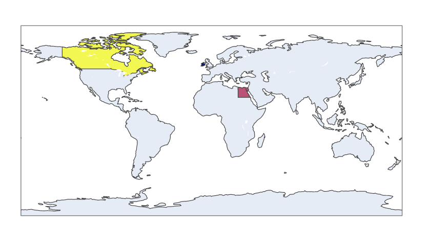
We can accomplish the same in a world map as shown in the following code:
fig = px.choropleth(locations=['Ireland', 'Egypt', 'Canada'], locationmode='country names', scope='world', color=[1,2,3])
fig.show()
The given code returns a choropleth plot with the world map and the previously highlighted countries.
Output:
We can also create a choropleth based on a DataFrame data. For example, we can use the gapminder data from the Plotly data as shown in the following:
df = px.data.gapminder().query('year==2007')
fig = px.choropleth(df, locations='iso_alpha', color='pop')
fig.show()
The given plot returns the following figure:
This figure depicts the world population.
Conclusion
This article covers the fundamentals of creating and working with choropleth maps in Plotly.


