In Salesforce LWC, if you want to allow the user to select an option from the specified list of options, combobox is used. In this guide, we will discuss how to create a combobox and the different attributes supported by combobox with examples.
Combobox
Basically, combobox is a read-only field which provides an input to choose an option from the specified options. We can create this using the lightning-combobox tag. The attributes are speed one after another which is separated by space. Let’s discuss some attributes that are required while creating a combobox.
- label – This is used to specify the label (text) for your combobox.
- options – Each option takes the “label” and “value” attributes. We can specify the multiple options in a list separated by comma.
- placeholder: Before selecting an option, the user needs to know the information related to options. So, this attribute is specified.
- required: In some case, it is mandatory to select the option. We can make it required by specifying this attribute.
- disabled: It can be possible to prevent the user by selecting the option from the checkbox. This attribute disables the combobox.
Syntax:
Let’s see how to create a combobox with some important attributes.
name="name"
label="label_name"
value={value_from_the_option}
placeholder="Help Text"
options={List_of_options}
onchange={handleChange} >
</lightning-combobox>
Specification:
Let’s see the steps to create the combobox and work with it.
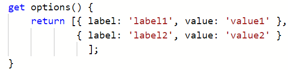
In the JavaScript file, create a list of options with label and value inside the “getter” method.
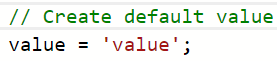
Create a variable that stores the default option.
Write the handle function that stores the option that is selected by the user from the UI.
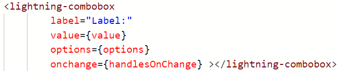
In the HTML file, create a combobox and pass the attributes. Also, we need to pass the onchange() event handler that handles the options in the combobox. It takes the “Handler” function created in the “js” file.
In all the examples that we are going to discuss in this guide, logic will be provided as the “js” code. After that, we specify the screenshot that includes the entire “js” code.
Example 1:
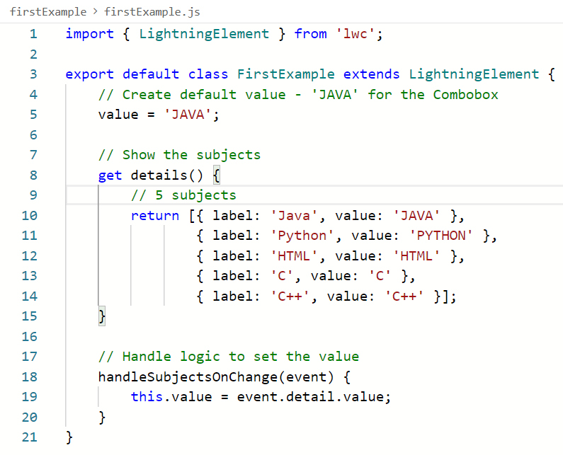
Create a combobox with five subjects (details) in the Javascript file. Specify the default value as “JAVA”. Handle the combobox in the handleSubjectsOnChange() method. Pass the value and details to the “value and options” attributes in the HTML file with a label and deploy the component.
firstExample.html
<lightning-card title="Subjects Combobox">
<div class="slds-var-m-around_medium">
<lightning-combobox
label="Select your Subject:"
value={value}
options={details}
onchange={handleSubjectsOnChange} ></lightning-combobox>
<br>
<p>Your Subject: <b>{value}</b></p>
</div>
</lightning-card>
</template>
firstExample.js
value = 'JAVA';
// Show the subjects
get details() {
// 5 subjects
return [{ label: 'Java', value: 'JAVA' },
{ label: 'Python', value: 'PYTHON' },
{ label: 'HTML', value: 'HTML' },
{ label: 'C', value: 'C' },
{ label: 'C++', value: 'C++' }];
}
// Handle logic to set the value
handleSubjectsOnChange(event) {
this.value = event.detail.value;
}
}
Entire Code:
firstComponent.js-meta.xml
<LightningComponentBundle xmlns="http://soap.sforce.com/2006/04/metadata">
<apiVersion>57.0</apiVersion>
<isExposed>true</isExposed>
<targets>
<target>lightning__AppPage</target>
<target>lightning__RecordPage</target>
</targets>
</LightningComponentBundle>
Output:
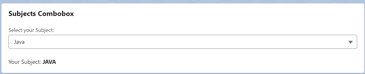
Add this component to the “Record” page of any object. In the HTML file, we display the value in the paragraph tag. When a user chooses any option, it will be displayed as bold. By default, “JAVA” is selected and displayed after the component is rendered on the page.
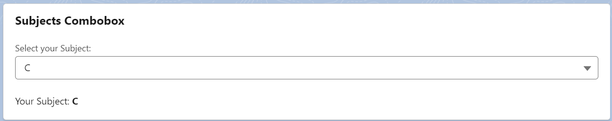
Let’s choose the subject as “C”. “C” is returned below the combobox.
Example 2:
In this example, we will render the different components based on the Campaign Type picklist values (from the Campaign object).
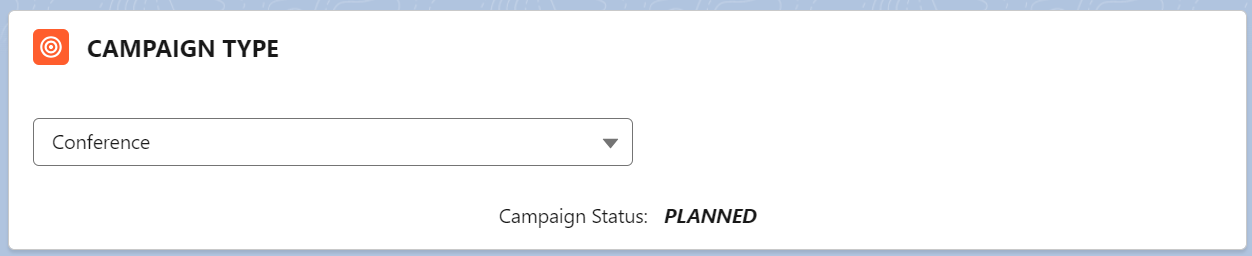
- If the Campaign type is “Conference”, we will render the template that returns the text – Campaign Status: PLANNED
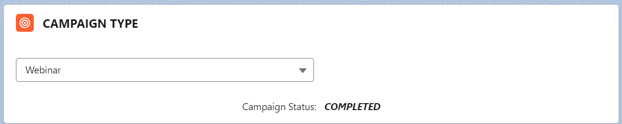
- If the Campaign type is “Webinar”, we will render the template that returns the text – Campaign Status: COMPLETED
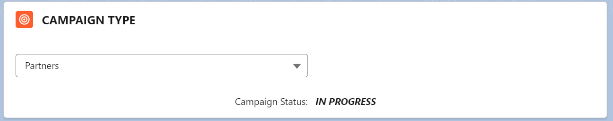
- If the Campaign type is “Partners”, we will render the template that returns the text – Campaign Status: IN PROGRESS
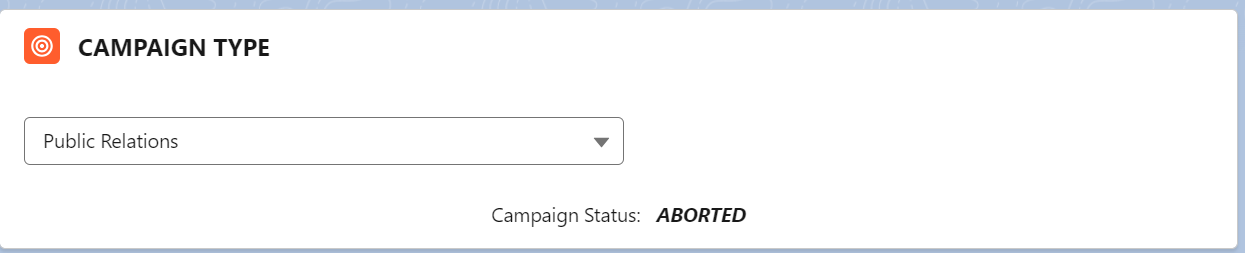
- Campaign Status: ABORTED for the rest of the options.
secondExample.html
<lightning-card title="CAMPAIGN TYPE" icon-name="standard:campaign" >
<div class="slds-var-m-around_medium" style="height:20px; width:400px">
<template lwc:if={CampaignTypeValues.data}>
<lightning-combobox value={value}
options={CampaignTypeValues.data.values}
onchange={handleChange} >
</lightning-combobox>
</template><br/>
</div>
<br><br>
<template lwc:if={conferenceval}>
<center> Campaign Status: <b><i> PLANNED</i></b> </center>
</template>
<template lwc:elseif={webinarval}>
<center> Campaign Status: <b><i> COMPLETED</i></b> </center>
</template>
<template lwc:elseif={partnerval}>
<center> Campaign Status: <b><i> IN PROGRESS</i></b> </center>
</template>
<template lwc:else>
<center> Campaign Status: <b><i> ABORTED</i></b> </center>
</template>
</lightning-card>
</template>
secondExample.js
We import the Campaign object (Standard) as CAMPAIGN and Type from it as TYPE. From the lightning/uiObjectInfoApi, we import the getPicklistValues and getObjectInfo. These will get the picklist values available in the Type field. These will be utilized as options for the combobox. The following are handled in the handleChange().
- If the value === “Conference”, we set the conferenceval variable to true and the other two as false.
- If the value === “Webinar”, we set the webinarval variable to true and the other two as false.
- If the value === “Partners”, we set the partnerval variable to true and the other two as false.
- If the value is not in the given options, all are false.
import CAMPAIGN from '@salesforce/schema/Campaign';
import TYPE from '@salesforce/schema/Campaign.Type';
import { getPicklistValues } from 'lightning/uiObjectInfoApi';
import { getObjectInfo } from 'lightning/uiObjectInfoApi';
export default class SecondExample extends LightningElement {
@track value;
// Get the Object
@wire(getObjectInfo, { objectApiName: CAMPAIGN })
objectInfo;
// Get the Campaign Type - Picklist
@wire(getPicklistValues, { recordTypeId: '$objectInfo.data.defaultRecordTypeId', fieldApiName: TYPE})
CampaignTypeValues;
conferenceval=false;
webinarval=false;
partnerval=false;
other=false;
// Handle logic
handleChange(event) {
this.value = event.target.value;
if(this.value === 'Conference'){
// Display Status as PLANNED
this.conferenceval=true;
this.webinarval=false;
this.partnerval=false;
}
else if(this.value === 'Webinar'){
// Display Status as COMPLETED
this.webinarval=true;
this.conferenceval=false;
this.partnerval=false;
}
else if(this.value === 'Partners'){
// Display Status as IN PROGRESS
this.webinarval=false;
this.conferenceval=false;
this.partnerval=true;
}
else{
// Display Status as IN ABORTED
this.webinarval=false;
this.conferenceval=false;
this.partnerval=false;
}
}
}
secondComponent.js-meta.xml
<LightningComponentBundle xmlns="http://soap.sforce.com/2006/04/metadata">
<apiVersion>57.0</apiVersion>
<isExposed>true</isExposed>
<targets>
<target>lightning__AppPage</target>
<target>lightning__RecordPage</target>
</targets>
</LightningComponentBundle>
Output:
Type – “Conference”. So, the status is “PLANNED”.
Type – “Webinar”. So, the status is “COMPLETED”.
Type – “Partners”. So, the status is “IN PROGRESS”.
The type is not in the provided options. So, the status is “ABORTED”.
Example 3:
Now, we create a combobox with the Campaign records as options. If we select any option, the corresponding Campaign type will be returned on the UI.
First, we need to create an Apex class with the getCampaign()method. This method returns a list of all Campaigns with the id, name, type, and status.
public with sharing class CampaignRecords {
@AuraEnabled(cacheable=true)
// Get the list of Campaigns
public static List<Campaign> getCampaign() {
return [SELECT Id, Name ,Type, Status from Campaign];
}
}
thirdExample.html
<lightning-card title="CAMPAIGN TYPE" icon-name="standard:campaign">
<div class="slds-var-m-around_medium" style="height:20px; width:400px">
<lightning-combobox name="Campaign"
label="Select Campaign Name"
options={Campaignoptions}
value={value}
onchange={handleonchange}
>
</lightning-combobox>
</div><br>
<br>
<p>Campaign Type for this Campaign: <b>{value}</b></p>
</lightning-card>
</template>
thirdExample.js
- We need to specify the method that gets a list of Campaigns inside the connectedcallback() method. Declare an array named “camps” and store the result with the label as Campaign ID and the value as Campaign Type. This array is the input to the campaignNames (this has to be created with the track decorator).
- In the Campaignoptions() getter method, return the campaignNames array. So, combobox uses these options.
- Set the selected value in the handleonchange() handler method.
import getCampaign from '@salesforce/apex/CampaignRecords.getCampaign';
export default class ThirdExample extends LightningElement {
value = '';
@track campaignNames = [];
get Campaignoptions() {
return this.campaignNames;
}
// Add the options to the camps array from the Apex.
// label will be the Campaign Name
// value will be the Campaign Type
connectedCallback(){
getCampaign()
.then(result =>{
let camps = [];
for(var k=0; k<result.length ; k++){
camps.push({label : result[k].Name, value : result[k].Type});
}
this.campaignNames = camps;
})
}
// Handle the value
handleonchange(event){
this.value = event.detail.value;
}
}
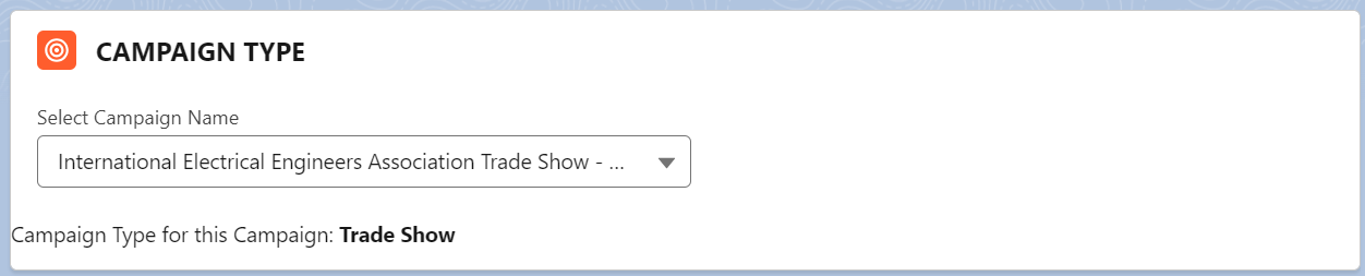
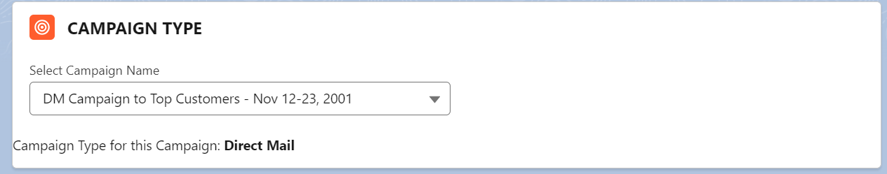
Output:
Let’s select the record and see the type.
Conclusion
We learned how to create a combobox in LWC with attributes and examples. First, we created a combobox with a list of values and displayed the selected value. Next, we render the HTML template based on the selected value through the conditional rendering. Lastly, we learned how to create the options for the combobox from the existing Salesforce records and display the related fields on the UI.