Pie Chart
A pie chart (known as circle chart) divides the statistical graphics into sectors to illustrate the numeric problems. In D3.js, the pie() function constructs a new pie generator. This generator basically computes the angles to represent a donut or pie chart. It takes an array of data (if the input array of dictionaries, it takes values from all the dictionaries). Each data point is an arc angle. Look at the following syntax:
const pie = d3.pie();
const arcs = pie(input_data);
The arcs hold the array of objects in the following structure:
{"data": value, "value": value, "index": index, "startAngle": start_angle, "endAngle": end_angle, "padAngle": padding_angle},
...
...
]
- data – It refers to the input datum which corresponds to an element in the input array.
- value – It specifies the numeric value for the arc.
- index – It specifies the arc-index, i.e sorted arc index.
- startAngle – It specifies the start angle of the arc.
- endAngle – It specifies the end angle of the arc.
- padAngle – It specifies the pad angle of the arc.
1. Building the Basic Pie Chart
Let’s build a basic pie chart by following the given steps. At each step, the syntax is provided like an example. Mostly, each step includes selecting SVG, passing the attributes to the functions that we are using at each step.
Place this script inside your head tag in the HTML template.
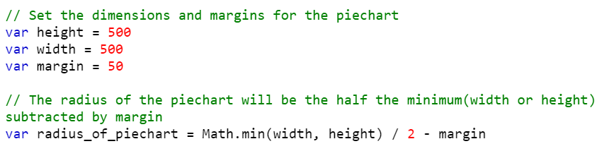
Step 1: Set the Margins, Dimensions, and Radius for the Pie Chart
The first step is to set up the margins and dimensions to the pie chart which is going to be created.
1. Create four variables – width, height, margin, and radius_of_piechart. Make sure that the radius should be half of the minimum of width and height that is subtracted by the margin. We can compute it as – Math.min(width, height) / 2 – margin.
Example:
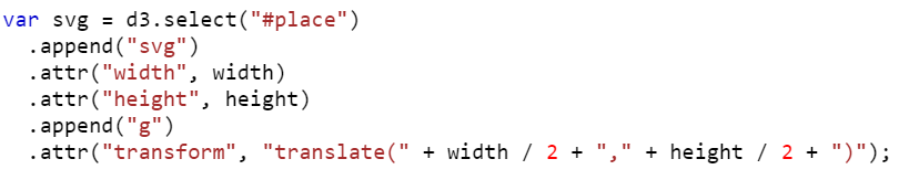
Step 2: Append the SVG (Scalable Vector Graphics) Object
In this step, we need to append the SVG by creating the “div” container and select the container to inject the SVG.
1. Create a div (with the following syntax) container in the body of the HTML template by passing the ID (this holds the svgContainer).
2. Select the container (svgContainer) to inject the SVG element and append the SVG. Adjust the width and height of the svgContainer by passing the width and height attributes.
Example: We can also transform the SVG. Also, appending the “g” element groups the shapes together. Here, the ID value is “place”.
Step 3: Define the Data
Next, we have to declare the data for the pie chart.
Example: Create the Subject_followers array of dictionaries with five entries.

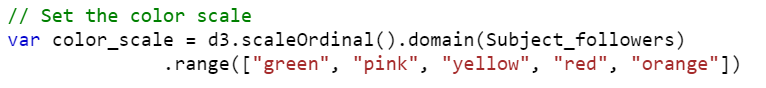
Step 4: Setup the Color Scale
The next step is to create an Ordinal Scale with domain. The d3.scaleOrdinal() function is used to construct the ordinal scale with the specified domain and the specified range. We need to pass the input data as the domain and the range takes colors.
Example:
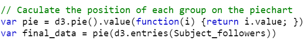
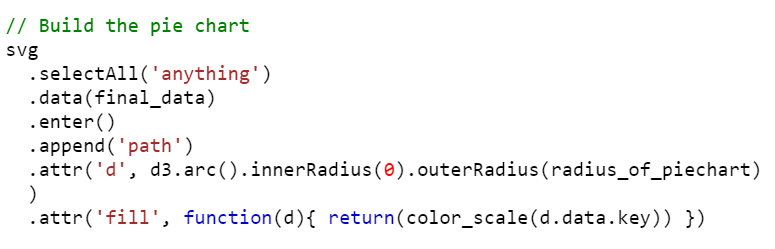
Step 5: Generate and Build the Pie Chart
1. As discussed about the pie() function in this guide, create a pie chart that takes the value in our input array of dictionaries.
Example:
2. Select anything from the SVG and pass the final_data to the data().
a. Set the inner radius as 0 for the pie chart (if the inner radius is greater than 0, it creates a donut chart).
b. Set the outer radius as the radius that is defined in the script.
c. Fill the colors from the color scale through the “fill” attribute.
Example:
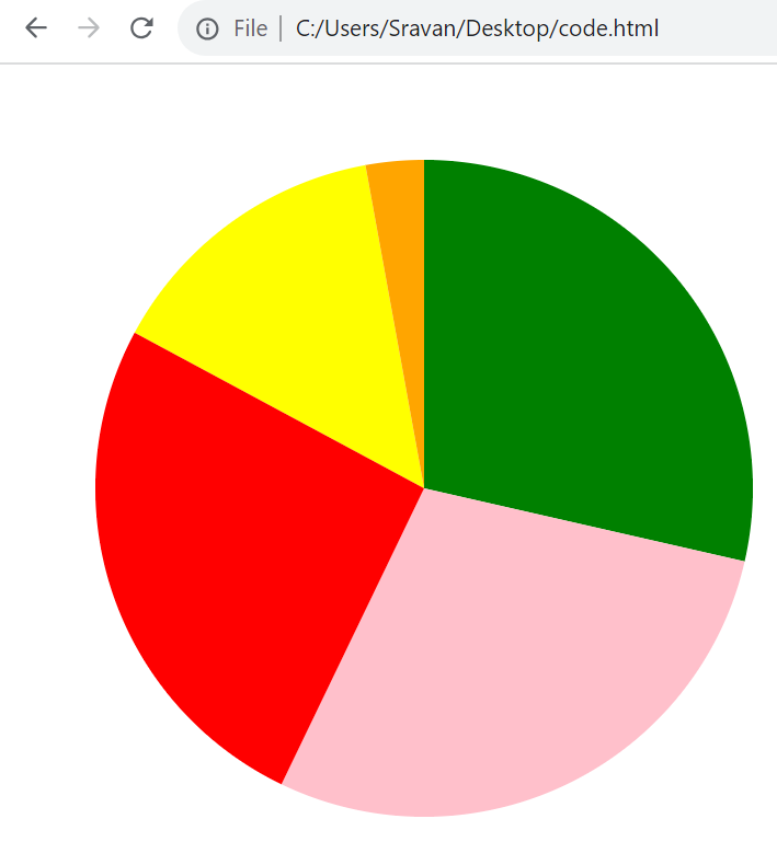
Complete Example:
Create a pie chart by combining all the examples that are discussed in each step.
<head>
<script src="https://d3js.org/d3.v4.js"></script>
</head>
<body>
<div id="place"></div>
<script>
// Set the dimensions and margins for the pie chart
var height = 500
var width = 500
var margin = 50
// The radius of the pie chart will be the half the minimum(width or height) subtracted by margin.
// Use math.min() function that will return the minimum width/height and then separate it from the margin.
var radius_of_piechart = Math.min(width, height) / 2 - margin
var svg = d3.select("#place")
.append("svg")
.attr("width", width)
.attr("height", height)
.append("g")
.attr("transform", "translate(" + width / 2 + "," + height / 2 + ")");
// Input data - Subject_followers
var Subject_followers = {Python: 20, Java: 20, CPP:10, HTML:18, PHP:2}
// Set the color scale
var color_scale = d3.scaleOrdinal().domain(Subject_followers)
.range(["green", "pink", "yellow", "red", "orange"])
// Calculate the position of each group on the pie chart
var pie = d3.pie().value(function(i) {return i.value; })
var final_data = pie(d3.entries(Subject_followers))
// Build the pie chart
svg
.selectAll('anything')
.data(final_data)
.enter()
.append('path')
.attr('d', d3.arc().innerRadius(0).outerRadius(radius_of_piechart)
)
.attr('fill', function(d){ return(color_scale(d.data.key)) })
</script>
</body>
</html>
Output:
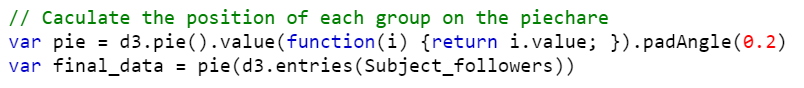
2. Pie Chart with PadAngle()
It can be possible to specify the angular separation in radians between the adjacent arcs. The padAngle() function sets the pad angle to the specified number.
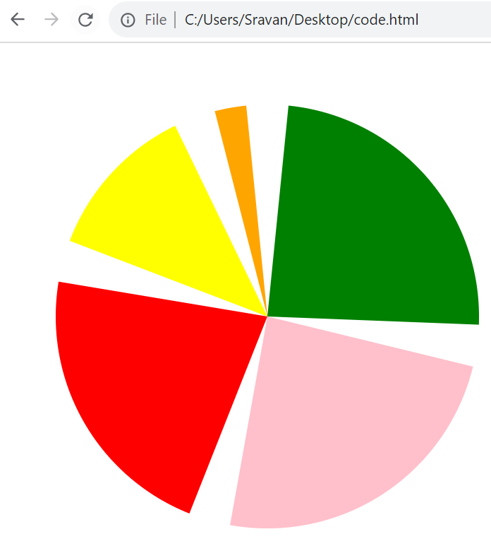
Example 1:
Use the previous code and specify the padAngle(0.2).
Output:
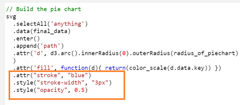
Example 2:
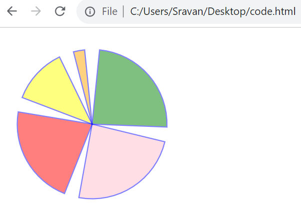
1. Add the stroke color to “blue” by passing the “stroke” attribute.
2. Set the stroke width to “3px” by passing the “stroke-width” attribute to the style().
3. Set the opacity (colors in the pie chart) to 0.5 by passing the “opacity” attribute to the style().
Output:
3. Adding Annotations to the Pie Chart
Let’s see how to annotate each group in the pie chart with a key from the input array of dictionaries. We need to specify the labels for each group at the center of the arc. For this, we need to utilize the centroid() function.
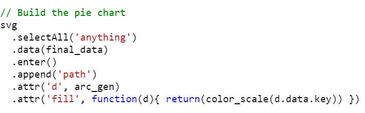
1. First, we need to build the arc using the arc() function with the innerRadius of 0 and the outer radius as the defined radius.

2. Next, we need to build the pie chart by passing the arc_gen using the “d” attribute.
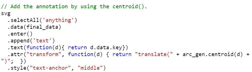
3. Lastly, we need to add the annotation using the centroid() function.
a. The text label is the key from the dictionary that is present in the array.
b. Pass the centroid() function to the “transform” attribute.
c. Pass the “text-anchor” as “middle” to the style() attribute.
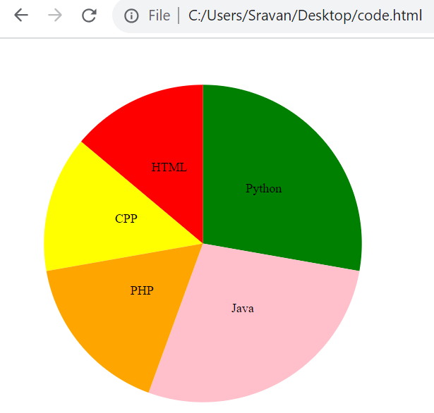
Example 1:
Use the same code that is discussed in the first example under basic pie chart. Add the annotations to the pie chart using the previous steps.
<head>
<script src="https://d3js.org/d3.v4.js"></script>
</head>
<body>
<div id="place"></div>
<script>
// Set the dimensions and margins for the pie chart
var height = 500
var width = 500
var margin = 50
// The radius of the pie chart will be the half the minimum(width or height) subtracted by margin.
// Use math.min() function that will return the minimum width/height and then separate it from the margin.
var svg = d3.select("#place")
.append("svg")
.attr("width", width)
.attr("height", height)
.append("g")
.attr("transform", "translate(" + width / 2 + "," + height / 2 + ")");
// Input data - Subject_followers
var Subject_followers = {Python: 20, Java: 20, CPP:10, HTML:10, PHP:12}
// Set the color scale
var color_scale = d3.scaleOrdinal().domain(Subject_followers)
.range(["green", "pink", "yellow", "red", "orange"])
// Calculate the position of each group on the pie chart
var pie = d3.pie().value(function(i) {return i.value; })
var final_data = pie(d3.entries(Subject_followers))
// Build arcs
var arc_gen = d3.arc().innerRadius(0).outerRadius(radius_of_piechart)
// Build the pie chart
svg
.selectAll('anything')
.data(final_data)
.enter()
.append('path')
.attr('d', arc_gen)
.attr('fill', function(d){ return(color_scale(d.data.key)) })
// Add the annotation by using the centroid().
svg
.selectAll('anything')
.data(final_data)
.enter()
.append('text')
.text(function(d){ return d.data.key})
.attr("transform", function(d) { return "translate(" + arc_gen.centroid(d) + ")"; })
.style("text-anchor", "middle")
</script>
</body>
</html>
Output:
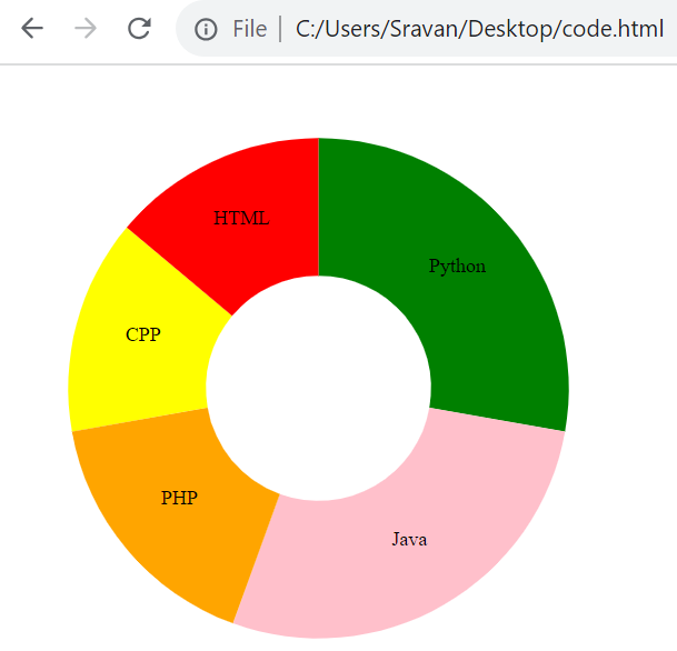
4. Bonus: Creating a Donut Chart with Annotations
We already discussed regarding the donut chart while creating the basic pie chart. If the inner radius is greater than 0, a donut chart will be generated.

Example:
Utilize the code that is discussed under Section 3 and create a donut chart by updating the innerRadius from 0 to 100.
<head>
<script src="https://d3js.org/d3.v4.js"></script>
</head>
<body>
<div id="place"></div>
<script>
// Set the dimensions and margins for the donut chart
var height = 500
var width = 500
var margin = 50
// The radius of the pie chart will be the half the minimum(width or height) subtracted by margin.
// Use math.min() function that will return the minimum width/height and then separate it from the margin.
var svg = d3.select("#place")
.append("svg")
.attr("width", width)
.attr("height", height)
.append("g")
.attr("transform", "translate(" + width / 2 + "," + height / 2 + ")");
// Input data - Subject_followers
var Subject_followers = {Python: 20, Java: 20, CPP:10, HTML:10, PHP:12}
// Set the color scale
var color_scale = d3.scaleOrdinal().domain(Subject_followers)
.range(["green", "pink", "yellow", "red", "orange"])
// Calculate the position of each group on the donut chart
var donut = d3.pie().value(function(i) {return i.value; })
var final_data = donut(d3.entries(Subject_followers))
// Build arcs
var arc_gen = d3.arc().innerRadius(90).outerRadius(radius_of_donutchart)
// Build the donut chart
svg
.selectAll('anything')
.data(final_data)
.enter()
.append('path')
.attr('d', arc_gen)
.attr('fill', function(d){ return(color_scale(d.data.key)) })
// Add the annotation by using the centroid().
svg
.selectAll('anything')
.data(final_data)
.enter()
.append('text')
.text(function(d){ return d.data.key})
.attr("transform", function(d) { return "translate(" + arc_gen.centroid(d) + ")"; })
.style("text-anchor", "middle")
</script>
</body>
</html>
Output:
Conclusion
Now, you are able to create the pie chart in D3.js with your own data with and without annotations. First, we discussed the steps to create a basic pie chart. Then, using the padAngle() function, we changed the padding to the arcs. Then, we changed the innerRadius which is greater than 0 to create a donut chart instead of a pie chart. If you want to specify the stroke color, width, and opacity to the pie chart, go through the example under Section 2.