This post will describe the procedure for detecting a mobile device using JavaScript.
How to Detect a Mobile Device With JavaScript?
Using the “window.matchMedia()” method with CSS media queries to detect mobile devices in a web app with JavaScript. The matchMedia() method provides a new MediaQueryList object, which can be used to identify whether or not the document matches the media query string and to keep track of it so that you can tell when it does or doesn’t match.
Syntax
Follow the mentioned syntax for detecting the mobile device in a web app:
This method outputs a new list of “MediaQuery” objects that verify if the document matches the media query string.
Example
In the JavaScript file, use a conditional statement where we will check the width of the device’s screen. It is considered a mobile device if the screen is 768px or less than 768px. Match this screen size with the returned media query list from the matchMedia() method. If it matches, show an alert message “Mobile Mode”; else, it is a “Desktop Mode”:
{
alert("Mobile Mode");
document.write("You are using a mobile device.");
}
else
{
alert("Desktop Mode");
document.write("You are using desktop.");
}
Output
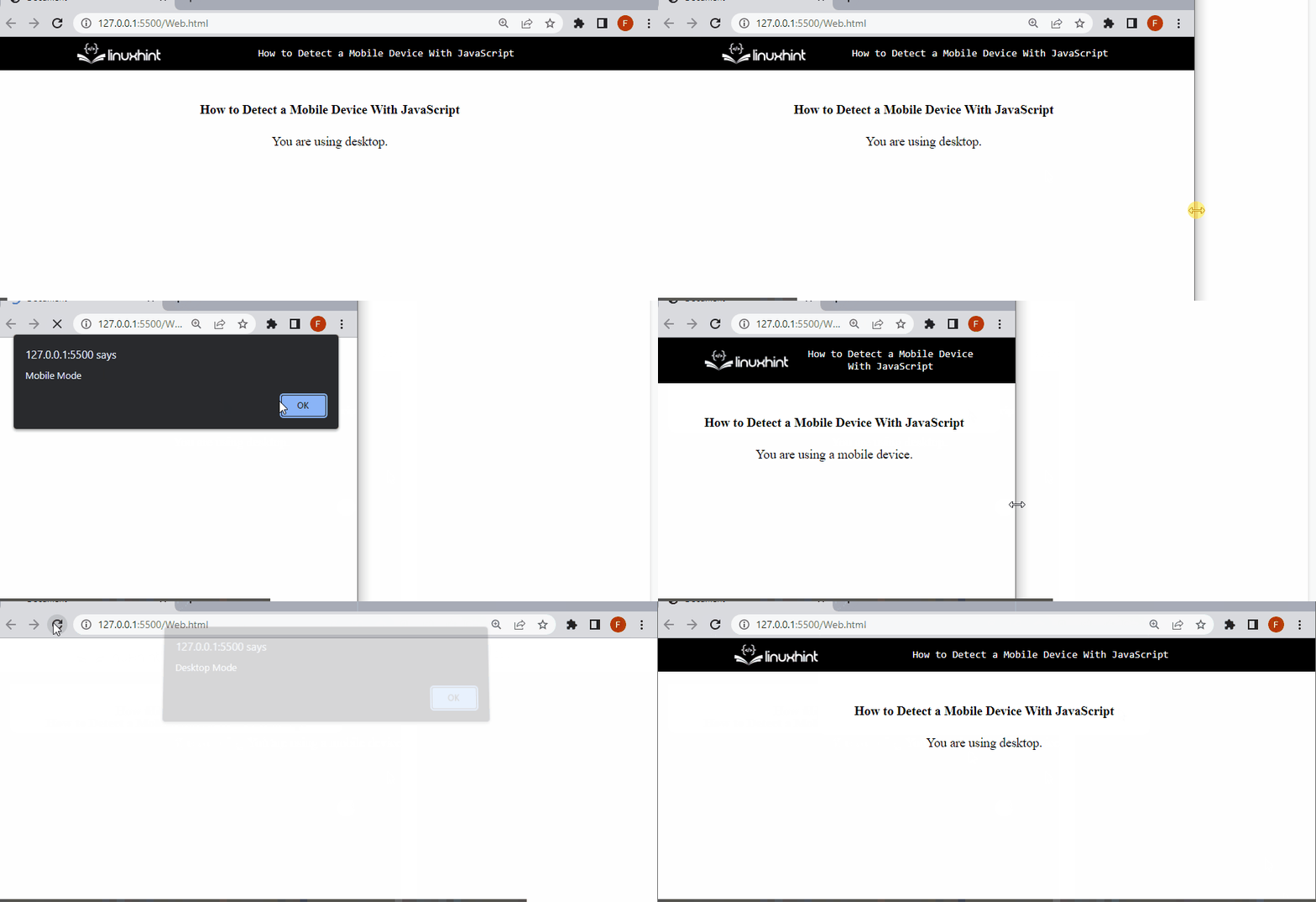
The above GIF shows when we have adjusted the document window, and the viewport is equivalent to the 768px. As a result, an alert message “Mobile mode” has been displayed.
Conclusion
For detecting mobile device mode on a web app, use the “window.matchMedia()” method with CSS media queries. It returns a new MediaQueryList object, which can be used to identify whether or not the document matches the media query string and to keep track of it so that you can tell when it does or doesn’t match. This post described the procedure for detecting a mobile device with JavaScript.

