This write-up explains the use of “columns-{count}” in Tailwind.
How to Use the “columns-{count}” in Tailwind?
Tailwind CSS “columns-{count}” utility allows the users to specify a set of columns for the specified HTML element content. It can be easily used with all the HTML elements to adjust its given content column-wise. The width of the column is automatically adjusted according to the column number.
Project File Structure
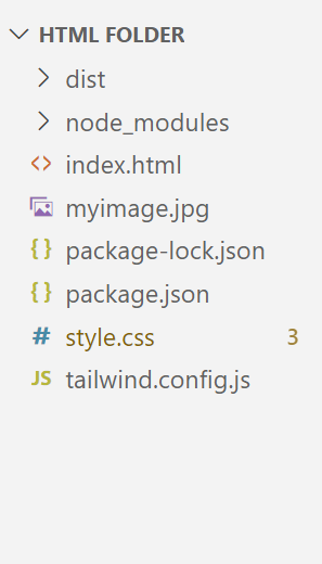
The “columns-{count}” utility can be used in any Tailwind project. The given file structure is taken as a sample to explain the use of the “columns-{count}” practically:
Step 1: Configure the Template Path
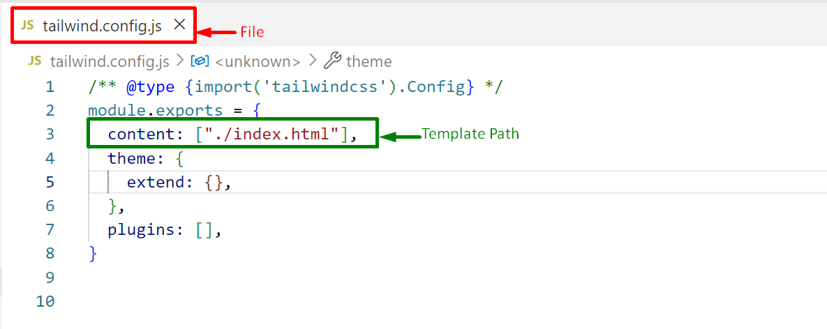
Firstly, configure the existing HTML file path in the “content” section of the Tailwind “tailwind.config.js” configuration file:
Press “Ctrl+S” to save the file.
Step 2: Write the HTML Code
Next, navigate to the existing “index.html” file and write a simple HTML code as well as use the “columns-count{}” utility to specify the number of columns with the particular element:
<link href="/dist/output.css" rel="stylesheet">
</head>
<body>
<h1 class="text-3xl font-bold text-center underline text-orange-600">Welcome to Linuxhint!</h1><br>
<div class="columns-4">
<img class="border-2 border-black object-cover h-48 w-96" src="./myimage.jpg" />
<img class="border-2 border-black object-cover h-48 w-96" src="./myimage.jpg" />
<img class="border-2 border-black object-cover h-48 w-96" src="./myimage.jpg" />
<img class="border-2 border-black object-cover h-48 w-96" src="./myimage.jpg" />
<img class="border-2 border-black object-cover h-48 w-96" src="./myimage.jpg" />
<img class="border-2 border-black object-cover h-48 w-96" src="./myimage.jpg" />
<img class="border-2 border-black object-cover h-48 w-96" src="./myimage.jpg" />
<img class="border-2 border-black object-cover h-48 w-96" src="./myimage.jpg" />
</div>
<body>
In this code block:
- First, link the main CSS file “/dist/output.css” with the existing HTML file “index.html” using the “<link>” tag in the “head” section.
- Next, the “body” section creates an “<h1>” element that uses the “Font Size”, “Font Weight”, “Text Align”, “Text Decoration”, and the “Text Color” Tailwind classes, respectively.
- After that, a “div” is added using the “<div>” tag that applies the “columns-count{}” utility to set its content in the specified number of columns.
- In the “<div>” element’s body section, eight images are added using the “<img>” tag specifying the image path using the “src” attribute.
- Also, apply the “Border Width”, “Border Color”, and the “Object Fit” Tailwind classes, respectively upon the added images.
Step 3: Output
Run the above HTML code in the live server and check the output:
As seen, the output sets the images in the specified columns i.e., “4” with the help of the “column-{count}” Tailwind utility.
Conclusion
“Tailwind CSS” provides the built-in “columns-{count}” utility that adjusts the HTML element content in accordance with the given number of columns. It can be used easily with any HTML element by specifying the “columns” with a positive integer value. This write-up deeply explained the use of “columns-{count}” in Tailwind.


