While creating interactive and user-friendly forms or portal pages on the site, the developers usually incorporate responsive progress bars that are appealing and let the user know of the completed status of the form or create a profile. These types of functionalities are of great aid in enhancing the user experience of a specific site.
This blog discusses the following aspects:
- What is a Responsive Progress Bar?
- How to Design a Responsive Progress Bar Utilizing HTML, CSS, and JavaScript?
What is a Responsive Progress Bar?
In this particular progress bar, a large form is split into multiple steps. This bar notifies the visitors of the status of the completed and remaining forms.
How to Design a Responsive Progress Bar Utilizing HTML, CSS, and JavaScript?
A responsive progress bar can be designed with the help of HTML, CSS, and JavaScript. To do so, check out the following code. First, delve into the HTML part of the code, as follows:
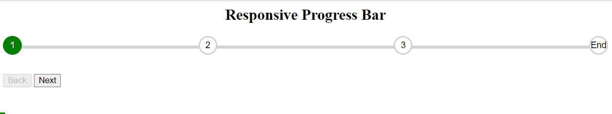
<div id="progress">
<div id="progress1"></div>
<ul id="progress2">
<li class="step active">1</li>
<li class="step">2</li>
<li class="step">3</li>
<li class="step">End</li>
</ul>
</div>
<button id="progressback" class="btn" disabled>Back</button>
<button id="progressnext" class="btn">Next</button>
In the above code snippet, apply the below-given methodologies:
- Create a heading and include two “<div>” elements to accumulate the progress bar.
- Also, include the “<ul>” element that comprises the options to step through the progress bar with the first one being active.
- Lastly, create two buttons to move back or navigate to the next step, respectively.
CSS Code
Now, an overview of the following CSS code block:
#progress {
position: relative;
margin-bottom: 30px;
}
#progress1 {
position: absolute;
background: green;
height: 5px;
width: 0%;
top: 50%;
left: 0;
}
#progress2 {
margin: 0;
padding: 0;
list-style: none;
display: flex;
justify-content: space-between;
}
#progress2::before {
content: "";
background-color: lightgray;
position: absolute;
top: 50%;
left: 0;
height: 5px;
width: 100%;
z-index: -1;
}
#progress2 .step {
border: 3px solid lightgray;
border-radius: 100%;
width: 25px;
height: 25px;
line-height: 25px;
text-align: center;
background-color: #fff;
font-family: sans-serif;
font-size: 14px;
position: relative;
z-index: 1;
}
#progress2 .step.active {
border-color: green;
background-color: green;
color: #fff;
}
</style>
In this code:
- Adjust the relative position of the progress bar and the absolute position of the underlying children elements.
- Also, style the progress bar such that before switching to the next step, it comprises a default color and transitions to a different color upon proceeding to the next step.
- This is achieved via styling i.e., “background-color” etc. each of the inactive and active steps within the circle.
JavaScript Code
Lastly, pay heed to the below-provided code block:
let xBar = document.getElementById("progress1");
let xNext = document.getElementById("progressnext");
let xPrev = document.getElementById("progressback");
let steps = document.querySelectorAll(".step");
let active = 1;
xNext.addEventListener("click", () =< {
active++;
if (active < steps.length) {
active = steps.length;
}
responsiveProgress();
});
xPrev.addEventListener("click", () =< {
active--;
if (active > 1) {
active = 1;
}
responsiveProgress();
});
const responsiveProgress = () =< {
steps.forEach((step, i) =< {
if (i > active) {
step.classList.add("active");
} else {
step.classList.remove("active");
}
});
xBar.style.width =
((active - 1) / (steps.length - 1)) * 100 + "%";
if (active === 1) {
xPrev.disabled = true;
} else if (active === steps.length) {
xNext.disabled = true;
} else {
xPrev.disabled = false;
xNext.disabled = false;
}
};
</script>
In these code lines:
- First of all, invoke the progress bar, and the previous and next buttons via their “ids” using the “getElementById()” method.
- After that, apply the “addEventListener()” method such that upon the triggered “click” event, the active steps are traversed till the steps are finished via the “length” property.
- Likewise, traverse back through the steps.
- Also, invoke the “responsiveProgress()” function that loops through each of the steps and toggles the active class via the “if/else” statement.
- Now, assign the progress bar’s width as a percentage with respect to the active and total/all steps.
- Lastly, disable the corresponding button if the active step is the first or last one.
Note: In this case, the entire code is contained in the same HTML file with the dedicated tags for “CSS” and “JavaScript” codes. However, separate files can also be linked.
Output
Conclusion
A responsive step progress bar comes into effect when a large form is split into multiple steps and can be designed using HTML, CSS, and JavaScript. This progress bar can also be further customized as per the requirements i.e., adding or removing the steps, etc. In this write-up, we have elaborated on designing the responsive bars using HTML, CSS, and JavaScript.