A responsive image is one that can adapt itself to different devices, regardless of the screen sizes. Having a responsive image on the website has become so crucial nowadays. As it not only speeds up the website but also offers a cool user experience across all devices. Responsive images will also get resized by resizing the browser.
Responsive images efficiently adapt to different screen sizes on different devices. It ensures that the quality is maintained. A responsive website with responsive images surely increases engagement and conversion rates. Images can be made responsive using CSS along with media queries.
This write-up will use HTML and CSS to make the images responsive.
How to Make Images Responsive with HTML and CSS?
To make images responsive using HTML and CSS, go through the below steps:
Method 1: Use the “max-width” Property
The first method to make an image responsive is by using the “max-width” property. The “max-width” property is used to define the image’s maximum width. In case the content exceeds the maximum width, it will change the height of the element.
Create HTML
To add an image file in the HTML’s <body> tag, users need to use the <img> tag. For that particular purpose, add the <img> tag. Inside the <img> tag, use the “src” attribute and assign it the image file path along with the file extension. After that, use the “alt” tag and specify the alternative image file name, which will appear when the image won’t load:
Add CSS
Now, create an external CSS file save it with the “.css” file extension, and link it inside the <head> tag of the HTML file. To style the image file in the CSS file, start with img tag and open the curly braces. Then, inside the curly brace, add the “max-width: 100%;” to fit the image horizontally within the container. Moreover, it will prevent images from being cut. After that, add “height: auto;” to adjust the height automatically, so the image gets displayed correctly:
max-width: 100%;
height: auto;
}
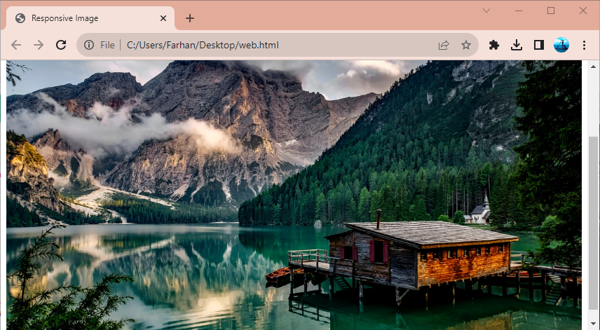
Resize the browser window to check how the image scales.
Method 2: Use the “width” Property
Another method to make an image responsive is by utilizing the property “width”. The property “width” defines the width for the images and text. It does not contain margins, padding, or borders. It can set the size of images and text in the form cm, px, or %. To make an image responsive, simply assign the “width” property to “100%”. Setting “width: 100%;” means that make the image as big as the parent element:
width: 100%;
height: auto;}

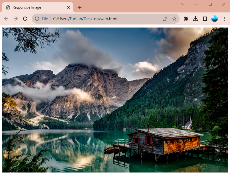
The above confirms that the image is responsive. To check if it is responsive or not, simply resize the browser window.
Method 3: Apply Media Queries
CSS media queries helps the users to modify the appearance of a web page. CSS media query contains conditions, whenever these conditions met, it will change the appearance of the device or browser. Media queries can also help the users in making images responsive. For that reason, first, specify the “@media” tag and then specify the “max-width” property and assign the maximum width for an image within the braces. Whenever this condition will meet the image will get responsive. After that, add the curly braces specify the img tag, and specify the “width: 100%;” value:
img {
width: 100%;
}
}
Note: the image will only be responsive if it meets the specified condition.
The CSS media query has been applied, and now the image would behave as responsive if it is resized to the specified image size. Else, it won’t be responsive:
Conclusion
To make images responsive with HTML and CSS, users have various methods. These methods include making images responsive using “max-width” property, “width” property, and also by applying the CSS media query. This article has presented the users with the complete solution to make images responsive.