In web development, the background of any web page, ad, or website is an important part that shows the impression on the audience. It should be aligned well and customized in an eye-catching and attractive way.
In this write, we will illustrate:
- How to Control the Background Size in Tailwind
- Bonus Tip: Control the Position of Background
- Conclusion
How to Control the Background Size in Tailwind?
In Tailwind, developers are only needed to play with classes. Different classes are available to align text, set images, implement media queries, border radius, and background size. The “background-size” Tailwind utility is specifically utilized to set the background image size.
Here, three types of background-size classes are listed below that are used to align the background image in different variations:
- bg-auto: It will set the background image to its default background size.
- bg-cover: It will set the background image to cover the full size of the background container.
- bg-contain: It will set the background image within the container by shrinking it.
Let’s take some examples to implement all of the background-size classes one by one.
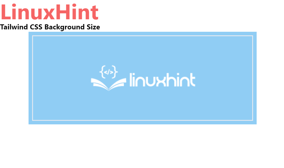
Auto
The “bg-auto” tailwind background size class is utilized to set the size of the background image to its default size. To implement the “bg-auto” class, the following syntax is utilized:
To set the background size of the image to its default size, go through the following code:
<h1 class="text-red-500 text-5xl font-bold">
LinuxHint
</h1>
<b>Tailwind CSS Background Size</b>
<div class="bg-blue-300 mx-16 space-y-4 p-2 justify-between">
<div class="bg-no-repeat bg-auto bg-center bg-brown-200 w-full h-48 border-2" style="background-image:url( https://linuxhint.com/wp-content/uploads/2019/11/Logo-final.png)">
</div>
</div>
</body>
</html>
In the above code:
- “body” tag is utilized to set the body of the webpage. It implements the “text-center” class.
- “h1” tag is used to specify the level one heading. It implements the “text-red-500”, “text-5xl”, and “font-bold” classes to set the text color, size, and font-weight respectively.
- “b” element sets the dummy bold text.
- “div” elements are utilized to set the containers on a webpage. The first “div” tag implements “bg-blue-300”, “mx-16”, “space-y-4”, “p-2” and “justify-between” classes to set the background color blue, margin-right and margin-left horizontally and vertically, padding, and implement equal space between elements respectively.
- The second div element uses the “bg-auto” class to set the background image to its default size. “w-full” sets the element width 100%, the “h-48” class sets the height of the element, and “border-2” sets the border around the element.
- “style” attribute sets the styling of the element. In our case, we have used it to set the background image.
Output:
Cover
The tailwind “bg-cover” class is used to set the background size of the image in that way to cover the whole size of the container. The syntax used to implement the “bg-cover” class is as follows:
To set the background size of the image to cover the whole width of the container, go through the following code:
<h1 class="text-red-500 text-5xl font-bold">
LinuxHint
</h1>
<b>Tailwind CSS Background Size</b>
<div class="bg-blue-200 mx-16 space-y-4 p-2 justify-between">
<div class="bg-no-repeat bg-cover bg-center bg-blue-500 w-full h-48 border-2" style="background-image:url( https://linuxhint.com/wp-content/uploads/2019/11/Logo-final.png)">
</div>
</div>
</body>
In the above snippet, the second “div” container uses the “bg-cover” class to set the background image to cover the whole size of the container. The remaining code is the same as used in the first case.
Output:

Contain
The “bg-contain” class of tailwind sets the background image size to container size by shrinking its size. To apply the “bg-contain” class to set the background size, utilize the following syntax:
Go through the following code to implement the “bg-contain” Tailwind class:
<h1 class="text-red-600 text-5xl font-bold">
LinuxHint
</h1>
<b>Tailwind CSS Background Size</b>
<div class="bg-blue-300 mx-16 space-y-4 p-2 justify-between">
<div class="bg-no-repeat bg-contain bg-center bg-orange-800 w-full h-48 border-2" style="background-image: url( https://linuxhint.com/wp-content/uploads/2019/11/Logo-final.png)">
</div>
</div>
</body>
Here, we have implemented the “bg-contain” class in the second “div” element to set the background image size to container size by shrinking the image size. Here, we have increased the intensity of the background color to display the orange color using the “bg-orange-800” class. However, the code remains the similar to first and second examples.
Output:

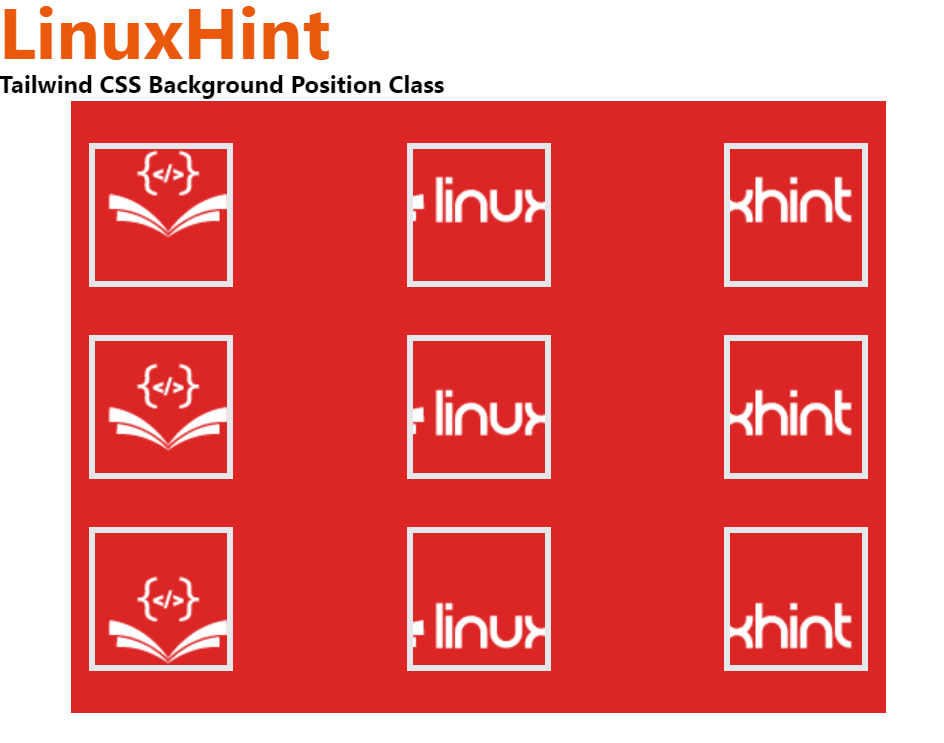
Bonus Tip: Control the Position of Background
Controlling the position of the background is also essential to design an attractive and valuable webpage. To set or control the position of the background, the user can use different “background-position” classes such as “bg-left” to align the position on the left, “bg-right” to align the background image to the right, “bg-left-top” to set the background image on left and top and so on.
To set the background image in a different position or to control the position of the background image, go through the given code snippet:
<h1 class="text-orange-600 text-5xl font-bold">
LinuxHint
</h1>
<b>Tailwind CSS Background Position Class</b>
<div class="bg-red-600
mx-12
space-y-4
p-3
justify-between
grid grid-rows-3
grid-flow-col">
<div title="bg-left-top" class="bg-no-repeat bg-left-top
bg-gree-200 w-24 h-24
border-4 my-4" style="background-image:url( https://linuxhint.com/wp-content/uploads/2019/11/Logo-final.png)">
</div>
<div title="bg-left" class="bg-no-repeat bg-left
bg-gree-200 w-24 h-24
border-4 my-4" style="background-image:url( https://linuxhint.com/wp-content/uploads/2019/11/Logo-final.png)">
</div>
<div title="bg-left-bottom" class="bg-no-repeat bg-left-bottom
bg-gree-200 w-24 h-24
border-4 my-4" style="background-image:url( https://linuxhint.com/wp-content/uploads/2019/11/Logo-final.png)">
</div>
<div title="bg-top" class="bg-no-repeat bg-top
bg-gree-200 w-24 h-24
border-4 my-4" style="background-image:url( https://linuxhint.com/wp-content/uploads/2019/11/Logo-final.png)">
</div>
<div title="bg-center" class="bg-no-repeat bg-center
bg-gree-200 w-24 h-24
border-4 my-4" style="background-image:url( https://linuxhint.com/wp-content/uploads/2019/11/Logo-final.png)">
</div>
<div title="bg-bottom" class="bg-no-repeat bg-bottom
bg-gree-200 w-24 h-24
border-4 my-4" style="background-image:url( https://linuxhint.com/wp-content/uploads/2019/11/Logo-final.png)">
</div>
<div title="bg-right-top" class="bg-no-repeat bg-right-top
bg-gree-200 w-24 h-24
border-4 my-4" style="background-image:url( https://linuxhint.com/wp-content/uploads/2019/11/Logo-final.png)">
</div>
<div title="bg-right" class="bg-no-repeat bg-right
bg-gree-200 w-24 h-24
border-4 my-4" style="background-image: url(https://linuxhint.com/wp-content/uploads/2019/11/Logo-final.png)">
</div>
<div title="bg-right-bottom" class="bg-no-repeat bg-right-bottom
bg-gree-200 w-24 h-24
border-4 my-4" style="background-image:url(https://linuxhint.com/wp-content/uploads/2019/11/Logo-final.png)">
</div>
</div>
</body>
In the above snippet:
- The nine “div” containers are used to set the nine background images that are implementing different “background-position” classes.
- The “bg-left-top” class is used to set the position of the background image on the top and left sides.
- “bg-left” class is used to set the background image position to the left side.
- “bg-left-bottom” class is used to set the background position to the left bottom.
- “bg-top” class is utilized to align the position of the background image to the top.
- “bg-center” class is utilized to align the background image position to the center.
- “bg-bottom” class aligns the position of the background image to the bottom.
- “bg-right-top” class sets the image position to right and top.
- “bg-right” class aligns the background image to the right.
- “bg-right-bottom” is used to set the position of background image to right bottom.
Output:
That is all about controlling background size in Tailwind CSS.
Conclusion
To control the background size in Tailwind, the “bg-auto”, “bg-cover”, and “bg-contain” classes are used. The “bg-auto” class sets the background image to its default background size. The “bg-cover” tailwind class sets the background image to cover the full size of the background container and the “bg-contain” sets the background image within the container by shrinking its size. This blog has illustrated how to control the background size in Tailwind.