Moreover, Tailwind also provides a minimum and maximum width limit to an element. By doing this, Tailwind will not let the width of the element increase or decrease from the applied width limits.
This article will explain the method for using the maximum width property in Tailwind.
How to Use Maximum Width Property in Tailwind CSS?
Tailwind also provides various maximum width classes to set the maximum width limit of an element. This class will not let the width of an element increase more than the specified maximum width.
Syntax
The syntax for using the maximum width is as follows:
Let’s understand the meaning of each value that can be assigned to the maximum width class one by one using the following table:
| Maximum Width Class | Value in Pixels |
| max-w-0/max-w-none | 0px |
| max-w-xs | 320px |
| max-w-xm | 384px |
| max-w-md | 448px |
| max-w-lg | 512px |
| max-w-xl | 576px |
| max-w-2xl | 672px |
| max-w-3xl | 768px |
| max-w-4xl | 896px |
| max-w-5xl | 1024px |
| max-w-6xl | 1152px |
| max-w-7xl | 1280px |
| max-w-full | Equal to 100% of the screen width |
| max-w-min | Minimum width needed by the content |
| max-w-max | Maximum width needed by the content |
| max-w-fit | Width needed to fit the text content |
| max-w-prose | Width is provided according to the text font size |
| max-w-screen-sm | 640px |
| max-w-screen-md | 768px |
| max-w-screen-lg | 1024px |
| max-w-screen-xl | 1280px |
| max-w-screen-2xl | 1536px |
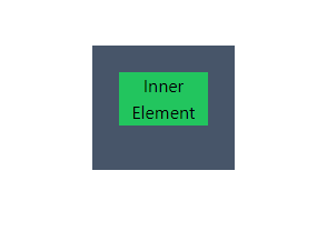
Let’s understand how to use the maximum width class through a simple demonstration. In the below-provided code, the inner “div” element is provided with a maximum width equal to the width of its parent container:
The classes used in the above code are explained as follows:
- The parent div element is provided with a “w-56” width.
- The height of the parent div element is set using the “h-28” class.
- The “bg-{color}-{number}” class sets the background of the div elements to the given color.
- The inner div element is provided the width using the “w-56” class. However, the “max-w-full” class will limit the width of the inner element to 100% width of its parent element. Hence, it will not let the width become larger than the parent element i.e. “w-32”.
- The “text-center” class aligns the text to the center of the element.
Output:
It can be seen in the below-provided output that the “max-w-full” class has limited the width of the inner element to fit in the width of the parent element:
That is all about using the maximum and minimum width classes in Tailwind.
Conclusion
The maximum width of an element can be provided using the “min-w-{value}” class in Tailwind. Tailwind provides a variety of default maximum width values such as max-w-prose, max-w-full, max-w-fit, and many more. These classes will not allow an element to expand more than the specified maximum width limit. This article has explained the method for using the minimum width of an element in Tailwind.