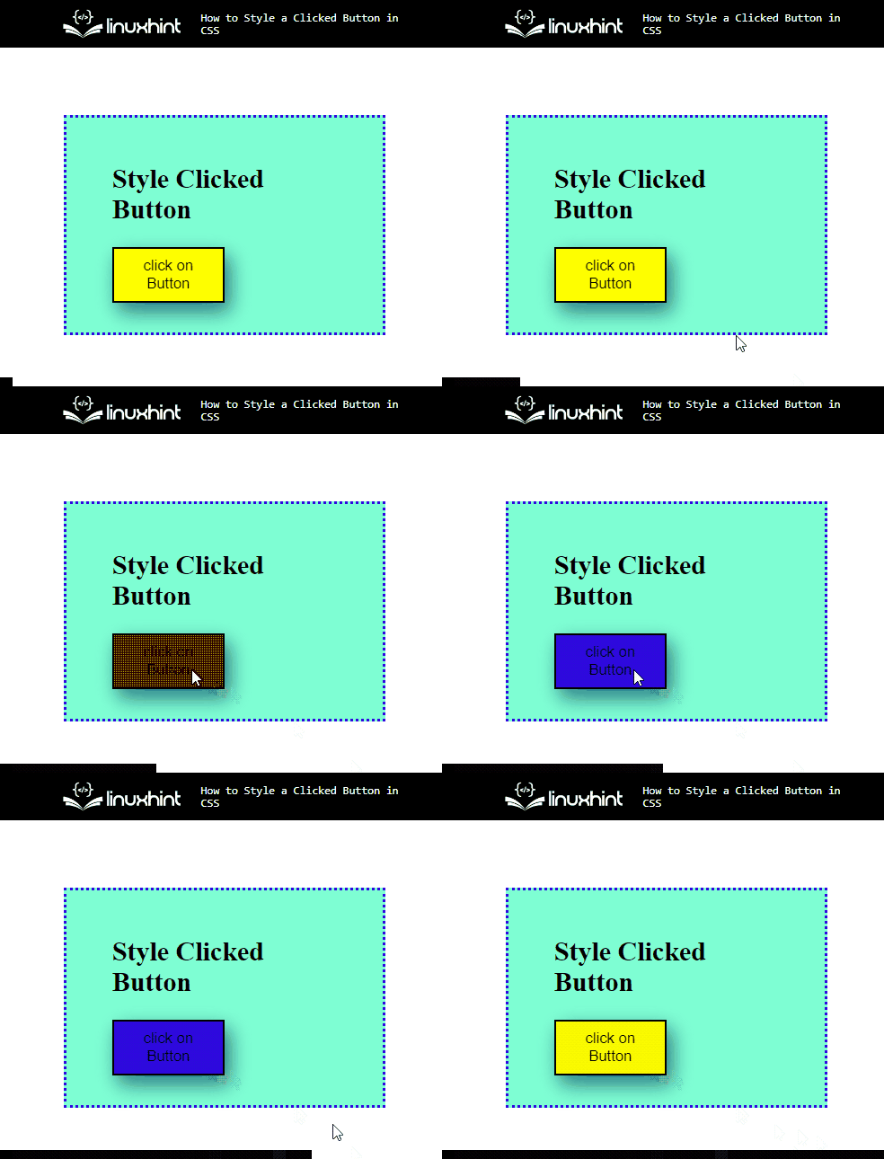
In web development, buttons are the key components that enable user interaction with the website. The buttons can enhance the developer experience and bring more income to the business. Furthermore, buttons help the developers navigate the product because they require the users to convert the desired outcomes.
In this write-up, we will demonstrate:
How to Create/Make a Button in HTML?
To create/make a button in HTM, the HTML “<button>” element is utilized. For practical demonstration, you must check out the given instructions.
Step 1: Make a “div” Container
Initially, make a “div” container by inserting a “<div>” element. Then, assign a class attribute and allocate a name for further use.
Step 2: Insert a Heading
Next, utilize the HTML heading tag to insert a heading. Users can use any heading tag from the “<h1>” to the “<h6>” tag. In this scenario, the “<h2>” is used.
Step 3: Create a Button
After that, create a button element with the help of the “<button>” element. Then, specify the button “type” as “submit” and embed some text in between the button tag to display on the button:
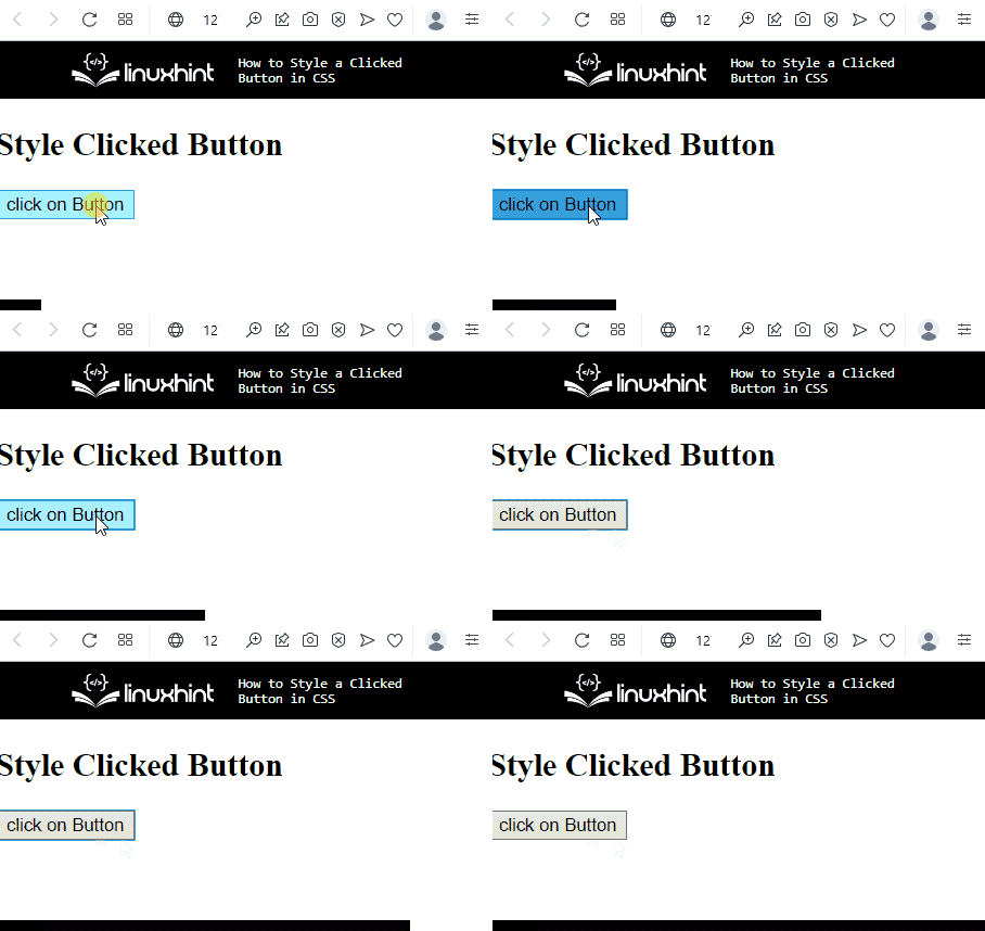
It can be observed that the button has been created successfully:
Move toward the next section to learn about styling the clicked button.
How to Style a Clicked Button in CSS?
There are different pseudo-classes, including “:hover” and “:focus” utilized with button elements. Furthermore, the user can also apply the various CSS properties on a button for styling.
To style a clicked button in CSS, try out the following procedure.
Step 1: Style “div” Container
Access the “div” container by using the attribute selector and the attribute. To do so, the “.btn-container” is used for this purpose:
margin: 60px;
padding: 20px 40px;
border: 3px dotted rgb(47, 7, 224);
height: 150px;
width: 200px;
align-items: center;
}
According to the given code snippet:
- “margin” property helps to add the blank space around the element’s boundary.
- “padding” is used for specifying the space inside the element.
- “height” and “width” properties allocate the size for a defined element.
- “align-items” is utilized for setting the item’s alignment inside the element.
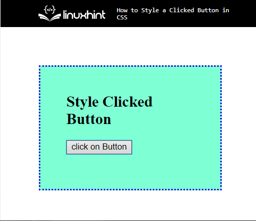
Output
Step 2: Style Button Element
Access the button element with the help of “button” and apply the below-stated properties in the code snippet:
filter: drop-shadow(5px 8px 9px rgb(42, 116, 126));
height: 50px;
width: 100px;
background-color: yellow;
}
Here:
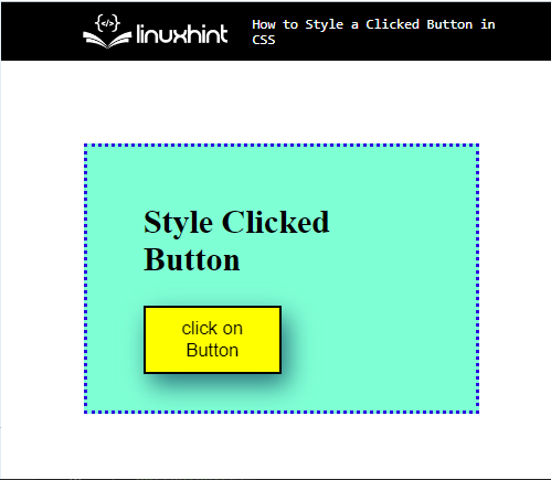
- “filter” property is used for applying the visual effect on the defined element. To do so, the value of this property is set as “drop-shadow”, which is utilized for specifying the shadow on the element.
- “background-color” is utilized to allocate the color at the element’s backside. For instance, the value of this is specified as “yellow”.
Output
Step 3: Style With “:hover” Selector
Now, access the button element along the pseudo selector, which is used for selecting elements when the user mouse over them:
background-color:rgb(238, 7, 7);}
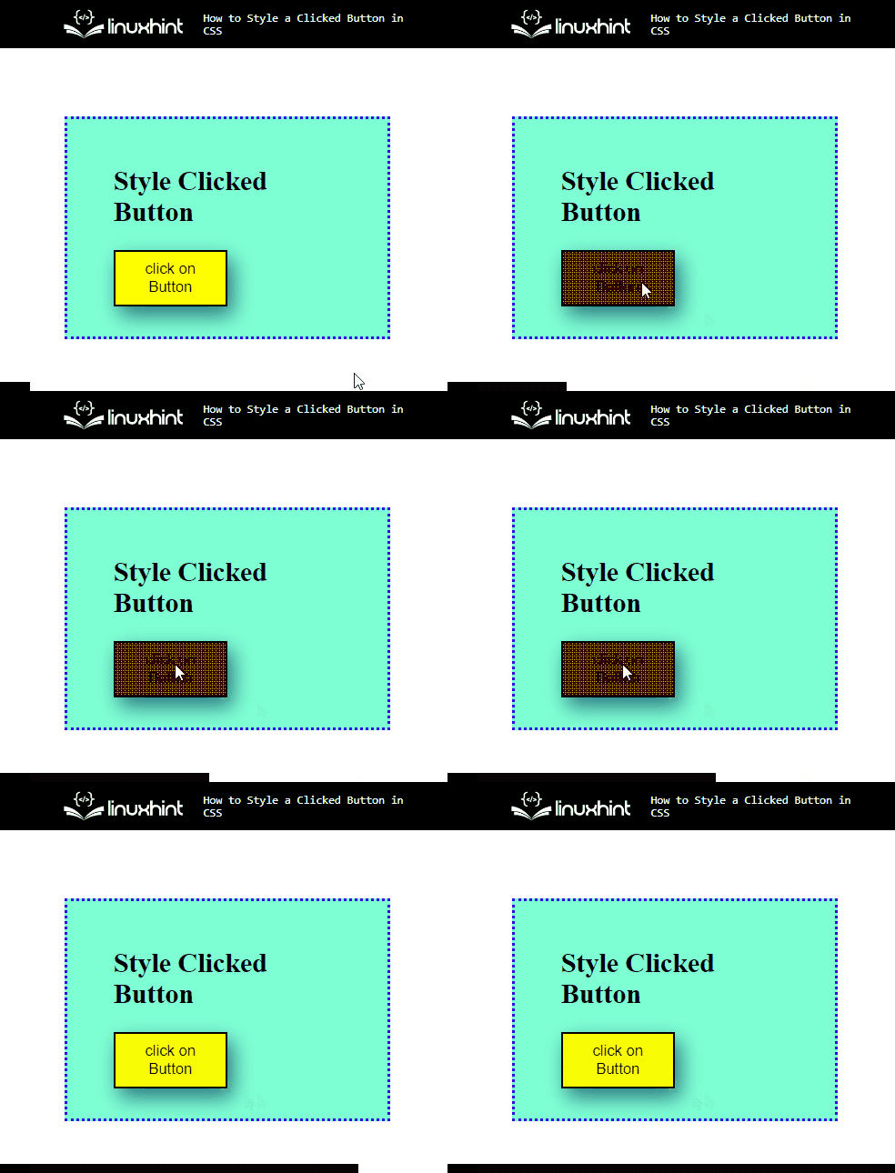
To do so, the “background-color” property is used with the value “rgb(238, 7, 7)”. This color will only display when the user hovers over the button.
Output
Step 4: Style With “:focus” Selector
Now, utilize the “:focus” pseudo selector along the button element, which is used for applying style on the selected element when the user is targeted by the keyboard or focused on by the mouse:
background-color: blue;
}
In this scenario, the “background-color” is used with the values set as “blue”.
You have learned the method for styling the clicked button in CSS.
Conclusion
To style the clicked button in CSS, first, create a button in HTML with the help of the “<button>” element. Then, access the button pseudo selectors, such as “:hover” and “:focus” and apply CSS properties, including “height”, “width”, “filter”, “background-color”, and many more. This post was all about styling the clicked button in CSS.

