This post will explain the method to specify the image height and width as percentages without skewing the proportion.
How to Specify width and height as Percentages Without Skewing Photo Proportions in HTML?
For the purpose of specifying the “height” and “width” in the form of percentages without skewing photo proportions, check out the following methods:
Method 1: Use Inline Styling In HTML
Users can add the image in an HTML page with the help of the “<img>” element. Furthermore, to specify the “width” and “height” of the image without skewing, you must set the image height and width in the percentage. For practical implications, follow the below-listed steps.
Step 1: Create a div Container
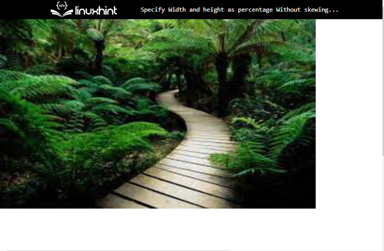
First, create a “div” container by utilizing the “<div>” element. Also, add a “style” attribute for using the CSS properties in HTML for inline styling. Then, set the value of the style as the “height” with the value “600px” and “width” as “1000px”.
Step 2: Add an Image
Then, utilize the “img” tag to add an image inside the div element. Furthermore, add the following attribute between the img title:
- “src” is used for inserting the media file.
- The “height” and “width” are both used to determine the size of the image. To do so, the value of these properties is set in percentage:
It can be observed that the image is added successfully after specifying the width and height in the form of percentage:
Method 2: Use CSS Properties
Users can also specify the “height” and “width” as percentages in CSS. To do so, try the given instructions.
Step 1: Make a div Container
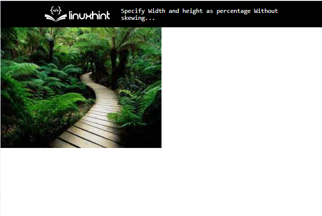
Initially, make a “div” container with the help of the “<div>” element. Furthermore, insert a class attribute inside the div opening tag with a particular name.
Step 2: Insert an Image
Next, utilize the “<img>” tag to insert an image into the HTML page. Then, add the “src” attribute to the image tag used to insert the media file. For instance, we have specified the image name as the value of the “src” attribute:
Step 3: Style “div” Container
Now, access the div container by using the class name “.img-container”:
margin: 20px;
}
Then, apply the “margin” for setting the space outside of the element.
Step 4: Set Image “height” and “width”
Then, access the image with the help of “img”:
height: 70%;
width: 50%;
}
Specify the “height” and “width” properties and set the value of these properties in the required percentage.
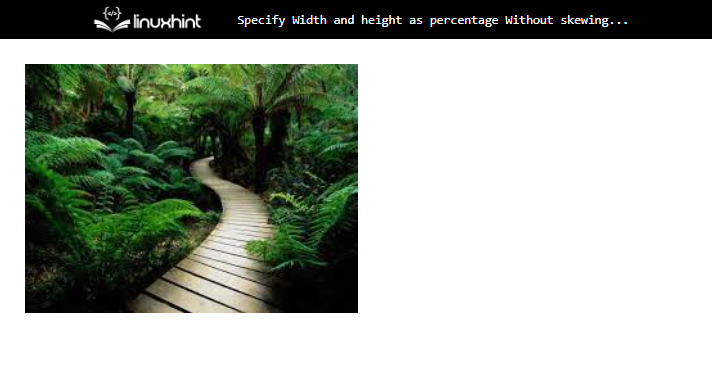
That was all about specifying the height and width in percentage.
Conclusion
To specify the height and width in percentage without skewing photo proportion in HTML, first, make a “div” container using the “
About the author