How to Set Transition Height in CSS?
In CSS, transition height can be set using the following properties:
So, let’s get started with method one!
Method 1: Set the Transition Height Using CSS transition Property
A “transition” is a time frame set by specifying an element’s initial and final state. It is the shorthand property of all longhand transition properties, such as transition-duration or transition-property.
Let’s move ahead and take an example to understand how the transition property can be used to set the transition height.
Example 1
Within the HTML file, specify the “<div>” between <body> tags.
HTML
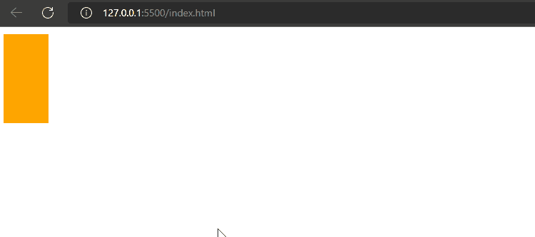
First, we will specify the “background-color” property with value “orange”. Then, assign the height and width properties with values “100px” and “50px”. Now, set the “transition” property with the “height 1s” value; height 1s specifies the element will perform the assigned action in one second in a vertical direction.
In the next step, we will use the selector “:hover” with element div and set the height property as “200px”. This will make the vertical line expand from 100px to 200px when we hover our pointer on the element.
CSS
background-color: orange;
height: 100px;
width: 50px;
transition: height 1s;
}
div:hover{
height: 200px;
}
Let’s save the mentioned code and run it in the browser:
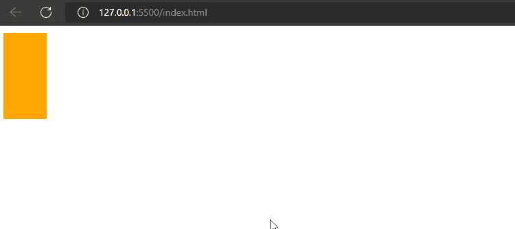
As you can see in the above output, the transition height has been set successfully.
Method 2: Set the Transition Height Using CSS transform Property
The 2d or 3d variations that can be implemented on HTML elements result from the “transform” property. You can perform different actions utilizing this property, such as scale, skew, translate and rotate. If you are not aware of these mentioned operations, check out this dedicated article.
Example
We will set the value of the “transform” property as “scaleY(1)”; here, the scaleY is used for adjusting an element vertically, and passing “1” as its argument will increase the height. We will set the “transform-origin” property with the value “top”, which indicates that the transformation will be applied from the upper point. Now, we will give the transition property a value “transform 1s, 1s”, where the first 1s is for width, and the other is for height; this will specify the one-second transformation over the selected element.
Use the :hover selector and assign the transform property a value “scaleY(1.1)”. As a result, when the pointer is placed on the element, its size will increase, respectively.
CSS
background-color: orange;
height: 100px;
width: 50px;
transform: scaleY(1);
transform-origin: top;
transition: transform 1s, 1s;
}
div:hover {
height: 200px;
transform: scaleY(1.1);
}
Output
We have covered how to set transition height in CSS.
Conclusion
To set the transition height, the “transition” property can be utilized. It takes the seconds value as an argument to perform a specific action for a certain time. Moreover, CSS “transform” property along with transition can also be used in which you have to specify the transform scale and origin to achieve the desired results. This guide demonstrates all efficient methods to set transition height in CSS.