This article will provide the procedure for setting the list-style image of a list block in Tailwind.
How to Set the List Style Image Class in Tailwind?
The List Style Image Class is used for providing an image as the list marker in Tailwind. By default, Tailwind only provides the “list-image-none” class that can only be used for removing any previously set image marker for a list.
Syntax
The syntax for using the list style image class in Tailwind is as follows:
This syntax provides the specified image as a marker for the list element.
This syntax removes any previously set images as the marker for a list element.
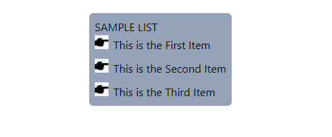
Let’s use the above-defined syntax to use an image as a marker in an unordered list. In this demonstration, the user has an image named “handpointer.png” present inside the same Tailwind project folder. In case if the image is present in some other folder, the user has to provide the full path to the list style image class. We will use that image as a list marker using the “list-image” class.
The explanation of the above code is as follows:
- A “<div>” element is created and is provided with the “flex” class that aligns the items horizontally in a container.
- The “justify-center” class aligns the child items to the center of the container.
- Next, the “<ul>” class is used to create an unordered list.
- It is provided with the “list-inside” class that will place the specified list item marker inside the list block.
- The “list-image-[url({Image Url})]” class is used for providing an image as a list item marker to the element.
- The “space-y-{number}” class provides the vertical space between the list items.
- The “rounded-md” class makes the corners of the list block rounded.
- The “bg-{color}-{number}” class is used for providing the background color to the list block.
- The “p-2” class provides the border to the list element.
- Three list items are created using the “<li>” tags.
Output:
It can be seen in the output, that a hand pointer image is set as the marker for the list items:
Using State Variants With List Style Image Class in Tailwind
Tailwind provides various state variants such as hover, focus, and active which helps in creating interactive designs. To use a list-style image class with these states, the following syntax is used:
Let’s use the above-defined syntax to use the list-style image property with the “hover” state in Tailwind. In this demonstration, the list will be provided with an image as the list marker. However, using the “hover” state, the image will be removed.
In the above code, the “hover:list-image-none” class removes the previously set image as the list marker.
Output:
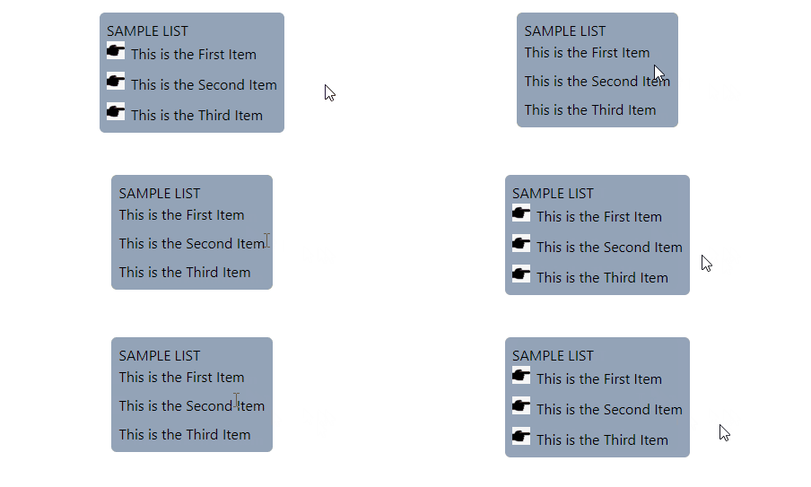
In the below output, the list-style image resets to “none” when the user hovers the mouse cursor over it. Due to this, the image that was being used as the list marker was removed.
Using Breakpoints With List Style Image Class in Tailwind
The breakpoints are pre-set media queries for the elements in Tailwind. They are used to make the design responsive for various screen sizes. These breakpoints include sm, md, lg, xl, and 2xl. To use a list-style image class with a breakpoint, the following syntax is used:
Let’s use the above-defined syntax to change the list marker from an “image” to “none” using a breakpoint. In this example, the image marker will be removed once the screen size increases the width of “md” breakpoint:
In the above code, the “md:list-image-none” class removes the image list marker when the screen size reaches the “md” breakpoint.
Output:
In the below output, the image marker is removed when the screen size reaches the md breakpoint:
That is all about setting the list-style image in Tailwind.
Conclusion
Tailwind has two pre-defined list-style image classes for removing or setting the listing marker of an element to an image. The “list-image-[url({Image Url})]” class provides the specified image as the list marker. The “list-image-none” class removes any previously provided image as the list marker. This article has provided the procedure for setting the list style type in Tailwind.


