This write-up will discuss the method for making rounded corners on rectangular images using CSS.
How to Make Rounded Corners on a Rectangular Image Using CSS Only?
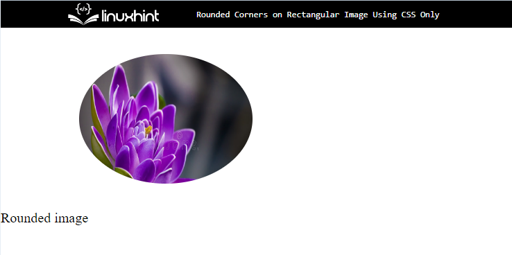
To make the rounded corners on a rectangular image using CSS, the “border-radius” CSS property with the value “50%” is utilized. For practical implications, try out the instructions stated below:
Step 1: Add a div Container
Initially, add the div container with the help of the “<div>” element. Then, insert an “id” or “class” attribute and specify a name for further use.
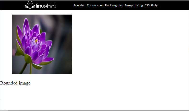
Step 2: Add Image
For the purpose of adding images in the container, utilize the “<figure>” element that represents self-contained content. Next, add an “<img>” element and insert the following attribute inside the “img” tag:
- The “src” is utilized for adding the media file to the HTML page.
- Then, add “width” and “height” attributes to set the element’s size.
Step 3: Add Caption For Image
After that, insert “<p>” tag and embed text in between the paragraph tag for the image:
Output
Step 5: Make Image Rounded
Access the image with the help of “figure” and set various CSS properties mentioned in the below code snippet:
width:200px;
height:150px;
overflow: hidden;
margin: 30px 90px;
border-radius: 50%;
}
Here:
- “width” and “height” are used for setting the size of the image.
- “overflow” property indicates what should happen if a box for an element is overflown. To do so, the value of this attribute is set as “ hidden”.
- “margin” defines the space around the element’s boundary.
- “border-radius” denotes the element’s corner radius. For that purpose, the value is set as “50%” to make the border rounded.
Output
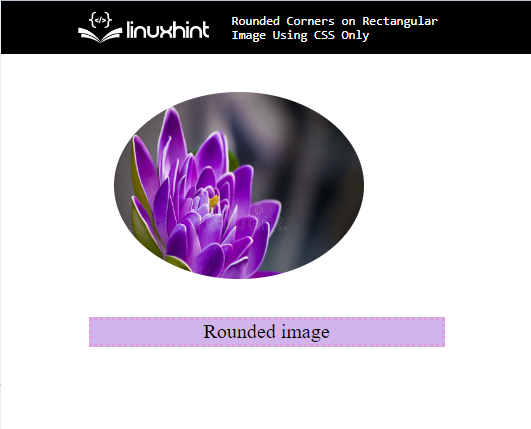
Step 6: Apply Styling on Caption
Access the class by utilizing the “.caption” and apply the following CSS properties:
margin:0px 70px;
border: 3px dotted plum;
text-align: center;
background-color: rgb(209, 180, 236);
}
According to the above-given code snippet:
- “margin” determines the space outside of the boundary.
- “border” defines a boundary outside the element.
- “text-align” property utilized for setting the alignment of the text.
- “background-color” property indicates the color of the element’s backside.
Output
That’s all about making the rounded corner on a rectangular image using CSS.
Conclusion
To make the rounded corners on a rectangular image, first, add the image with the help of the “<img>” tag. Then, access the image and apply the “border-radius” CSS property with the value “50%” that rounds the image border. Also, set the “overflow” as “hidden”. This post has explained the method for making rounded corners on rectangular images using CSS only.


