Responsive Web Design using Flexbox
CSS Flexbox is a layout model that allows an efficient and dynamic arrangement of elements. This layout is one-dimensional and permits the placement of elements inside a container with equally distributed space.
It makes elements responsive which means that the elements change their behavior according to the kind of device displaying them. Moreover, it makes elements flexible and provides them with appropriate position, and symmetry.
A flexbox has two components, which are flex container, and flex item. A flex container describes the properties of the ancestor element, while, a flex item defines the properties of successor elements. Each of these components makes use of various properties to implement a flexbox.
Here we will present you with various responsive layouts that you can create for different devices using flexbox.
How to create a Responsive Navbar using flexbox?
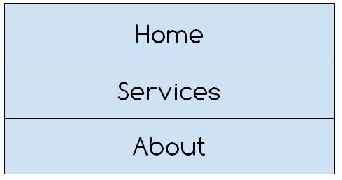
Here we are going to demonstrate how you can make a responsive navbar using the one-column layout for devices such as mobile phones, tablets, etc which have a small screen size, and a two-column layout for devices like computers, laptops, etc which have bigger screen sizes.
Here is a visual representation of a one-column layout for small screen sizes.
The diagram below shows the two-column layout for bigger screen sizes.
Now let’s move on to the code.
HTML
In the above code, we have made a flexbox by nesting three div containers inside a larger div container.
CSS
display: flex;
flex-direction: column;
font-size: 25px;
text-align: center;
font-family: Verdana, Geneva, Tahoma, sans-serif;
}
Using the class assigned to the larger div we are setting its display to flex then giving it a direction using the column value of the flow-direction property and then styling our div with basic CSS.
CSS
background-color: darkgray;
padding: 15px;
flex: 50px;
}
.nav:hover{
background-color: lightgray;
}
Here we are simply styling our navbar columns by providing them some background color, padding, and initial length using the flex property and defining some styling on the hover of the navigation link.
CSS
.flex-container {
flex-direction: row;
}
}
The query above states that when the width of a particular device is 768px or wider then the direction of the layout will change from one-column to two-column layout.
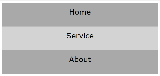
Output
When the width is 767px or less.
When the width is 768px or wider.
A responsive navbar was successfully generated.
How to create a Responsive Image Grid using flexbox?
Here is how you can create a responsive gallery that changes its behavior according to the browser window.
HTML
Here we have created a div container and nested two more div containers inside it. Both of the nested containers further nest three images each.
CSS
display: flex;
flex-wrap: wrap;
padding: 5px;
}
The div with the “container” class is being displayed as a flexbox, and has been given certain padding. Moreover, the flex-wrap property is assigned wrap value which means if necessary the images will be wrapped inside the container.
CSS
width: 100%;
}
.columns {
flex: 30%;
max-width: 30%;
padding: 5px;
}
The images have been given 100% width so that they fit appropriately in the container, moreover using the flex and max-width we are creating two columns that will be placed next to one another.
CSS
.columns {
flex: 50%;
max-width: 50%;
}
}
The media query specifies that if the width is less than the specified number then the two-column will be converted to one.
Output
When width is 600px, or wider.
When width is 600px, or less.
A responsive image gallery was created.
Conclusion
A responsive web design can be created using various flexbox properties such as flex-direction, flex-flow, flex-wrap, etc along with specifying certain media queries. The media query should specify the type and features of a device according to which the web design will alter its appearance on various devices. In the article above, we have demonstrated a few layouts that you can create using various flexbox properties along with media queries.


