This post explained responsive CSS background images.
How to Add Responsive CSS Background Images?
To add the responsive image as a background, follow the instructions below.
Step 1: Create div Container
Initially, create a div container with the help of the “<div>” tag and assign it an “id” attribute with a value of your choice.
Step 2: Insert Heading
Next, add a heading inside the “<div>” element by utilizing the “<h1>” tag. After that, add some text in between the “<div>” tags:
<h1>Background Image</h1>
Colorful image of leaves set as the background of this page. Now we can make any document on this page.
</div>
Step 3: Set Background Image
To set the background image of <div> element, first access the element with the help of the “id” attribute. Then, add the “background-image” CSS property to set the image at the element’s backside. The value of this property specifies the URL of the image.
Step 4: Make Background Image Responsive
To make the background image responsive, insert the following CSS properties:
background-image:url('emoji.png');
height: 100%;
width: 100%;
background-size: cover;
background-repeat: no-repeat;
border: auto solid red;
}
The description of the above-stated code is mentioned as follows:
- The “height” property utilized for setting the height of the element.
- “width” property is used for defining the element size horizontally.
- “background-size” property is used for setting the size of the image. For instance, we have its value as “cover” to fill the image in the element.
- “background-repeat” property sets whether the image will repeat or not.
- “border” feature is utilized for adding the border around the element.
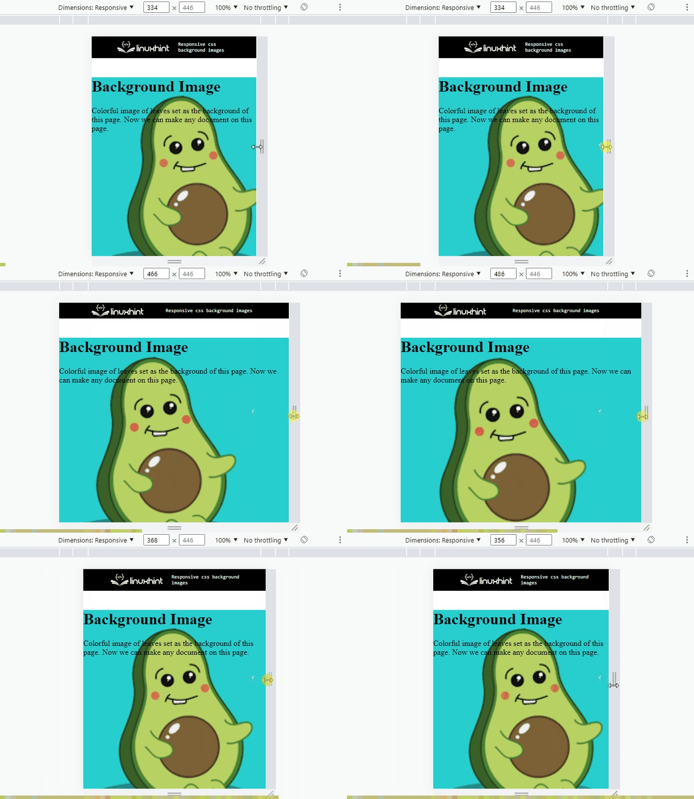
It can be observed that we have successfully made the background image responsive:
We have explained the method for adding a responsive background image with CSS.
Conclusion
To add the responsive CSS background image, first, create a container along with the “id” attribute. Then, access the div element using “id” in CSS and embed the background image using the “background-image” CSS property. After that, “background-size”, “background-repeat”, and “border” properties are also used to make the image responsive. This post has demonstrated how to set the responsive background image in CSS.

