Let’s learn them in detail.
2D Transformation Methods
To move, rotate, scale, and skew elements along the x-axis, and the y-axis, CSS provides various methods that fall under the category of 2D transformation methods. Here we have listed some basic 2D transformation methods for you.
Below we have explained these methods in detail.
translate() Method
The CSS translate() method alters the position of an element along the x-axis (horizontally) or along the y-axis (vertically) based on the parameters assigned.
Syntax
The tx, and ty parameters represent the x, and y axes.
Example
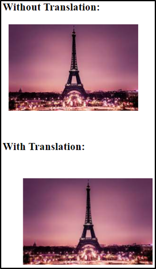
Suppose you want to move an image to a certain position using the translate() method. Here is the relevant code.
HTML
Here we have created two div elements and placed an image in both of them.
CSS
width: 50px;
margin: 20px;
}
.translate{
transform: translate(30px, 30px);
}
Apart from giving some width and margin to the div elements, we are applying the translate() method on the second image.
Output
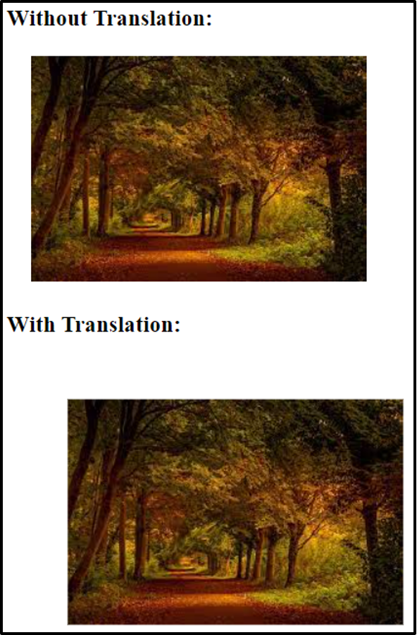
The image has been moved successfully using the translate() method.
rotate() Method
For the purpose of rotating an element clockwise or anti-clockwise based on the degree specified, the rotate() method is used.
Syntax
The degrees parameter defines the angle from which the element should be rotated.
Example
Suppose you want to rotate a div container both clockwise and anti-clockwise. Use the rotate() method.
HTML
To demonstrate the working of the rotate() method three div containers have been defined.
CSS
width: 250px;
height: 100px;
background-color: rosybrown;
border: 1px solid gray;
}
.clockwise {
transform: rotate(30deg);
}
.anticlockwise {
transform: rotate(-30deg);
}
In the above code, we are rotating the second div 30 degrees clockwise and the third div 30 degrees anti-clockwise. Negative values are used to rotate an element anti-clockwise.
Output
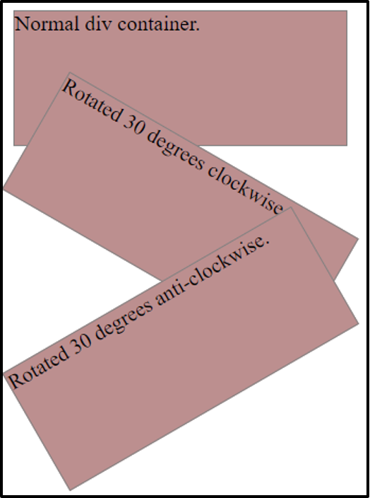
The rotate method is working properly.
scale() Method
In order to enhance or reduce the size of an element based on the specified width, and height the scale() method is used.
Syntax
The x, and y axes are defined by the sx, and sy parameter.
Example
The example below demonstrates the working of the scale() method.
HTML
We have simply created two div elements.
CSS
width: 200px;
height: 100px;
margin: 50px;
background-color: rosybrown;
border: 1px solid black;
}
.scale{
transform: scale(1.5,1.5);
}
We are using the scale() method to increase the width and height of the element one and a half times its original width and height.
Output
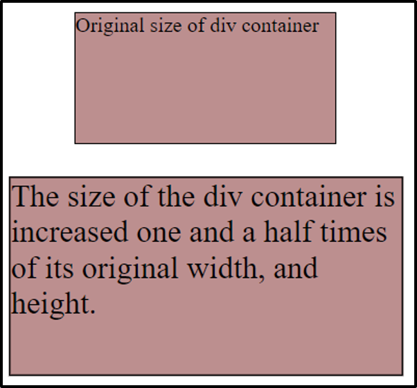
The size of the div container has been scaled using the scale() method.
skew() Method
The skew() method skews an element horizontally (along the x-axis) and vertically (along y-axis) based on the degrees specified.
Syntax
Or,
The two dimensions are represented by sx, and sy parameters.
Example
Suppose you want to skew an element both horizontally and vertically then consider the example below.
HTML
Here we have defined two div containers to demonstrate the concept of the skew() method.
CSS
width: 200px;
height: 100px;
background-color: rosybrown;
border: 1px solid gray;
}
.skew {
transform: skew(8deg,9deg);
}
We are skewing the second div container 8 degrees along X-axis and 9 degrees along Y-axis.
Output
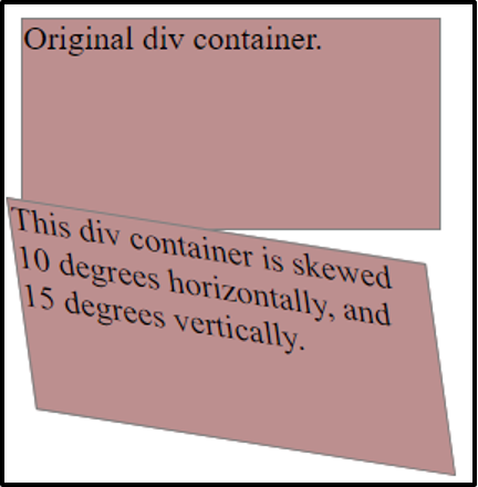
The element was skewed successfully.
matrix() Method
In order to translate, rotate, scale, and skew elements all at once, the matrix() method is used.
Syntax
The values of respective methods can be assigned as parameters.
Example
Let’s understand the working of the matrix() method using the following example.
HTML
To demonstrate the working of the matrix() method we have created three div elements.
CSS
width: 200px;
height: 100px;
background-color: rosbrown;
border: 1px solid gray;
}
.matrix1 {
transform: matrix(1, -0.4, 0, 1, 0, 0);
}
.matrix2 {
transform: matrix(1, 0, 0.4, 1, 120, 0);
}
We are assigning different values to various parameters of the matrix() method.
Output
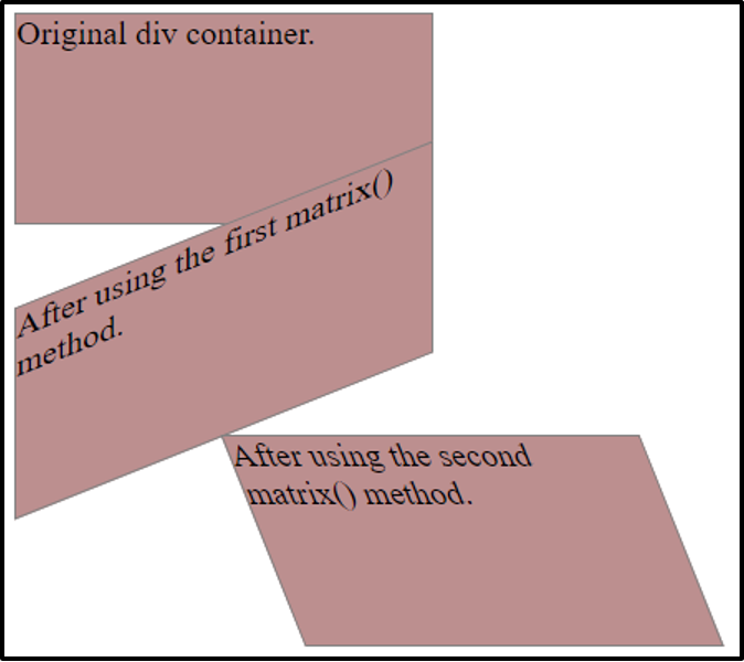
The matrix() method is working properly.
Now that we have learnt about the 2D transformation methods let’s explore the 3D transformation methods.
3D Transformation Methods
To move, rotate, and scale, and skew elements along the x-axis, the y-axis, and the z-axis, CSS provides various methods that are referred to as 3D transformation methods. The fundamental 3D transformation methods are as follows
We have explained these methods in detail below.
translate3d() Method
The method that is used to change the position of an element along the x, y, and z axes based on the parameters assigned is referred to as the translate3d() method.
Syntax
The three dimensions are represented by the tx, ty, and tz parameters.
Example
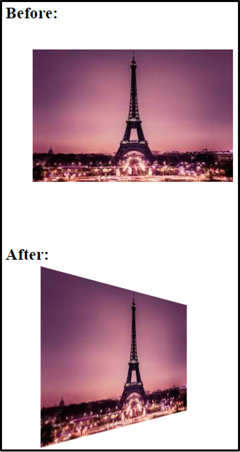
Suppose you want to change the position of an image along all the three axes. Use the translate3d() method.
HTML
Same image has been placed in both the containers to demonstrate the before and after effect of the translate3d() method.
CSS
width: 50px;
margin: 20px;
}
.translate {
transform: translate3d(25px, 25px, 40px);
}
We are using the translate3d() method to change the position of the second div container.
Output
The image has been translated using the translate3d() method.
rotate3d() Method
For the purpose of rotating an element clockwise or anti-clockwise along x,y, and z axes based on the degree specified, the rotate() method is used.
Syntax
The rx, ry, and rz parameters define the three dimensions, whereas the degrees parameter specify the angle from which the element should be rotated.
Example
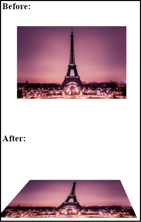
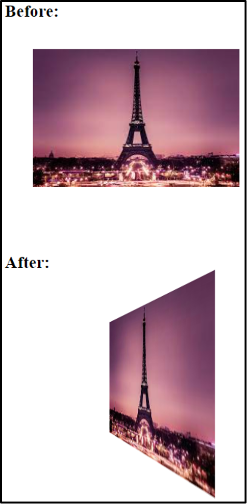
Suppose you want to rotate an image in the 3D space.
CSS
width: 200px;
margin: 30px;
perspective: 300px;
}
.rotate {
transform: rotate3d(0, 1, 0, 45deg);
}
We are rotating the second div container by specifying the values of x, y, and z axes and the angle. Note that we have also set the perspective property to 300px, which defines the perspective view of an element.
Output
The image has been rotated successfully.
scale3d() Method
In order to enhance or reduce the size of an element based on the specified width, and height, the scale() method is used. In order for this method to work use it along with other transform methods such as rotate and perspective.
Syntax
The above parameters specify the three dimensions.
Example
Let’s see what happens to the same image used in the above example when using the scale3d() method.
CSS
width: 300px;
margin: 30px;
perspective: 300px;
}
.scale {
transform: scale3d(1, 1, 1) rotate3d(1, 0, 0, 60deg);
}
As already mentioned, we have to use the scale3d() method with other methods to see its effect, therefore, in the above code, we are using it along with the rotate3d() method.
Output
The scale3d() method is verified and working properly.
matrix3d() Method
For the purpose of translating, rotating, and scaling elements all at once in the 3D space, the matrix() method is used. This method renders 16 values in the form of a 4×4 matrix.
Syntax
Or,
Each parameter takes in the value of the respective method.
Example
Let’s translate, rotate, and scale the dog image all at once using the matrix3d() method.
CSS
transform: translate3d(10px, 10px, 20px) rotate3d(0, 1, 0, -60deg) scale3d(1, 1, 1);
}
The image is being translated, rotated, and scaled simultaneously.
Output
The image has been moved, rotated, and scaled all at once.
Conclusion
For the purpose of moving, rotating, scaling, and skewing an element there are various methods available in CSS which fall under the categories of 2D transformation methods and 3D transformation methods. The methods translate(), rotate(), scale(), skew(), and matrix() are grouped under the classification 2D transformation methods, meanwhile, methods translate3d(), rotate3d(), scale3d(), and matrix3d() lie in the group of 3D transformation methods. All of these methods are explained in detail in this guide along with relevant examples.