This post explains the complete procedure to make the container responsive in Tailwind.
How to Make the Container Responsive in Tailwind?
To make the “container” responsive, use the “responsive variants” such as “sm:container”, “md:container”, “lg:container”, that helps in setting the HTML element as a container at certain breakpoints i.e., “sm(640px)”, “md(768px)”, “lg(1024px)”.
Let’s implement the above discussed concept practically.
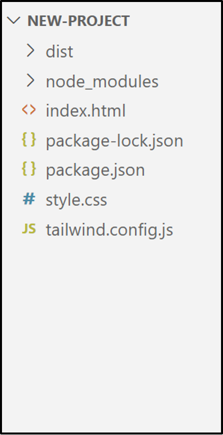
Project File Structure
First, have a look at the following file structure of the project that contains the list of mandatory files for the implementation of Tailwind CSS:
HTML Code
Now, write a simple HTML code and access the “container” class with any of the desired “responsive variant” to make the given container responsive:
<link href="/dist/output.css" rel="stylesheet">
</head>
<body>
<h1 class="text-3xl font-bold text-center underline text-orange-600">Welcome to Linuxhint!</h1><br>
<div class="sm:container sm:mx-auto text-center text-white font-bold bg-pink-600">Tutorial: Use Tailwind Container</div>
<body>
</html>
In the above code snippet:
- First, link the main CSS file “/dist/output.css” with the existing HTML file “html” via the “<link>” tag.
- Next, the “body” section defines the “<h1>” element that use the following Tailwind classes i.e., “Font Size” to apply the specified size, “Font Weight” to bold the text, “Text Align” to set the content in center, “Text Decoration” to underline the text, and “Text Color” to apply the specified color, respectively.
- After that, a “<div>” element is added that applies the “container” class with a responsive variant “sm: container” and centre the content such that the screen width will be “small(min-640px-max768px)”.
Output
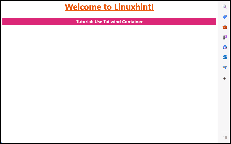
As seen, the added container sets the margins of both right and left at “auto” only at the screen width between “640-768” pixels.
Conclusion
“Tailwind CSS” offers the built-in “container” class that can be used with the help of the “responsive variants” to make the container responsive. The “responsive variants” such as “md:container”, “sm:container” etc. set the particular HTML element as a container at the defined breakpoints. This post explained the complete procedure to make the container responsive in Tailwind.