This article demonstrates the complete procedure to make a column responsive in Tailwind.
How to Make a Column Responsive in Tailwind?
To make a column responsive in Tailwind, use the “grid-cols-{n}” utility with the “screen” prefixes like “sm(640px)” for small screens, “md(768px)” for medium screens, and “lg(1024px)” for large screens.
Let’s perform this task practically.
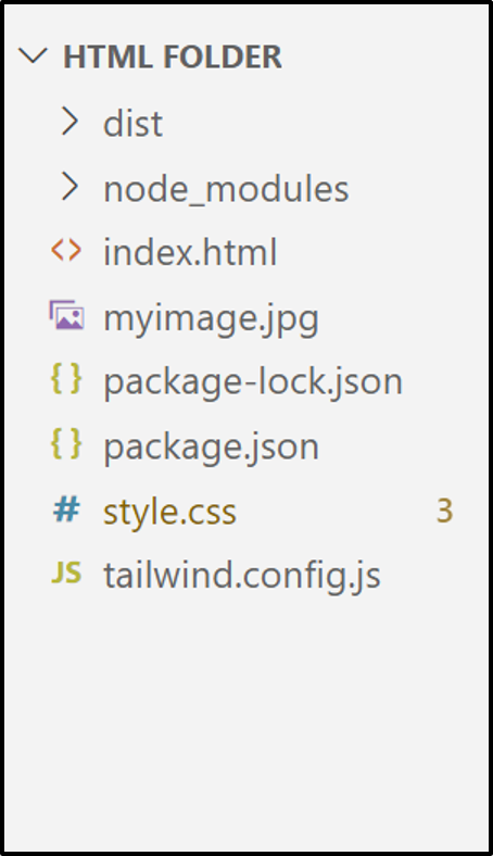
Project File Structure
First, have a look at the following project file structure named “Linuxhint” with the mandatory Tailwind CSS file:
HTML Code
Now, write the simple HTML code in the existing “index.html” file and use the Tailwind “grid-cols-{n}” utility with the discussed “screen” prefixes:
<link href="/dist/output.css" rel="stylesheet">
</head>
<body>
<h1 class="text-3xl font-bold text-center underline text-orange-600">Welcome to Linuxhint!</h1><br>
<div class="mx-2 grid md:grid-cols-4 lg:grid-cols-5 gap-4">
<img class="border-2 border-black " src="./myimage.jpg" />
<img class="border-2 border-black " src="./myimage.jpg" />
<img class="border-2 border-black " src="./myimage.jpg" />
<img class="border-2 border-black " src="./myimage.jpg" />
<img class="border-2 border-black " src="./myimage.jpg" />
<img class="border-2 border-black " src="./myimage.jpg" />
<img class="border-2 border-black " src="./myimage.jpg" />
<img class="border-2 border-black " src="./myimage.jpg" />
</div>
<body>
In the above code block:
- First, link the main CSS file “/dist/output.css” with the existing HTML file “html” using the “<link>” tag in the “head” section.
- Next, the “body” section creates an “<h1>” element that uses the “Font Size”, “Font Weight”, “Text Align”, “Text Decoration”, and the “Text Color” Tailwind classes, respectively.
- After that, add a “<div>” element that first utilizes the “horizontal margin(mx)” class and then applies the “grid-cols-{n}” utility as (md, lg) as discussed, as well as the “gap” utility, respectively.
- In the “<div>” element body section, eight images are added using the “<img>” tag specified by their path using the “src” attribute, as well as using the “Border Width”, and “Border Color” Tailwind classes.
Output
Run the above HTML code in the live server and use the “inspect” element to view the source code:
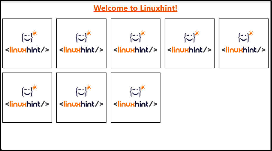
As seen, the grid layout sets the specified columns i.e., “4 (for medium screen)” and “5 (for large screen)”.
Conclusion
“Tailwind CSS” provides the built-in “grid-cols-{n}” utility that can be implemented to make the columns responsive with the help of “screen” prefixes “sm(small)”, “md(medium)”, and “lg(large)”. These screen prefixes are also known as the “responsive variants” that adjust the associated element at the defined breakpoints. This article demonstrated the complete procedure to make a column responsive in Tailwind.